
"World of Warships: Blitz" is a mobile adaptation of the legendary desktop game, offering players the opportunity to engage in battles using historical warships from the WW1/WW2 era.
01.
Goal
The WoWS Blitz product team at Wargaming Mobile approached our design team to identify and help to resolve critical UX issues in the alpha version of the game before its global release. Together, we created a future-proof vision for the game’s interface, established the foundation of its design system, and ensured the UI could scale across devices and accommodate upcoming features.
02.
Process
I joined the project as a Visual/UI designer alongside three other designers. My concept was selected by the client, so I took responsibility for developing it into a detailed visual direction and leading the subsequent interface design.
I helped develop the vision for the game UI, translated it into concrete steps for implementation, catalogued all interface elements, and built the core of the design system. I also delivered an intermediate UI iteration that aligned the mobile experience with the spirit of the desktop version. Beyond this, I contributed to new feature development, such as the Ranked Battles mode, by designing and refining their interfaces.
Key members
– Head of Product: Andy Muesse
– Product Manager: Nad Adjir
– Head of Game Design: Greg Hanefeld
– UI Designer: George Koultouridis
– Interaction Designer: Alexander Volyanyuk
Team structure
Our design team was fully remote: I was based in Amsterdam, the interaction designer in Minsk, and the game development team in Berlin. Initially, we worked on UI concepts independently, later integrating into the game team with regular alignment calls and on-site workshops in Berlin.
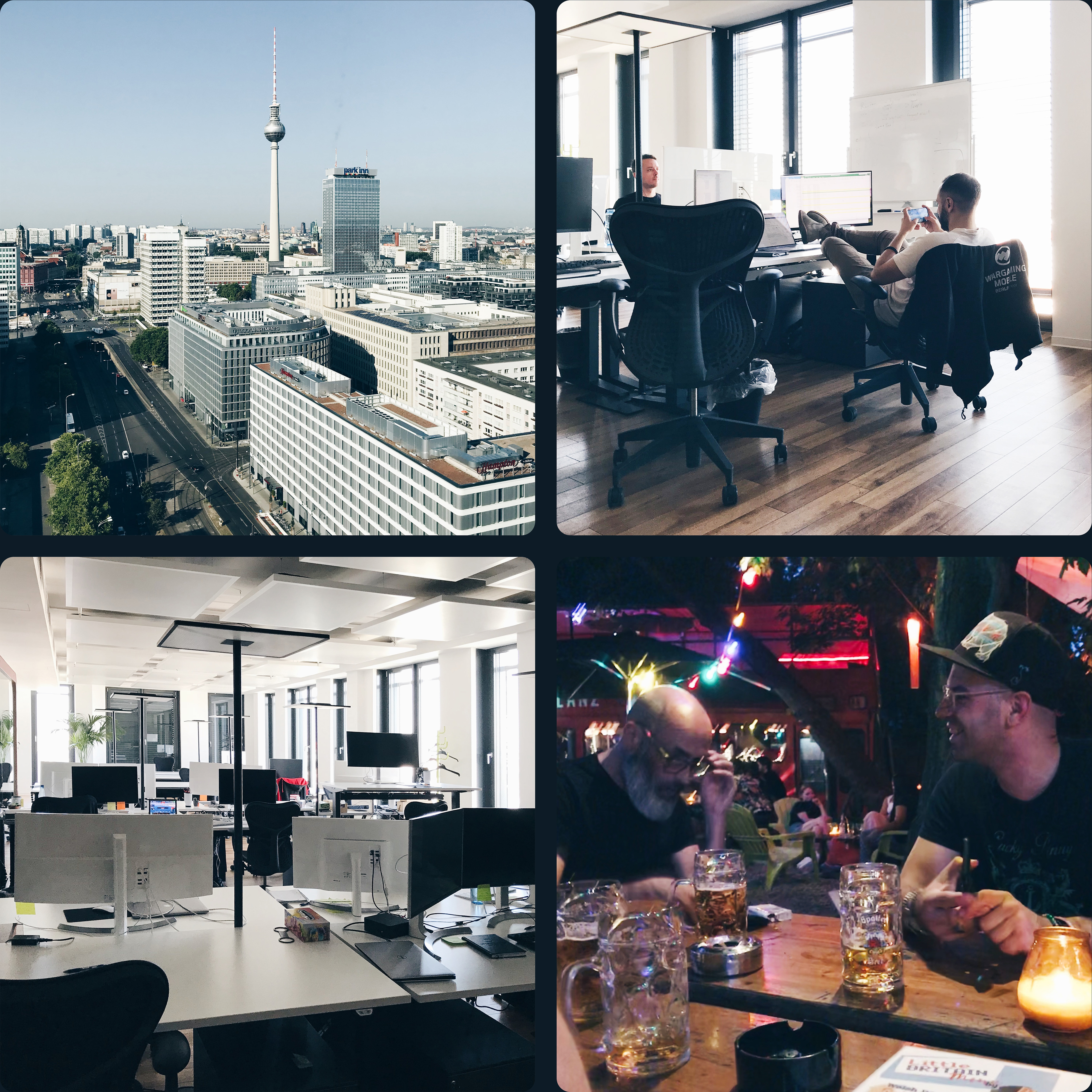
Wargaming Mobile office in Berlin, Nad is testing a new build of the game, late game design discussion with Ian Bowden (Art-director) Greg Hanefeld (Head of Game Design)
03.
Outcome
World of Warships Blitz became a successful title on the mobile market, reaching over 10 million installs on Android and maintaining a strong rating (around 4.0 on Google Play and 4.6 on iOS) with hundreds of thousands of reviews. The game consistently generated several million dollars in annual revenue according to mobile analytics services and was repeatedly featured by Apple in the App Store, which boosted its visibility worldwide. It reached peak concurrent usage of over 29,000 players and held strong positions in the Strategy and Action categories in multiple regions, including the US, Russia, and Japan.
My contribution to the game interface helped the game remain competitive and sustain high player engagement. By applying mobile interaction patterns to a complex PC-first game, I ensured that the experience felt native on handheld devices without losing the spirit of the original.
04.
Process
My involvement in the project can be divided into three stages.
Stage 0: Analysis
Before launch, the team asked us to identify major interface problems. I immersed myself in the game as a regular player: battles, ship research and upgrades, clan interactions, in-game purchases. Together with the interaction designer, we documented pain points through notes, screenshots, and recordings. Our report highlighted critical issues, many of which were fixed before release.
Stage 1: Vision
We went beyond the initial request and proposed a long-term vision for the UI. In a focused design sprint, our team of visual and interaction designers produced concept slides showing how the interface could evolve into a scalable, modern system. This vision was positively received, and I was asked to continue on the project full-time. I refined and polished the proposed concept integrating requirements from the product team.
Stage 2: Gradual adaptation
Since the game had already launched, the development team wanted a smooth transition rather than a full redesign. The vision became our north star, and I worked on gradual improvements: consolidating all screens and controls into a design library, creating the first style guide that became the backbone of the design system, reducing the variety of controls, grouping elements into clear patterns, and introducing templates for recurring screen types. These steps not only prepared the UI for a consistent design system but also made the game easier to learn and more intuitive for players. At the same time, I worked on new features like Ranked Battles and refining in-game shop and ships research and purchase flows, ensuring they fit naturally into the evolving system.
05.
Vision
The design principles we introduced in the very first concept presentation stayed consistent throughout the entire project. They became the backbone of the new UI and guided every decision we made. Below are the key principles, each illustrated with examples from the game interface.
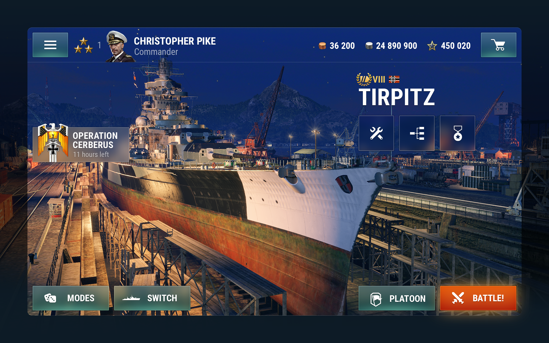
Clear focus
One of the guiding principles across all game screens was maintaining a clear focus. The reworked UI shows only what players need to make a decision at any given moment.
From the start, WoWS Blitz had a huge range of features: browsing and buying ships, upgrading and modifying them, joining clans, chatting, competing in rankings, shopping in the store – and that was just the first row of buttons in the lobby.
But players don’t open the game for menus, they open it to battle. That’s why we kept the “Battle!” button as the anchor of the experience. Everything not directly related to that flow was shifted to a secondary layer.

Predictable schemes
Our initial audit showed heavy inconsistency in controls. Buttons with the same function changed color, shape, and placement from screen to screen, and menus were re-invented almost every time.
As soon as we drafted the visual style, we pinned down core UI elements to build the design system. We structured individual controls (like buttons and menus), their placement, and semantic navigation zones. One of the most crucial aspects of creating an easy-to-learn user experience is having predictable locations for each navigation element and limiting their number.
We defined three semantic navigation zones:
1. Always available actions: the essentials, always visible.
2. Action screen area: the flexible central layout.
3. Contextual interactions: up to four buttons placed under the player’s fingers.
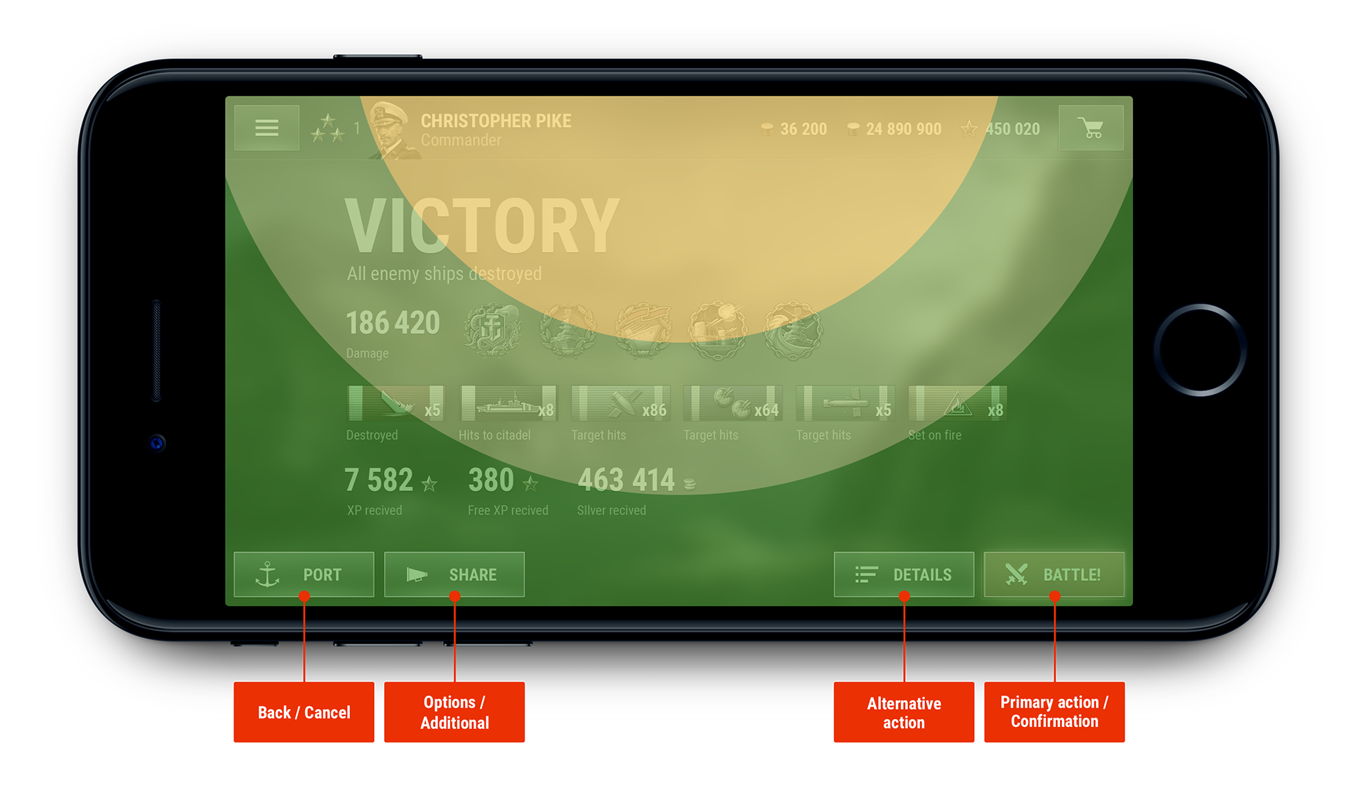
We also standardized a stable set of controls to automate player interactions with the service UI:
– Back / Cancel
– Options (e.g. Change warship, Setup resupply)
– Alternative action (e.g. commands like "Platoon" near the primary "Battle!" button on the Home screen or "Details" near "Battle!" on the battle results screen)
– Primary action / Confirm (e.g. Battle, Purchase, Equip)
Reducing variety made the system easier to recognize and faster to master.
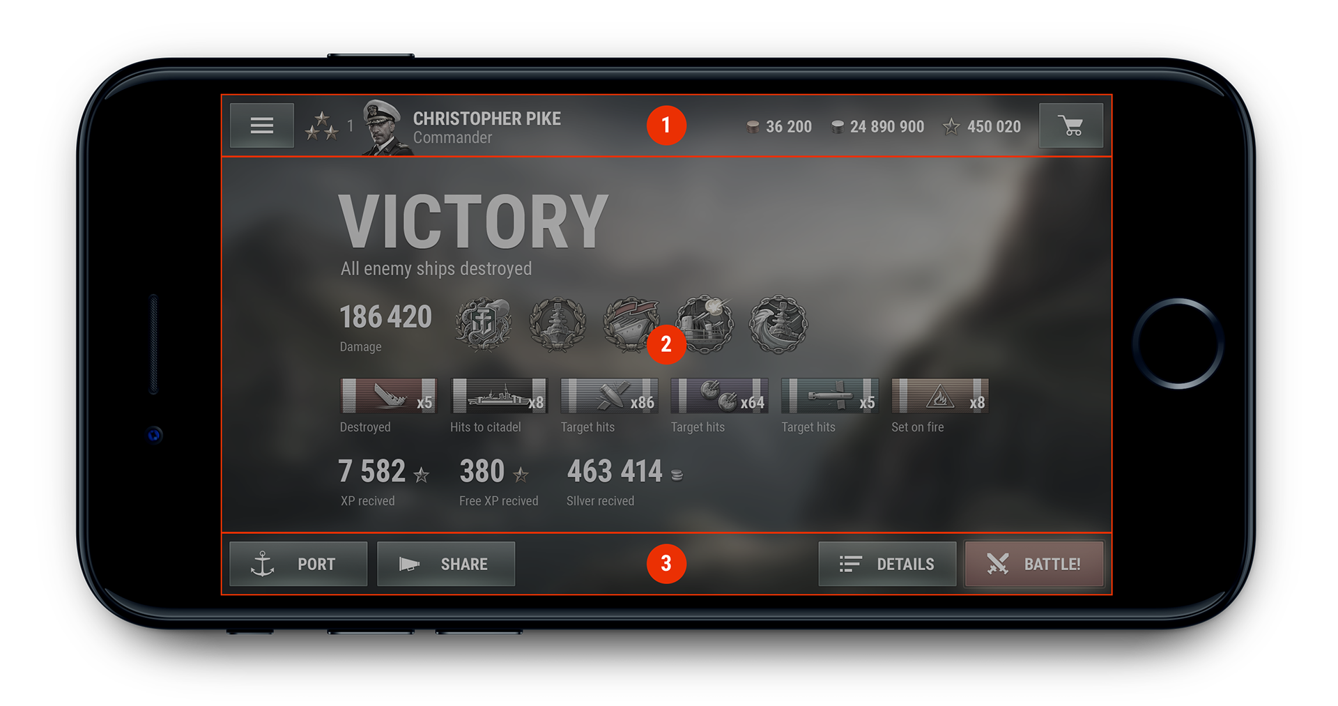
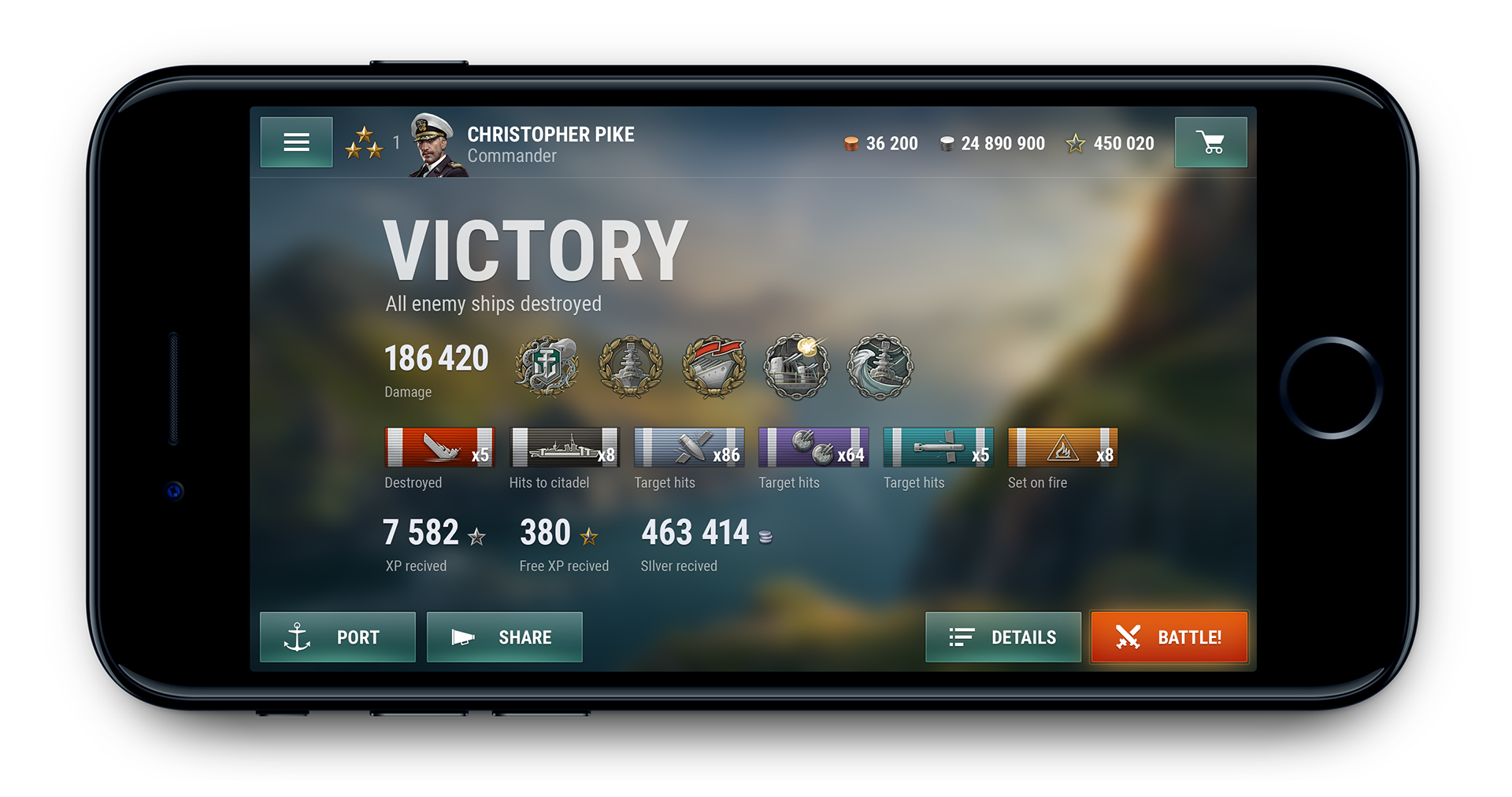
Flow support
The UI was built around player flow and designed to keep momentum. Right after a battle, players are still in the flow state – excited after a win or eager to correct mistakes after a loss. In both cases, the main thing they want is to jump straight into the next fight.
So we prioritized the “Battle again” path above everything else. Stats, rewards, and details are still available, but they take a back seat to keep the flow uninterrupted.
Common case
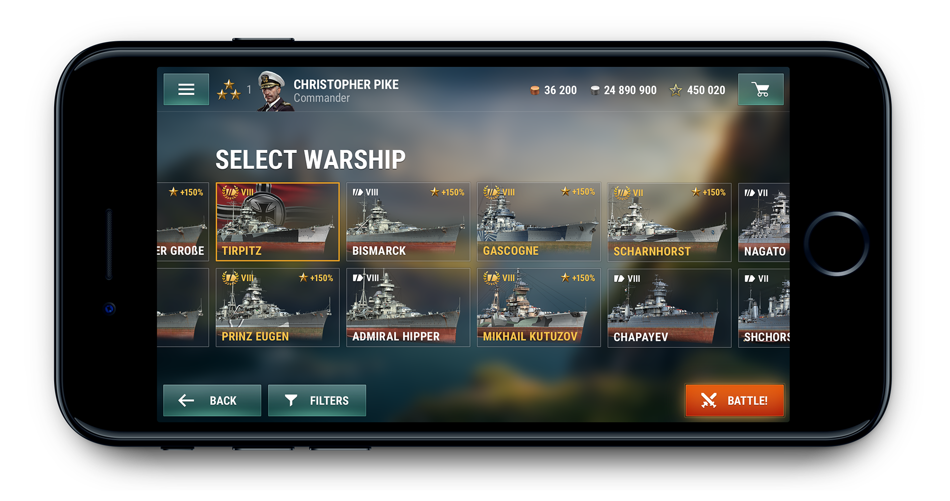
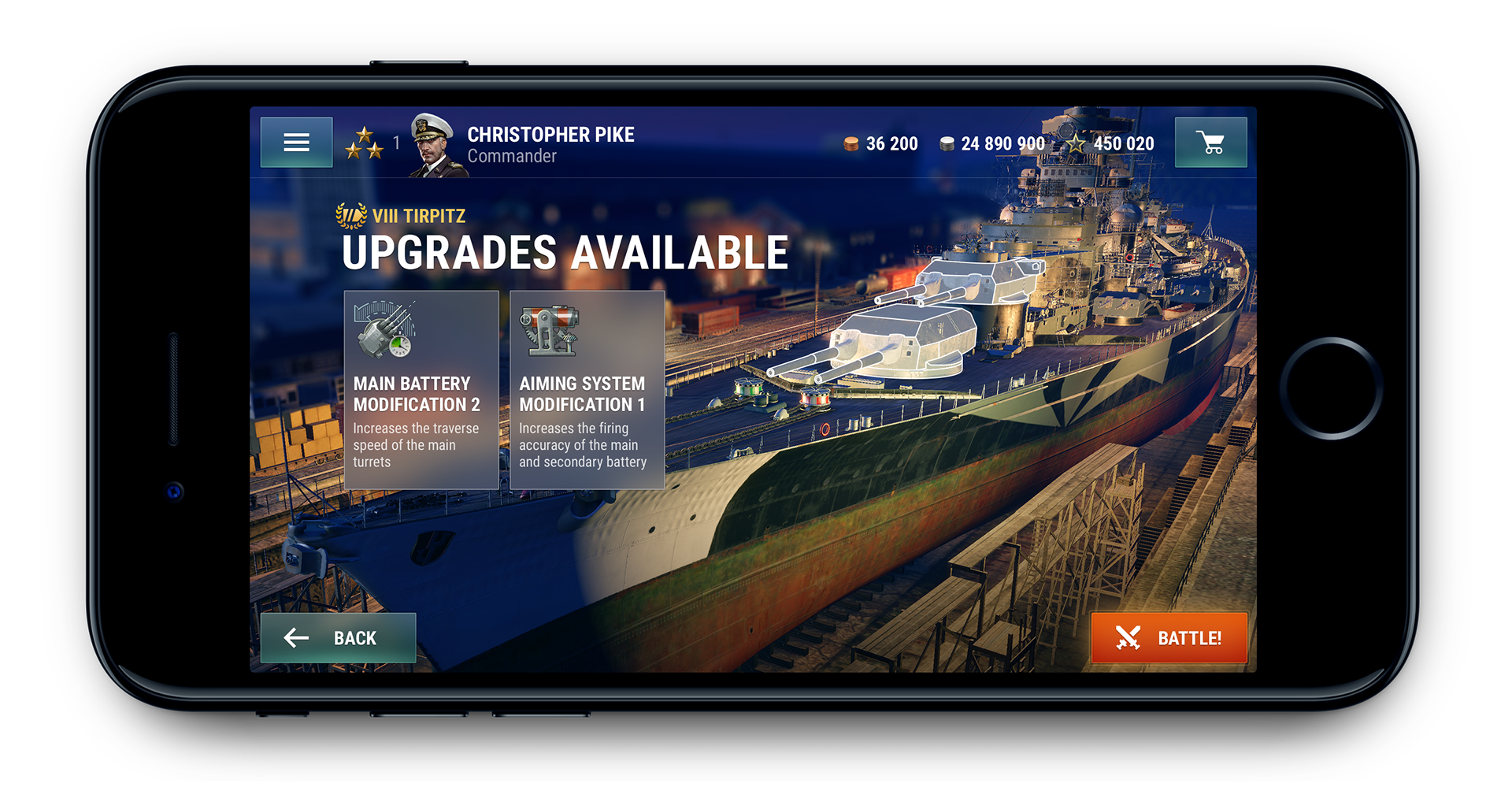
We used the “common case” principle to simplify both design and player experience. For example, most players use auto-resupply for consumables. Instead of cluttering the home screen with consumables management, we moved it one level deeper, while still making sure players never enter battle without them. The same logic applied to upgrades: instead of showing every possible option up front, we surface them contextually when they become available. This kept the lobby clean and focused.
Future proof
From the start, we designed with longevity in mind – thinking not just about current devices and features, but also about scalability and future growth. Every layout and control was built to handle new elements, new features, and new languages without breaking the system.
The difference is clear when comparing the first public release to the redesigned lobby. The early version was overloaded, leaving no room to expand. The new version prioritized what matters most, pushed secondary elements deeper, and freed up space for future additions. At the same time, it introduced a modern look and feel, leaving behind outdated desktop paradigms and making the game competitive on mobile for years ahead.
Lobby screen from initial public release of the game. Screen is overloaded with all available features and information. UI would hardly be able to accommodate any more new features.
Lobby screen from Vision, a complete overhaul of both the game's UI and UX. The most crucial elements prioritized and all secondary components moved to deeper levels.
06.
Gradual adaptation
In an ideal world, you scrap the old interface and build a new one from scratch. In reality, I worked with a live product that already had an active player base, a backlog of features scheduled for release, and a calendar of in-game events that relied on the existing UI. To evolve the experience without disrupting the product, I took a gradual adaptation approach.
The first step was to introduce a unified grid across all screens, define minimum font sizes, and set minimum tap areas for buttons. Text had to remain readable, buttons had to be reliably clickable, and the entire system had to scale gracefully across devices, from 4-inch phones to larger tablet screens.
The second step was to analyze redundant controls. Many buttons performed the same functions but appeared in dozens of variations. By mapping and consolidating them, I reduced the system to a few consistent versions. This not only prepared the ground for a unified design system but also made the interface easier to learn – fewer variations meant less friction for players.
The third step was to standardize screen templates. Nearly every screen in the initial version had been designed as a one-off. I identified recurring patterns, distilled them into a minimal set of templates, and migrated all screens accordingly. This streamlined the design system and made navigation more predictable for users.
This careful, incremental work turned scattered screens into a cohesive system, improving usability for players and establishing a scalable framework for future development.
07.
Visual language
The initial version of the game I received before release was heavily based on the interface of another Wargaming mobile title, World of Tanks Blitz. Many patterns and much of the visual style were quickly adapted for warships, but the tank UI had a very different character – grounded, heavy, and deliberately weighty.
In shaping the interface for World of Warships Blitz, I followed two core principles: the ship is the main character, and the interface should be as light and transparent as possible.
This project also brought together my personal and professional interests. I’ve loved ships since childhood, and here I could apply that passion directly. For players, a ship is the centerpiece—the thing they’ve invested time or money to earn. The UI should never overshadow it, but instead frame it as the true hero of the screen.
I also worked to align the mobile palette with the desktop version, carrying over its core principles and aesthetics. That meant a focus on semi-transparent glass textures, supported by greens and cyans, to create continuity across platforms.
Finally, I introduced a clear distinction between system and earned elements. System icons – such as buttons and controls – were kept simple and functional. Earned items, on the other hand, carried weight and realism. Medals used a realistic style, while in-game currencies like gold or experience points were rendered volumetric with shadows. These elements, like ships themselves, represent achievements players carry out of each battle. A medal for sinking five opponents in a single match isn’t just a number – it’s a memory of that fight, anchored in the interface.

I am proud of the work I contributed and of being part of such a large project from its early days. This case gave me the chance to learn a new industry, apply mobile interface patterns to a complex PC-first game, and shape the project vision. Most importantly, it showed me how design decisions can directly support both the player experience and the long-term success of a global title.