White noise
Mobile app product design
- Client
- Personal project
- Agency
- Handsmade
- Role
- Product Designer
- Date
- April 2023
01. Goal
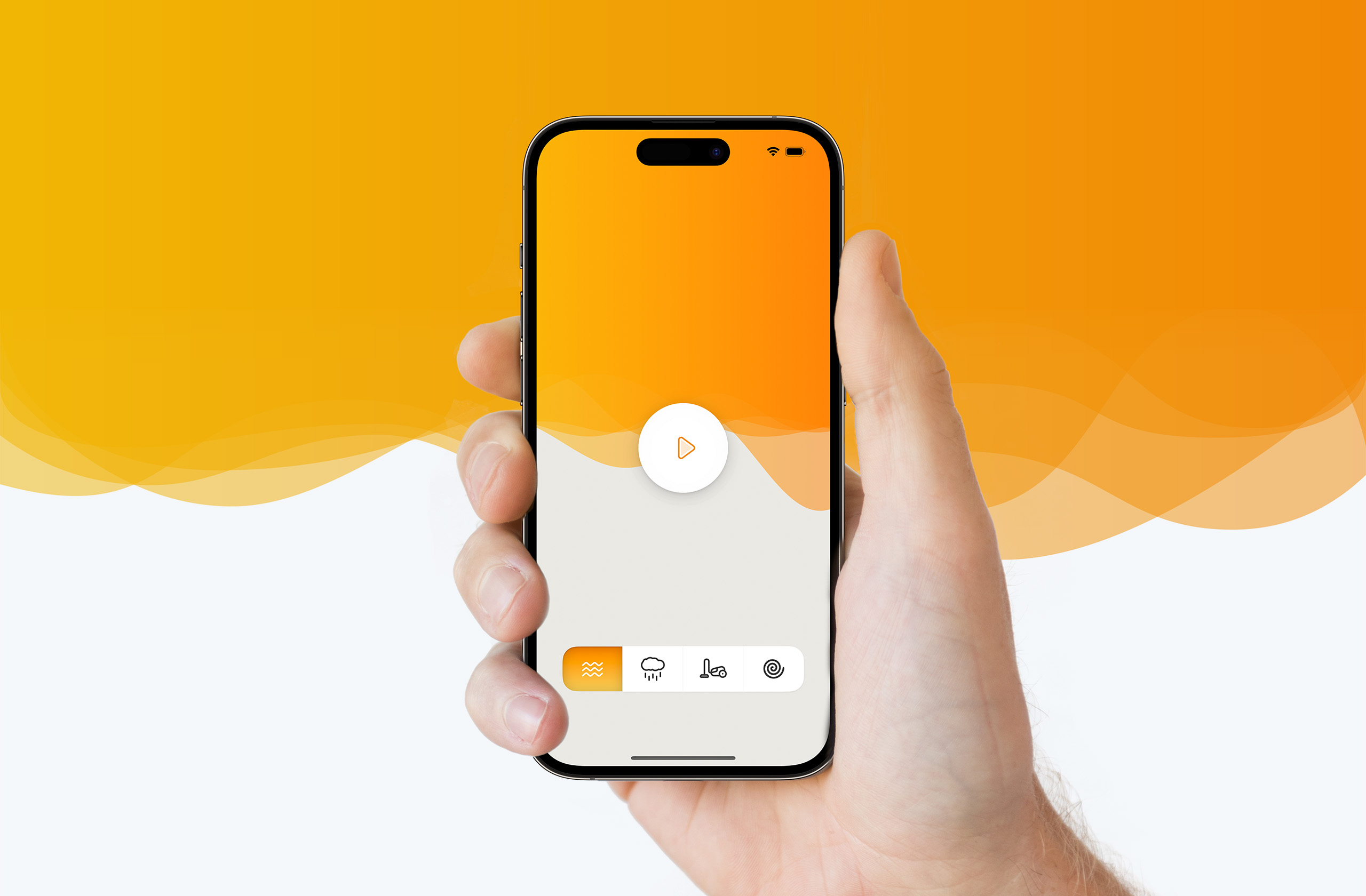
Create an app that feels both minimal and beautiful, made for people who don’t want fuss – especially young parents (myself included at the time). The interaction should be simple, the controls large enough, the interface calming. The task: build something you can open, tap, and relax.
02. Visual design
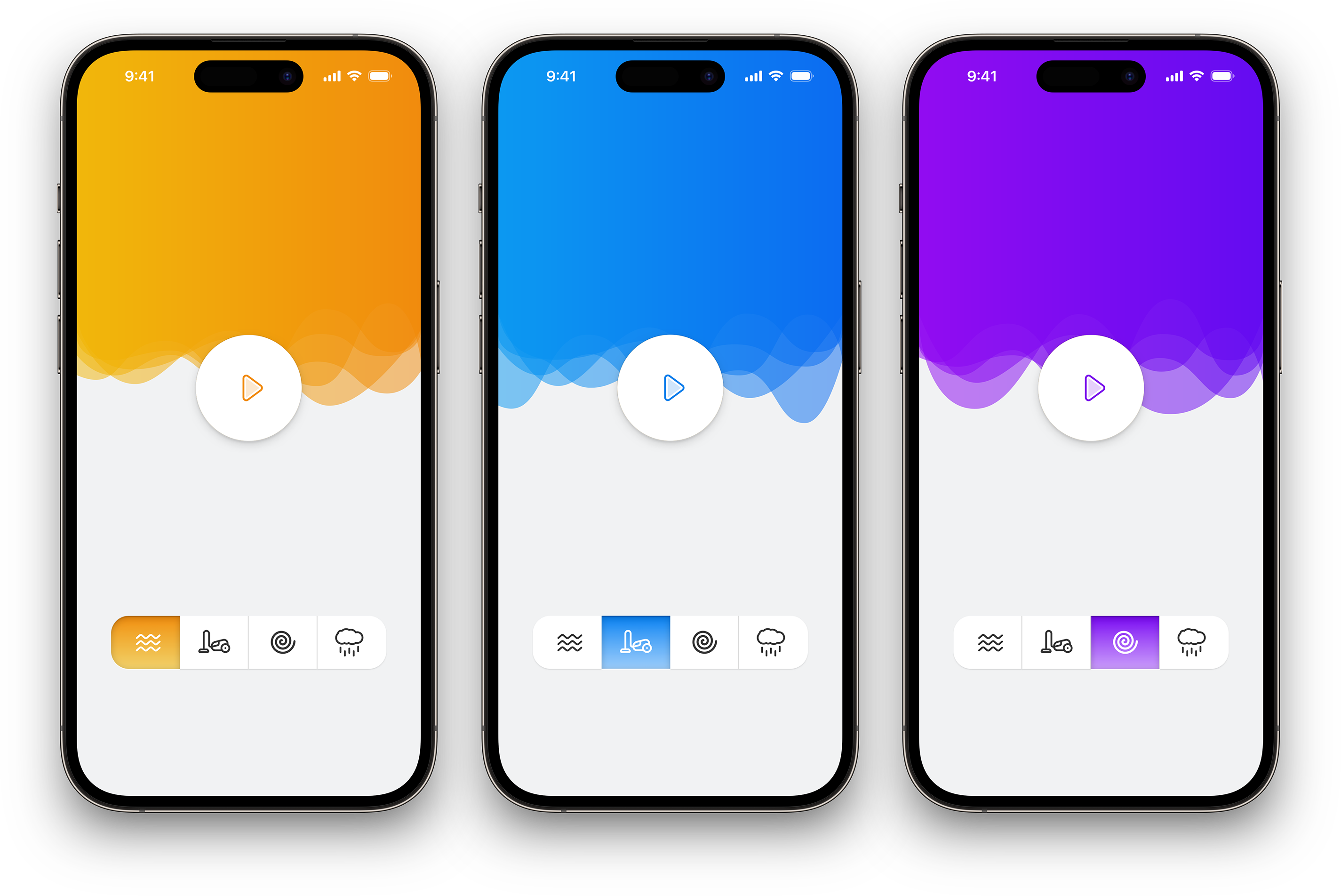
The app’s signature is its animated background: a smooth wave transition that adds elegance without clutter. Color changes depending on the chosen white noise sound – low contrast for soft tones, richer hues for more textured sounds – maintaining both aesthetics and clarity.
03. The outcome
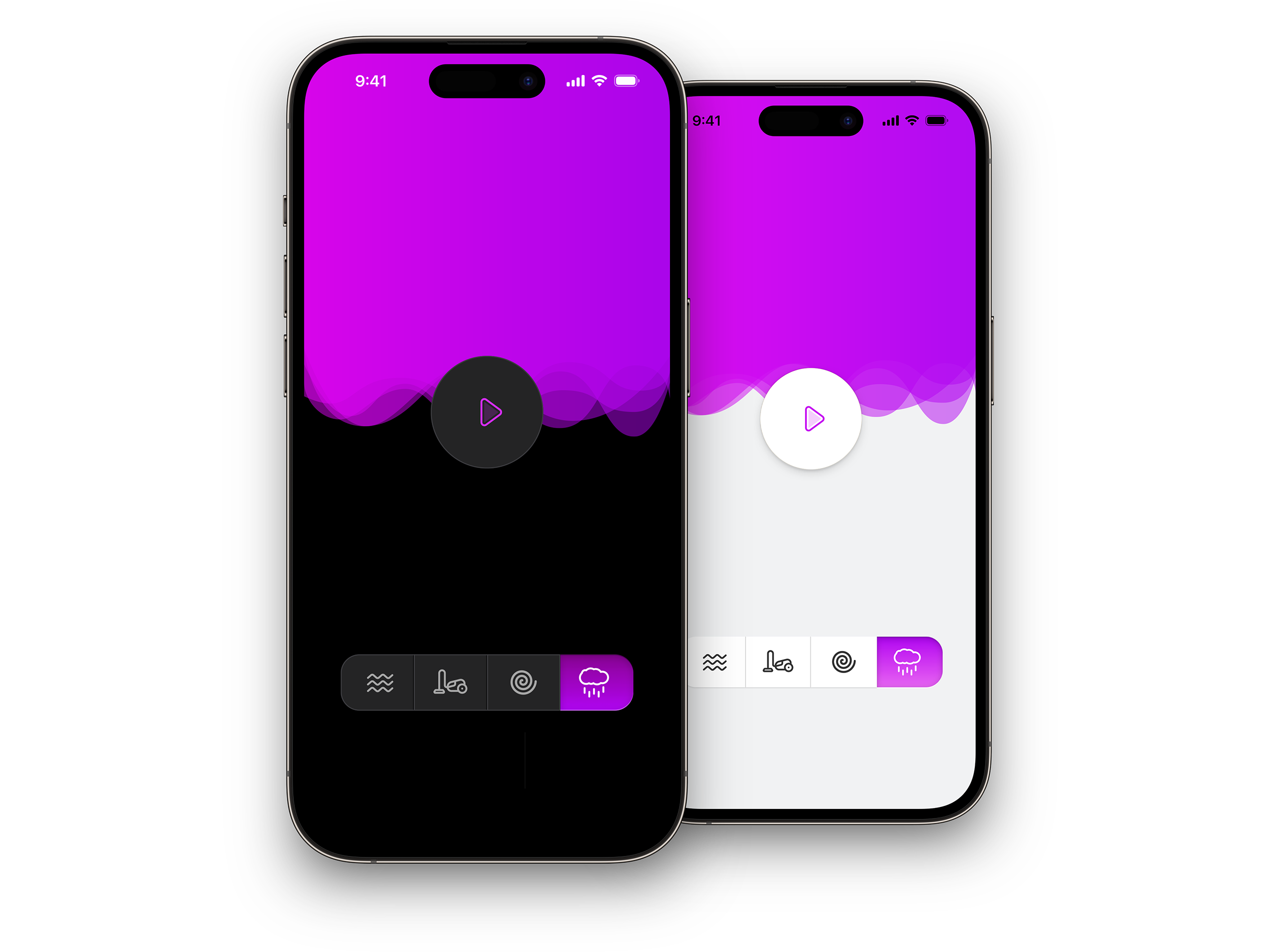
White Noise is as simple as it needs to be: its sole purpose is to play the noise, no distractions. It’s a personal experiment, a platform to try ideas. Along the way, I sharpened skills in dynamic shapes and color transitions in iOS design.