Bulbs and Wires
Mobile game product design
- Client
- Personal project
- Agency
- Handsmade
- Role
- Product Designer
Game Designer - Date
- October 2012
01. Goal
This was my first iPhone app design – a passion project I made in my free time in 2012. I wanted to build a puzzle game on a simple idea: connecting light bulbs into one network. I designed the game and the app; a developer built it.
The goal was to combine that classic puzzle mechanic with a visual identity of its own: something a new player understands immediately, and that gets harder from there.
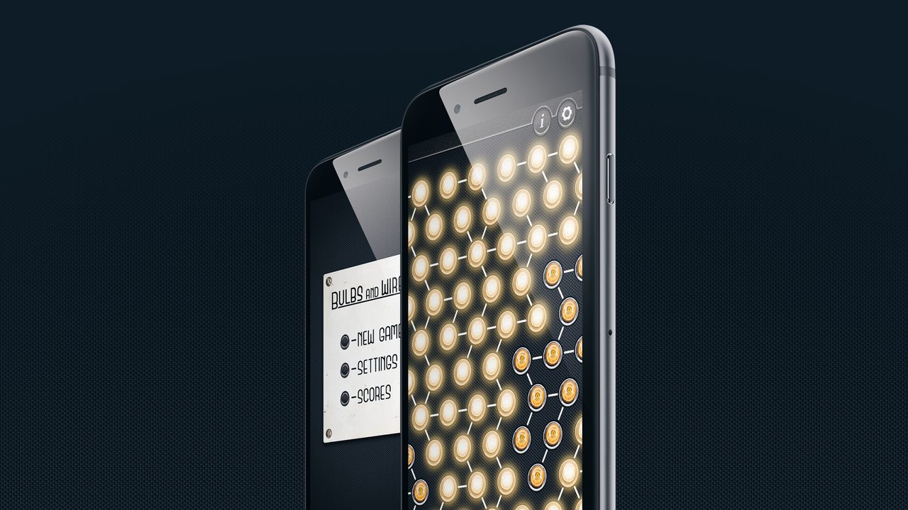
The structure is as small as the idea: a menu with three items – New game, Settings, and Scores – and the playing field.
02. Gameplay
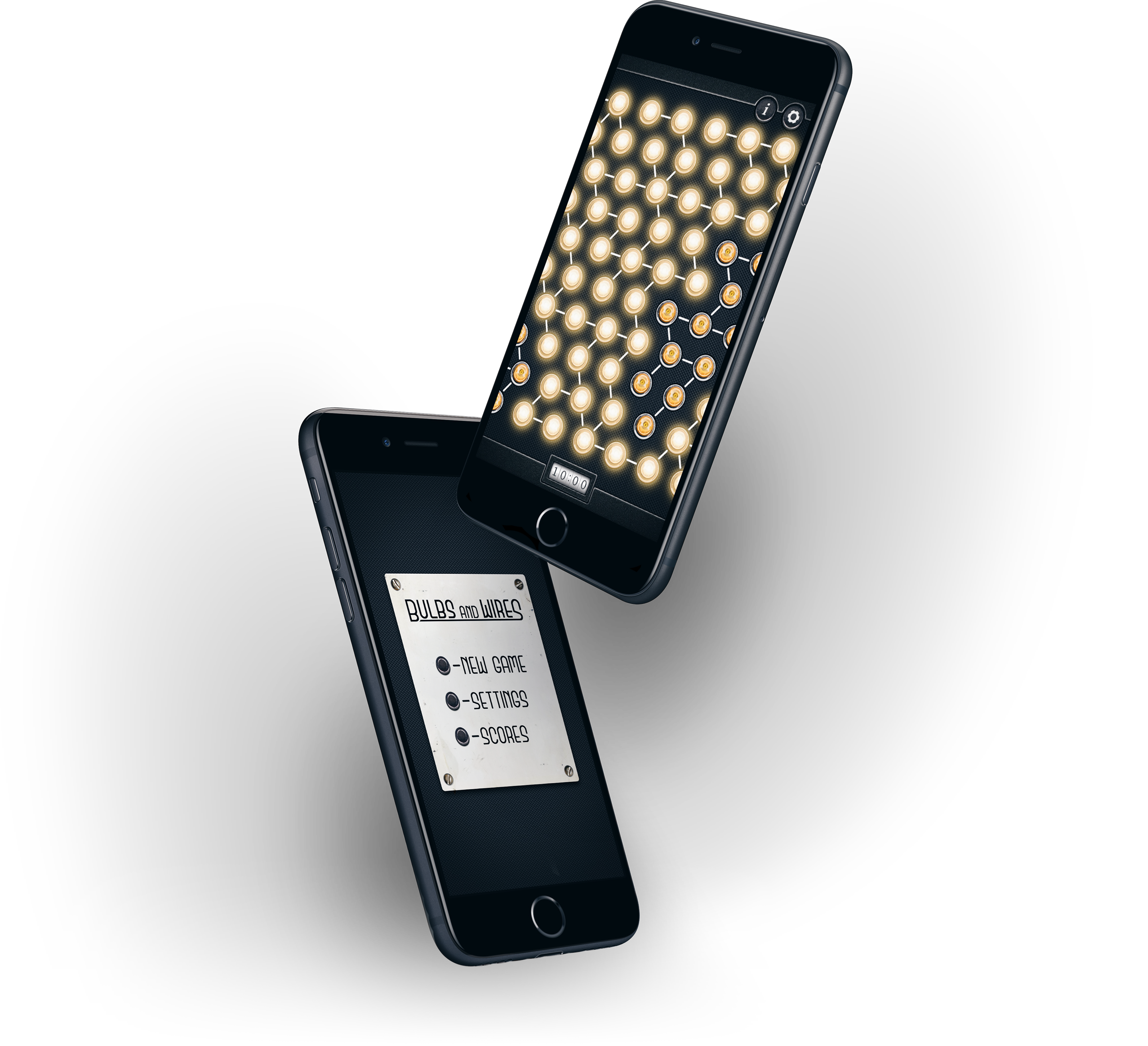
A lit bulb sits in the middle of the field, surrounded by bulbs that have to be connected to it. The field is a hexagonal grid, so each bulb can have up to six neighbors. Tapping a bulb rotates it, with its wires, by 60° – one step per tap. The game is won when every bulb is connected and lit.
The field shows its own state. Connected bulbs glow; unconnected ones stay dark, with only the filament visible. There is no progress counter – the dark patches are the progress, and they show where to work next.
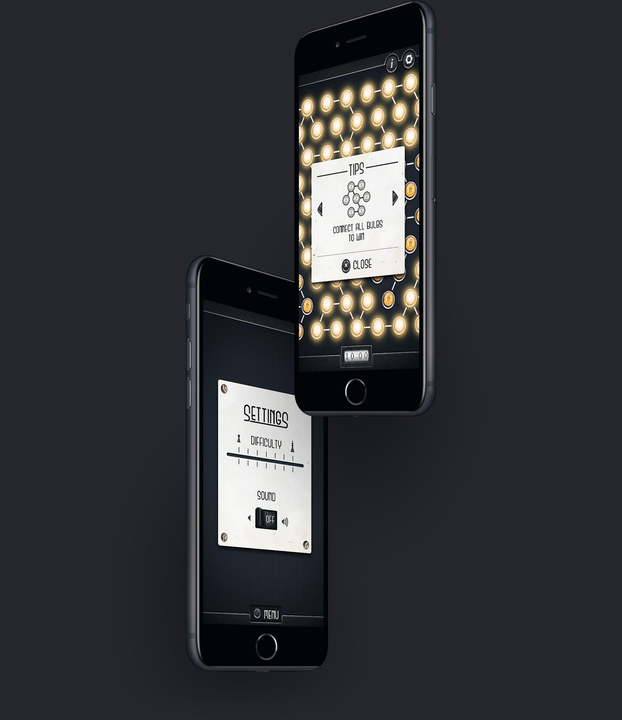
The field is larger than the screen, so you scroll to move around it and pinch to zoom. That leaves four things to know – tap, scroll, pinch, and the winning condition – and the tips are exactly those four, one pictogram and one line each. They open on a card over the field, so the rules are at hand during play.
-
 Tap the bulbs to rotate them
-
 Use scroll gesture to navigate the field
-
 Use pinch gesture to zoom
-
 Connect all bulbs to win
Besides the tips, the field carries only a settings button and a timer. The timer counts up from the moment a field opens until every bulb is lit: the faster you light the whole field, the better your result. Difficulty is a seven-step slider in Settings, marked with a chess pawn at one end and a king at the other instead of words. Each step makes the field larger and adds more bulbs.
03. Visual details
The visual language leans into warmth and texture: incandescent bulbs with yellow light on a dark, textured surface. The interface is inspired by retro amplifiers and steampunk. Menus and dialogs are metal plates fixed with screws, the timer is a flip clock, sound is a rocker switch, and difficulty is a slider like the one on an old mixer. Subtle animations and sound effects go with them.
Each control looks like the physical object that does the same job, so it explains itself: a switch flips, a slider slides. The plates also separate the two layers of the app: everything on a plate is menu, everything on the dark surface is the game.
This is a 2012 design, from the years when iOS interfaces imitated physical materials, and it shows. Later updates only added support for newer iPhones; the graphics and the game logic stayed as they were.
04. Outcome
Bulbs and Wires launched on the App Store in 2012 and has been downloaded more than 4,600 times. It is my longest-running project: over the years it has had only minor updates, and it is still free on the App Store.