
01.
Goal
After extensive and successful work on interfaces for the sub-brands of Stellantis (an automotive company formed in 2021 by the merger of Fiat Chrysler and PSA Group), our team at TomTom began working on the next generation of navigation system.
The primary task for our team in developing the next generation of the navigation system has become significantly more challenging. Previously, we focused on the clarity and simplicity of the system for the end user. However, a crucial new requirement now is the flexibility to adapt the system to vehicles from different brands, with varying numbers of screens and screens of different sizes.
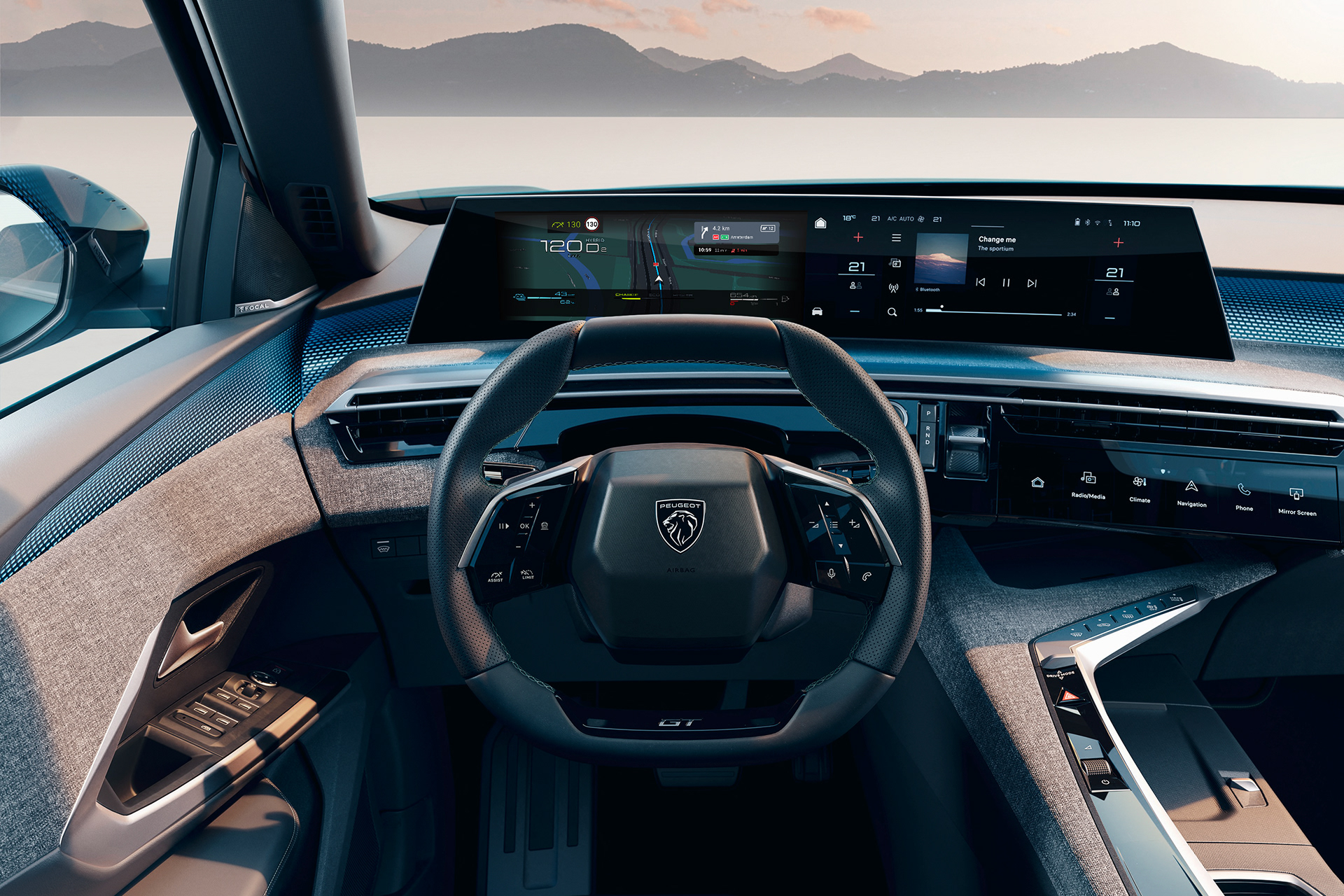
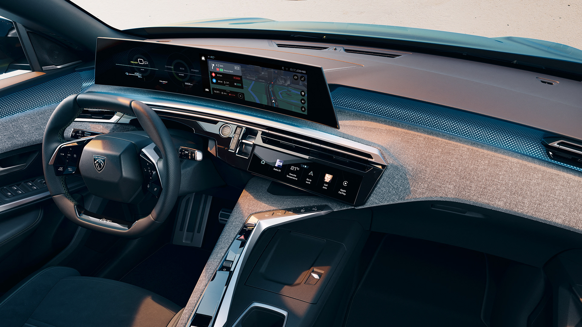
An example of the implementation of the new generation of the TomTom navigation system is the Peugeot 3008, which became the first car to roll off the production line with the new software. The navigation system was designed and specified in TomTom’s reference style, with the Peugeot design team adapting it to align more closely with the brand identity.
02.
Process: concept of "Horizon" panel concept
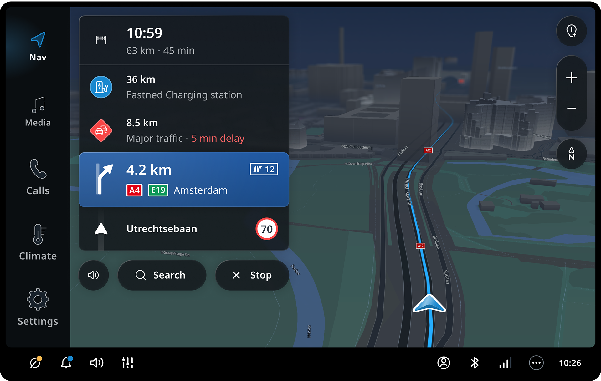
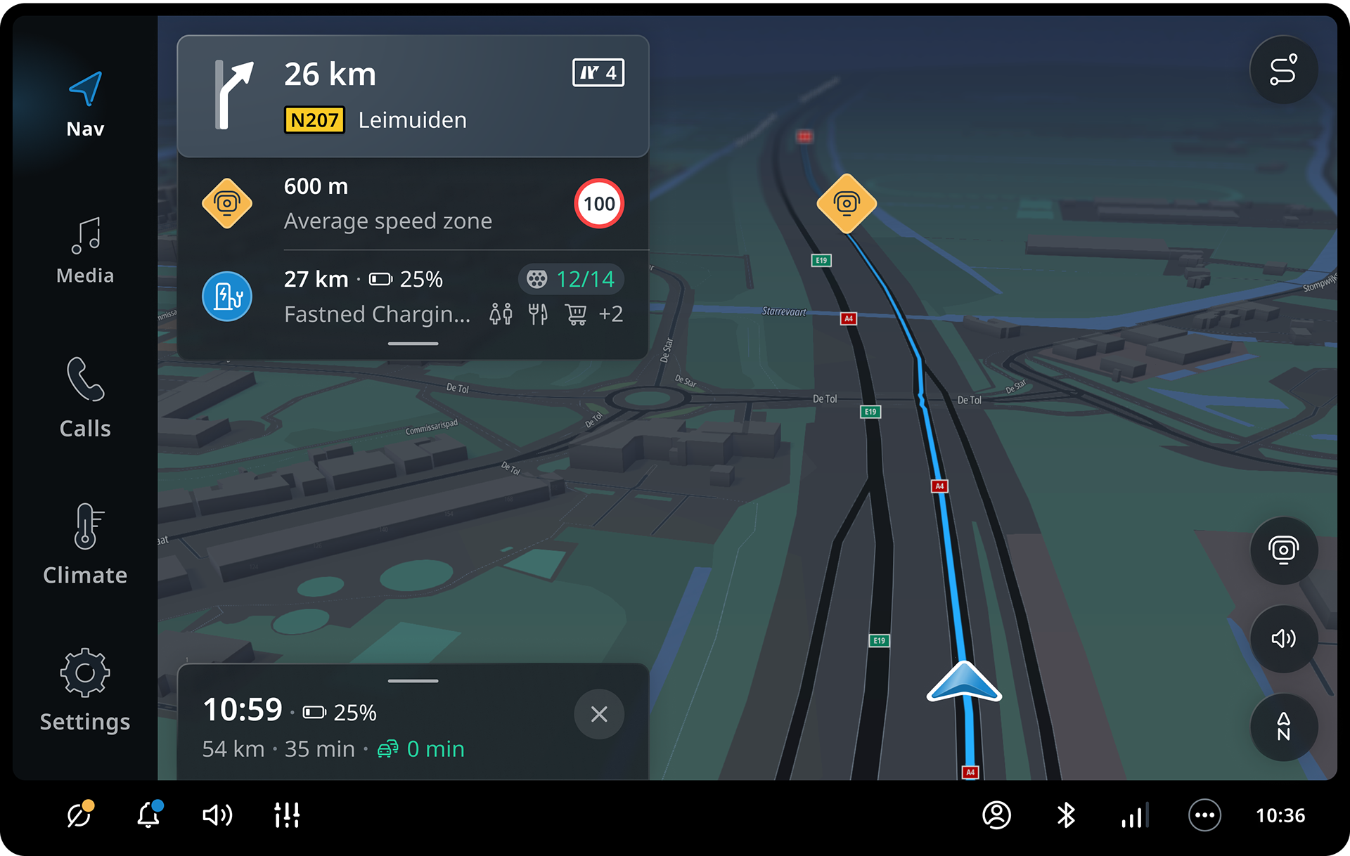
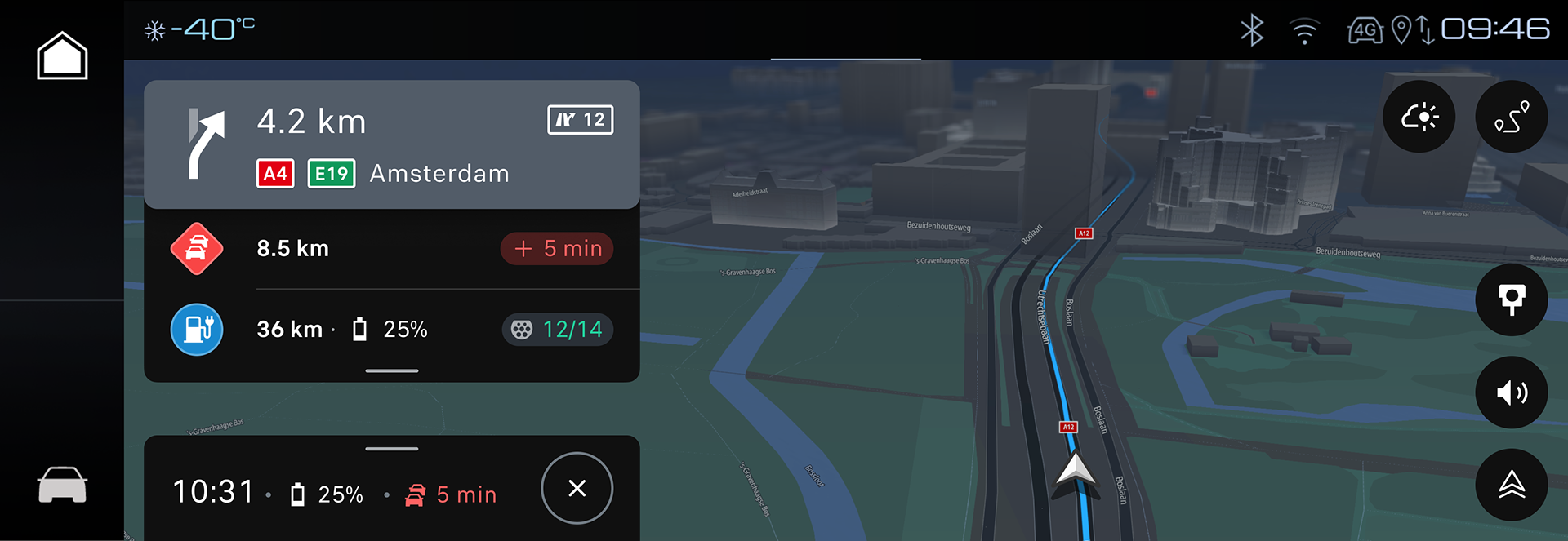
The new version of the navigation system was developed from scratch without any ties to the previous version. The key element of the driving experience became the concept of the "horizon" panel: a UI element that consolidates information about the next maneuver, important upcoming events (such as speed cameras or traffic jams), and suggestions for potentially interesting places, like rest areas after long drives or gas stations. Another important feature is the ETA panel, a modular element that provides access to settings and offers feedback to the driver when the route changes.
Early explorations of Horizon panel concept
The horizon panel went through numerous iterations and several global changes. Since the product is global, it needs to be intuitive for drivers in the United States, Europe, and Asia. In the initial stages of development, we iterated heavily on the layout of elements in the panel, striving to create the most clear and logical system possible.
We started with a bottom-up concept: the current position is at the bottom and the destination at the top. Following this concept, the panel was structured with the current street at the bottom, chronologically ordered upcoming events in the center, and the ETA information at the top. In this version, the next maneuver would float between the current position and the ETA as an event. While this version made sense logically, the floating position of the next maneuver was problematic. As the most critical element of navigation, its position on the screen needed to be as static as possible to reduce the time drivers spend glancing at the screen to understand where to turn at an intersection.
Final version of the Horizon panel layout.
After several major iterations, we settled on a solution where the maneuver information panel is fixed to the top edge of the screen. Beneath this element, we display the most relevant events for the user. The ETA information became a separate element fixed to the bottom of the screen, further reducing the time needed to locate this information. Additionally, the panel became the entry point for the navigation menu, providing quick settings and detailed route information.
03.
Next instruction panel
Each element of the Horizon Panel is independent and can be used separately from the rest of the panel. This is the foundation of the system’s flexibility.
For the Next Instruction panel, I designed a total of eight different configurations. First configuration prioritizes guidance information without any limitations on the panel’s size. Deriving from this configuration are three horizontal and three vertical configurations that sacrifice the amount of information displayed but allow the panel to fit into a limited screen area. A special configuration is the compact version, which condenses the information into a single line.
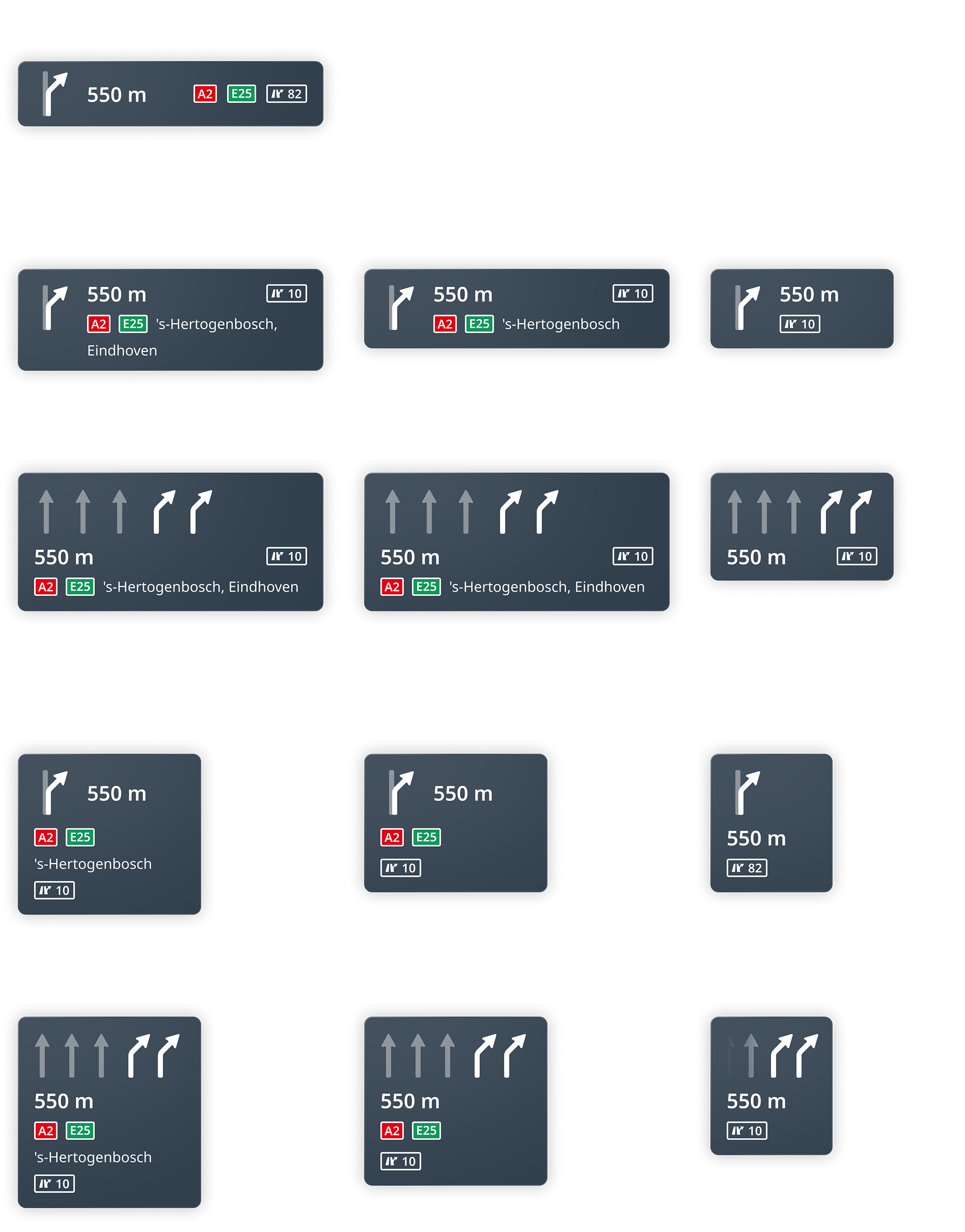
Overview of Next Instruction Panel configurations
Each configuration includes an optional element for the consecutive maneuver. This element is highly important but can be omitted in cases of limited screen space, such as in a cluster display.
04.
Upcoming events
Upcoming events are the least critical part of the Horizon Panel from a navigation perspective but provide tremendous added value. This element allows us to warn users about physical hazards, speed limit violations in speed camera zones, traffic jams, and to recommend charging and fuel stations or other points of interest along the route.
I invested significant effort into finding the right balance between the amount of information displayed and the visual simplicity of the element. Adaptability and information hierarchy were also key factors in the design process. For each event type, there are three configurations for different panel width: a default version, “narrow” and “tiny”.

Overview of layout for different upcoming events
Each event can be highlighted with a specific color when necessary. I identified four highlight colors for the system, each accompanied by a sound. A neutral blue is used for route changes without impacting travel time, a positive green for faster route alternatives, a cautionary yellow for speed alerts, and a critical red for hazards, significant speed violations, and similar issues.

Critical red highlight of the upcoming event to warn about overspeeding while approaching an average speed zone
Additionally, every event functions as a button, providing detailed information about the event and displaying it on the map. I designed a unified, universal template for presenting detailed information. The template includes fixed elements like a header and action buttons while leaving room for flexible, unique content tailored to different event types
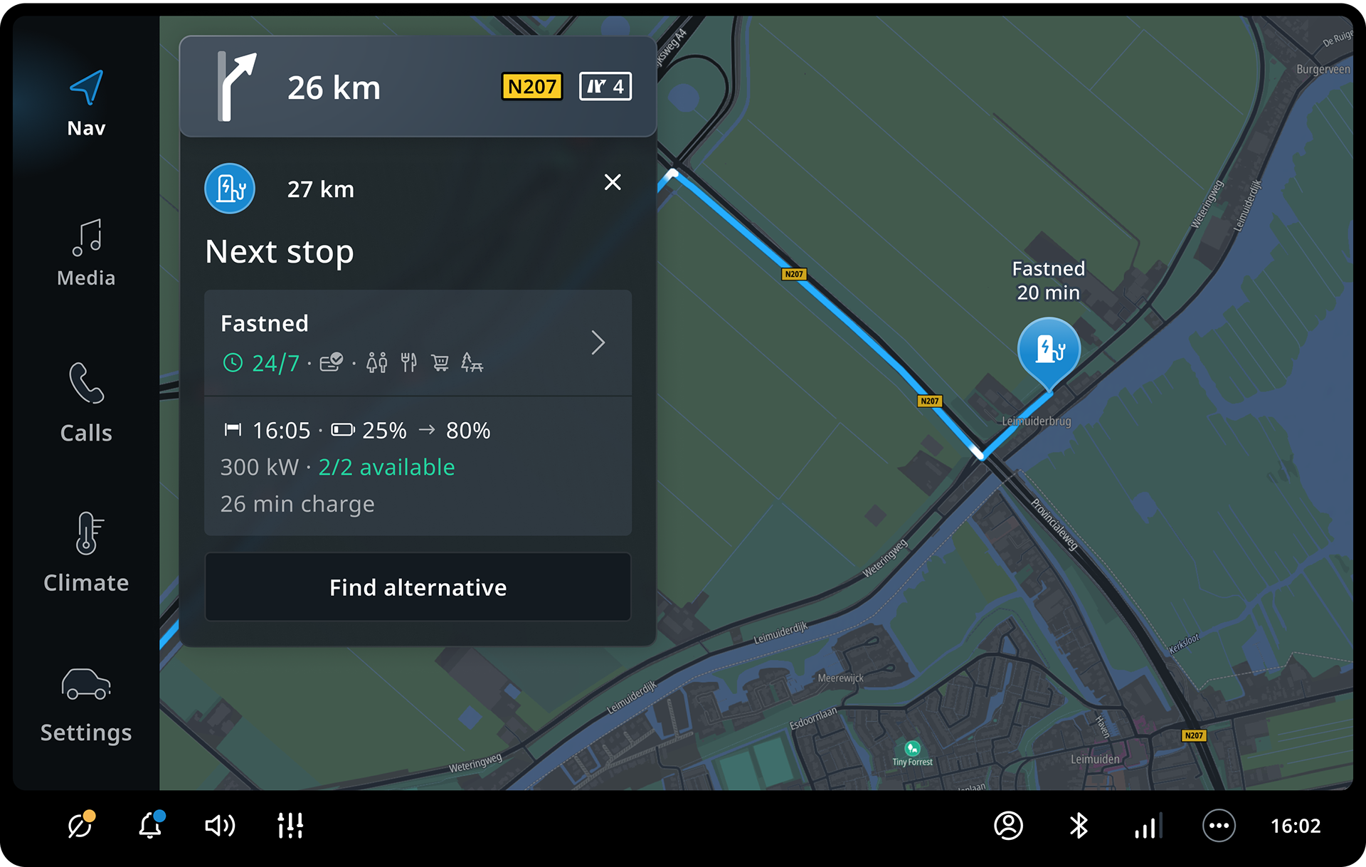
Upcoming event details shows key information after a tap on the event card
05.
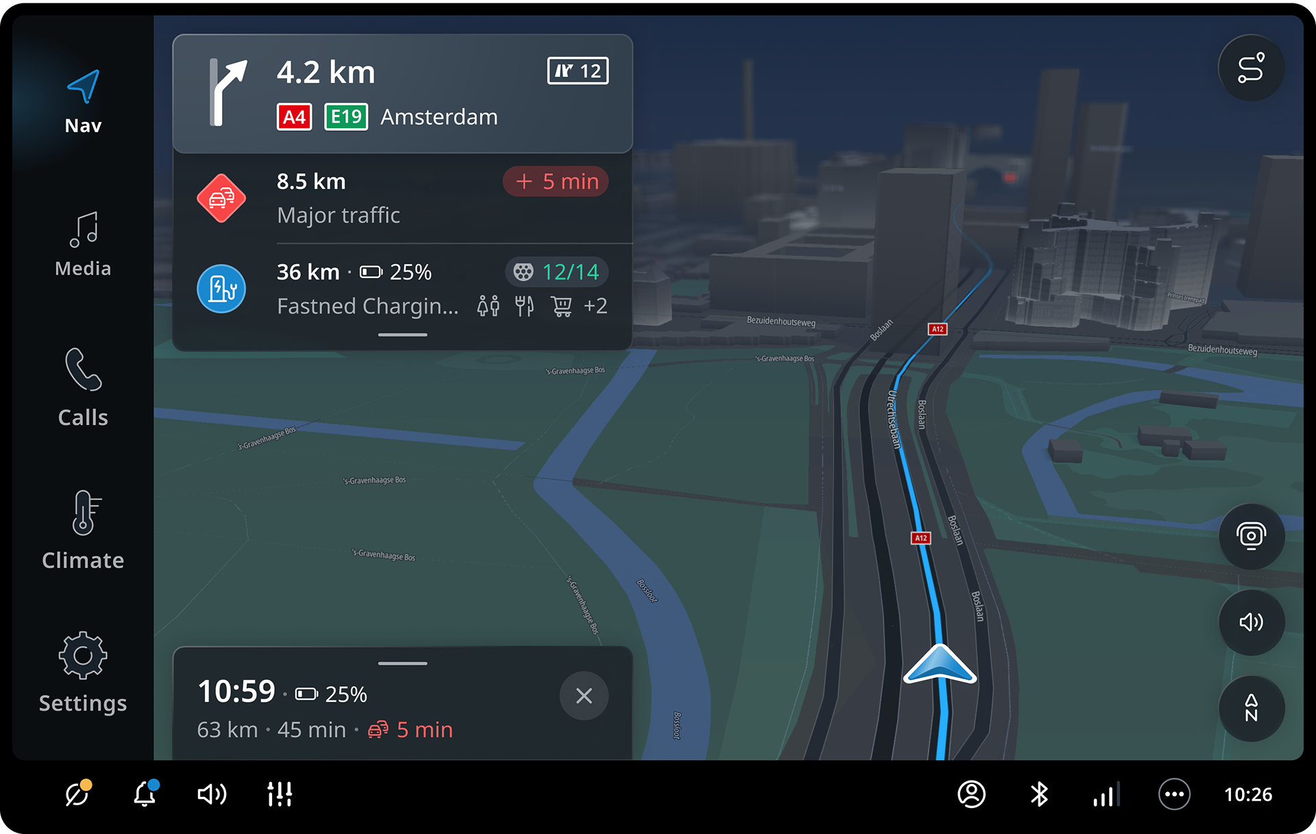
Estimated time of arrival
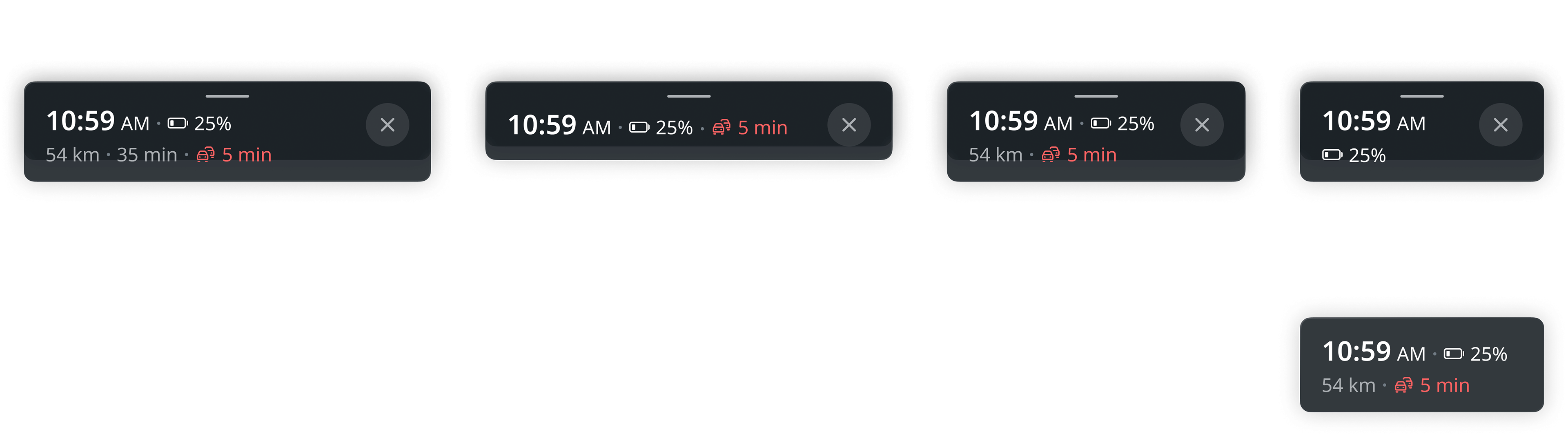
The ETA component of the horizon panel may seem simple compared to other elements, but it also required considerable time to design and can be adapted for various tasks. The component is fixed at the bottom of the screen to minimize the time needed to locate this information. It contains five information modules: estimated time of arrival, battery charge upon arrival (for EV), remaining distance, remaining time, and traffic conditions along the route. Additionally, the panel includes a “Stop navigation” button, which requires confirmation if the route includes one or more stops.
The panel itself also functions as a button, and tapping or swiping it opens a quick options menu.
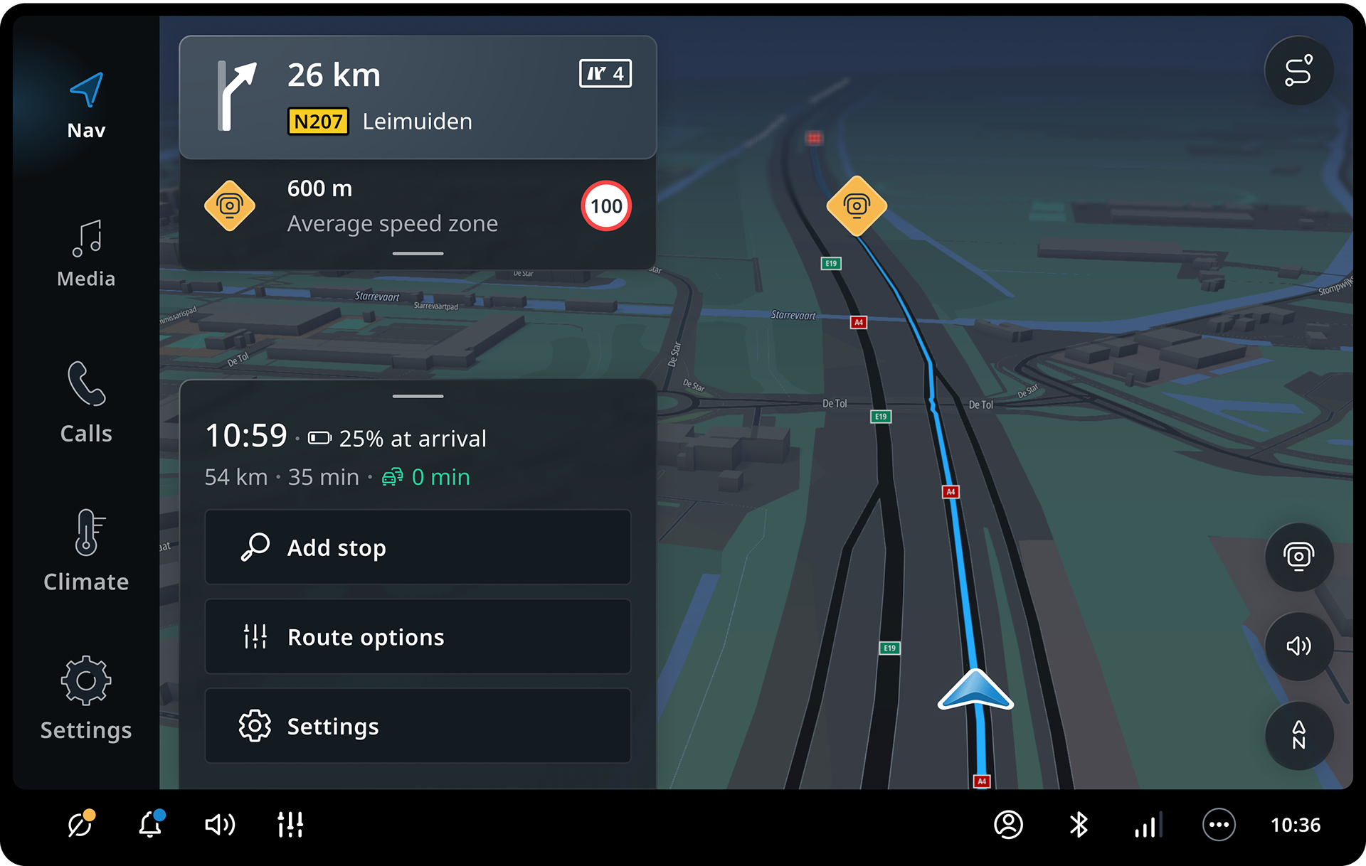
A quick options menu appears when tapping or swiping on the ETA panel
The panel is also used to communicate route changes to the driver. For example, it notifies the driver if they have chosen a faster route (to avoid traffic), additional charging stop is planned or destination is out of reach.
As a critical element of the driving experience, the ETA panel features a flexible, modular design. If necessary, it can shrink to a single line or compress to its minimal size, displaying only the most important information, to fit seamlessly into a vehicle’s dashboard.
06.
Driving experience adaptation for Peugeot
The first car off the production line to feature the new version of the navigation system was the new Peugeot 3008. The design teams from Peugeot and TomTom collaborated extensively on various aspects of adapting our system for this vehicle, as well as for subsequent models. Peugeot’s designers reworked all the interface icons for the navigation system for a better connection with the brand, while TomTom’s map designers developed a custom map style.
The driving experience domain remained largely unchanged in some respects. However, the screen ratio significantly deviated from the originally planned vertical minimum. As a result, the screen for this model became the reference “short” size for our navigation system, which in turn drove the development of adaptive configurations.

07.
Outcome
The previous generation of the Peugeot 3008 is a bestseller, having charmed over 1.3 million customers in 130 countries over the past seven years. The new model has just hit the market but has already gained considerable popularity. In Europe, more than 100,000 units have been sold within six months, marking a significant commercial success.
This makes the Peugeot 3008 a very important model for Peugeot, and it was equally crucial for TomTom to get everything right from the very beginning. Peugeot’s next big step coincided with a new chapter for TomTom, and many decisions in the development of the navigation product were made in close collaboration with the Peugeot team.
I am proud of my contribution to the new generation of TomTom’s navigation system. My work on the driving experience enables adaptation for any screen in the system, as well as for any screen area, whether it’s a mini-app or even a widget. I hope all users of the new Peugeot models will enjoy the driving experience of the navigation.
