
01.
Goal
In 2020 we started developing a new navigation product almost from scratch, rethinking what modern drivers really need. The main goals were:
– not only guide drivers from A to B, but brings extra value on every ride;
– modular and scalable for any screen type and dimensions;
– easily customizable for the needs of OEM-customers.
02.
Role
In the early stages, I was responsible for the visual design of the driving experience.
As the product grew, my role evolved into a deeper focus on product design. I took ownership of the driving experience component’s adaptability across all supported screen sizes and types. I also introduced a motion framework to unify transitions between elements, panels, and screens.
Product experience team
– PM;
– Engineering lead;
– Design lead;
– Visual designer;
– Interaction designer
– 10 developers
– QA.
Cross team collaboration
Driving experience domain is part of the larger navigation product and also overlaps with many other teams, with the intensity of collaboration varying depending on the task:
– product teams: search domain, route planning domain, end-to-end team, customization, APAC team (region specific features);
– design system;
– SDK teams: guidance, instructions;
– map visualization team;
– mobile navigation products teams;
– R&D.
03.
Process
Driving experience domain
team
Working together with Interaction designer on the key components and features of the application. Iterated and refined together with PM and design lead, sharing with designers from other experiences on design critique sessions and cross teams alignments. Radical proposals and new features presented to the key stack holders. Final solutions documented and specified, assisting developers on implementation and QA result.
Cross domain teams, SDK’s,
R&D and mobile products
I was also responsible for the guidance end-to-end SDK visual design (design of the guidance instruction) and define style for maneuver arrows, road shields and real world signage objects. I was also advocating for motion framework in the product and pushed its implementation. Process for such tasks was similar: working with interaction designer on the concept with high-fidelity prototype, present solution to the stackholders, iterate, refine and prepare documentation.
Process of working on the topic of moving a button from map to the panel (screenshot of work file). Explorations of all possible directions, layouts of information and testing each layout for handling different length of information on different screen dimensions and rations.
04.
Outcome
The product is solid, scalable, and customizable. It is already shipping in Stellantis vehicles launching from 2023 onwards, starting with Peugeot 3008 and expanding to DS, Citroën, and other brands. Market reception has been positive, and the system is set to roll out across a wider range of models in the coming years.
Product was built on solid foundation and ready for the future clients needs and requirements. It keeps evolving, and my work on it continues.
05.
User value
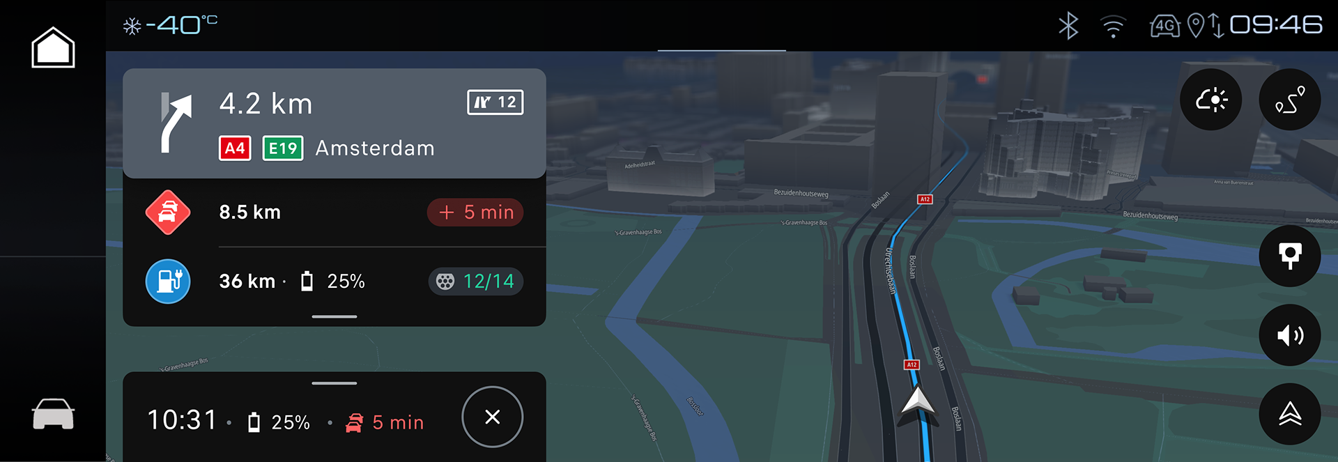
Driving experience starts the moment the car moves, regardless of whether a route is planned or not.
Key aspects of the driving experience in the product:
– the driver receives clear and timely instructions to reach the destination;
– the driver gets immediate notifications about critical road events;
– the driver can easily find a fuel station, charger, or other points of interest.
Driving is fundamentally different from other parts of the experience, such as search or route planning. Those stages are full of details because the car is stationary and the user can read them. Driving, however, prioritizes information and shows only what is absolutely necessary at a given moment.
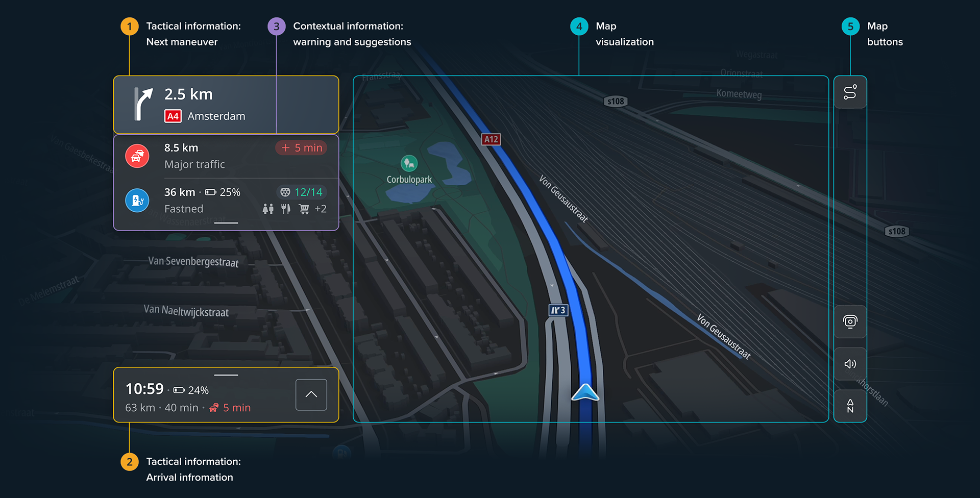
Tactical aspect
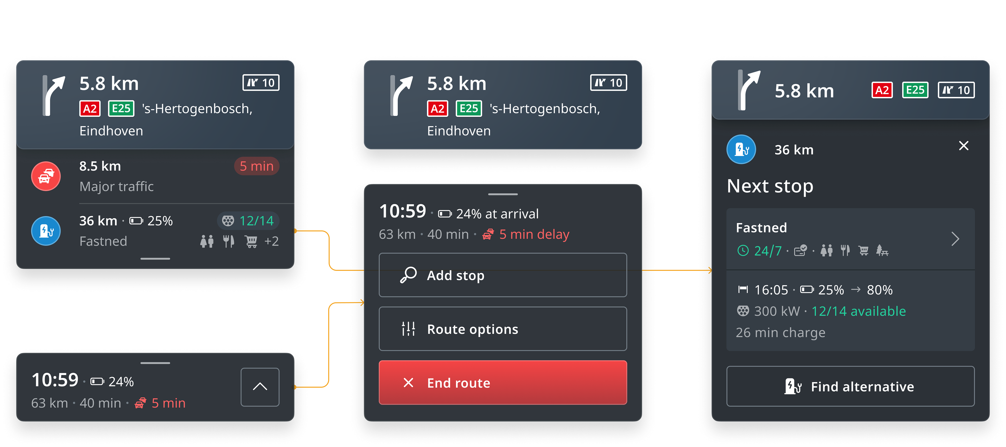
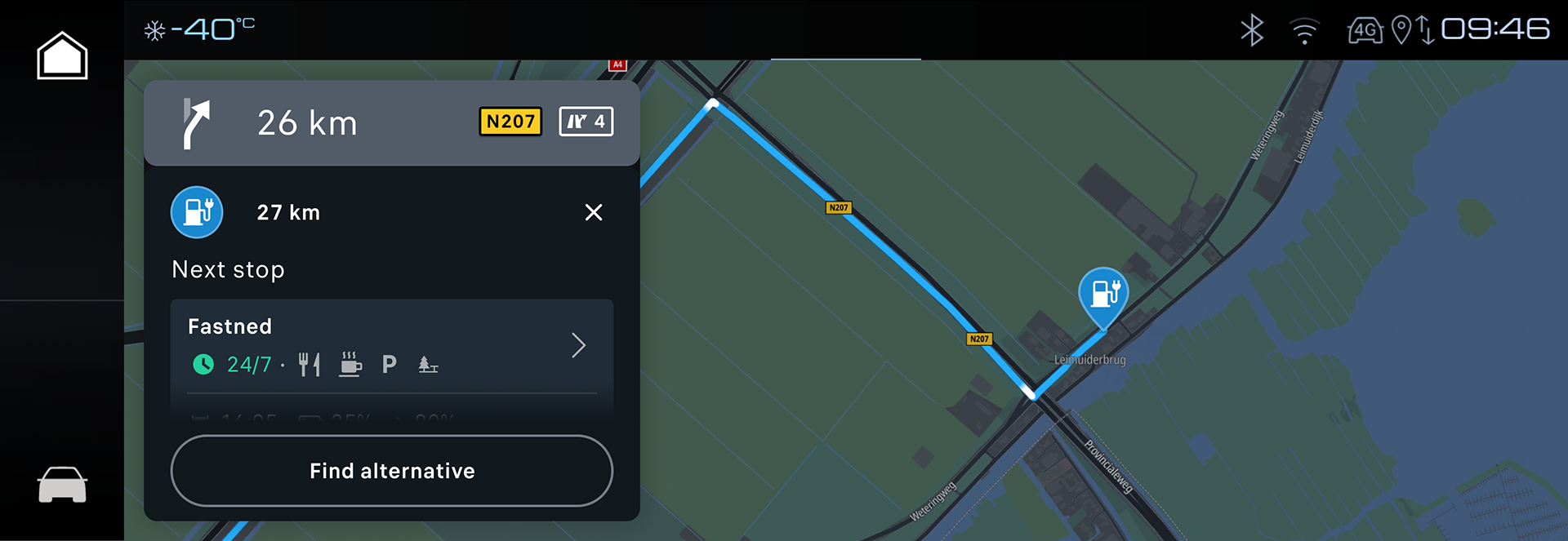
The user always receives information about the next maneuver – this is the core of navigation. Delivery methods vary depending on car configuration, system, and user preferences. We provide: visual instructions (graphic representation of the maneuver and distance to it) on the central screen, cluster, or HUD, map visualization (central screen and cluster), and audio guidance.
Another crucial tactical element is the “when will we arrive?” – arrival information. It is always present on screen, but sometimes its priority is lowered and it may be hidden. This information includes not only arrival time, but also remaining distance, driving time, traffic on route, and estimated battery level upon arrival (for EV).
Contextual information
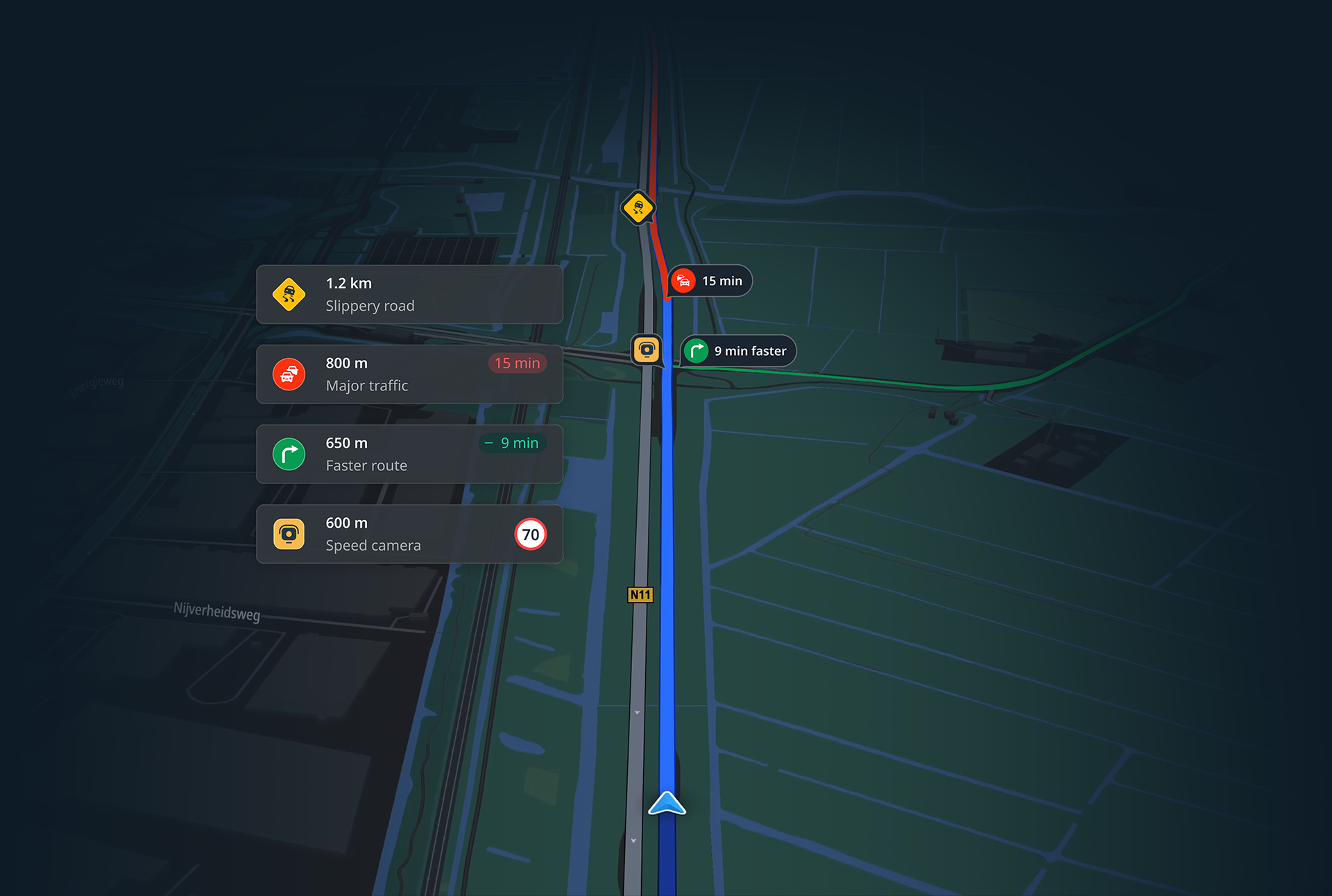
Contextual data is the additional user value we wanted to bring into the product. Drivers receive critical alerts like jam tail or slippery road warnings at the right moment. We also visualize events with monetary impact (fine), such as speeding near a speed camera or inside an average speed zone. A third layer includes POI suggestions: rest stops after long driving, charging stations, or fuel stations.
All three types of contextual events are displayed in a compact form on screen. Each is interactive: tapping opens more details with a preview of the event location on the map relative to the driver’s position.
Even in detailed view we don’t overwhelm the user – the information remains brief and focused, showing only what’s necessary to avoid distraction from the road.
06.
Visual design
The visual design of the product was built on key foundations:
– Safety guidelines, including minimum button and font sizes based on screen distance from the driver’s eyes.
– Product design system.
– Readiness for customization and scalability for client needs.
– Continuity: TomTom has been a pioneer in automotive navigation, and over years of product evolution we developed strong conventions for colors, icons, and information hierarchy.
The visual language of the driving experience relies heavily on the information itself. Every element has a defined place on the screen and can be scanned with just a quick glance. Primary information is fixed in the layout, always easy to find, and uses the highest-contrast colors. Secondary information is more flexible and color-coded based on its impact on the driver’s route. The tertiary layer contains additional details that different users may appreciate depending on their needs. It is present on the screen but shown with lower contrast.
The focus, however, is always on tactical information – the next maneuver – which must remain visible at all times while the car is moving.
Zooming into details, from overall visual language to the elements used in the UI: I created a set of maneuver icons optimized for readability across all sizes and surfaces – center screen, cluster, and HUD. To ensure instant recognition, I applied strict rules: grid-based construction, 45° angles, and circles for roundabouts.
The grid helps drivers understand the visual language. Once they see a 45-degree turn, they can easily recognize it again in future similar maneuvers. It makes the geometry of a maneuver more distinct and helps drivers connect the graphic representation to the actual turn on the road. The grid also simplifies the addition of alternative roads at junctions, further helping users identify the correct maneuver in complex interchanges.
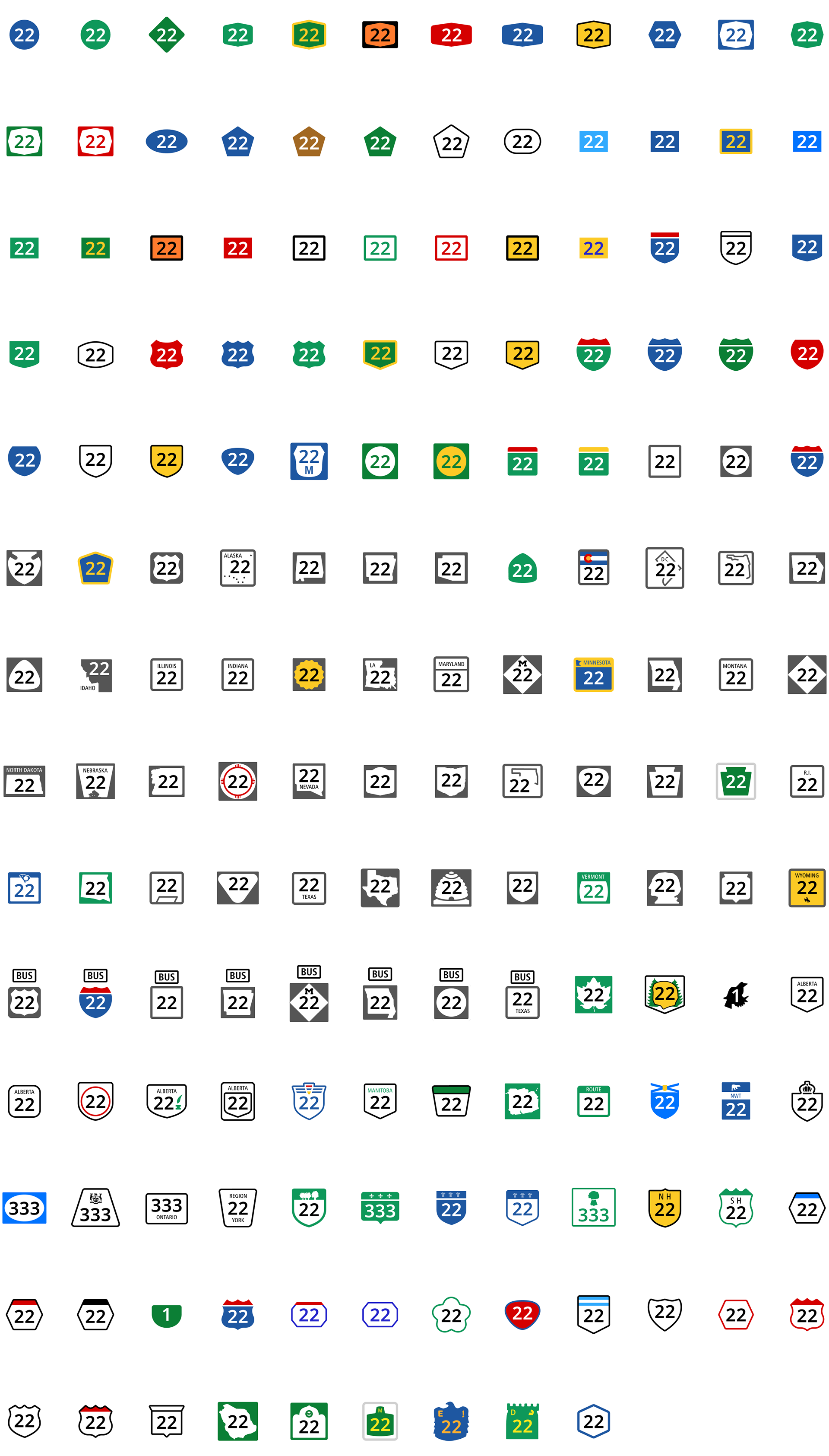
Another important aspect was representing real-world objects, such as road numbers and warning signs. I aimed to keep them as close as possible to their real-life appearance, while adapting them into the product’s fonts, colors, and visual language. For road numbers, for example, I designed a scalable icon set that covered all road types differentiated in the product.
Contextual information during driving was also critical. I developed a color and shape coding system to make it instantly scannable. Important elements have a background layer below the icon with shape and color communicate category:
– route-related elements have circle background and color-coded (blue for planned route, green for positive updates, yellow/red for negative changes);
– hazards use diamond background and color levels to signal danger;
– speed cameras use square background to differentiate the category and show monetary impact;
– points of interest like rest areas or fuel stations are shown without background, since they are not part of the route.
07.
UI scalability
Each screen element was designed with different screen sizes and types in mind, from the central console to the cluster and HUD.
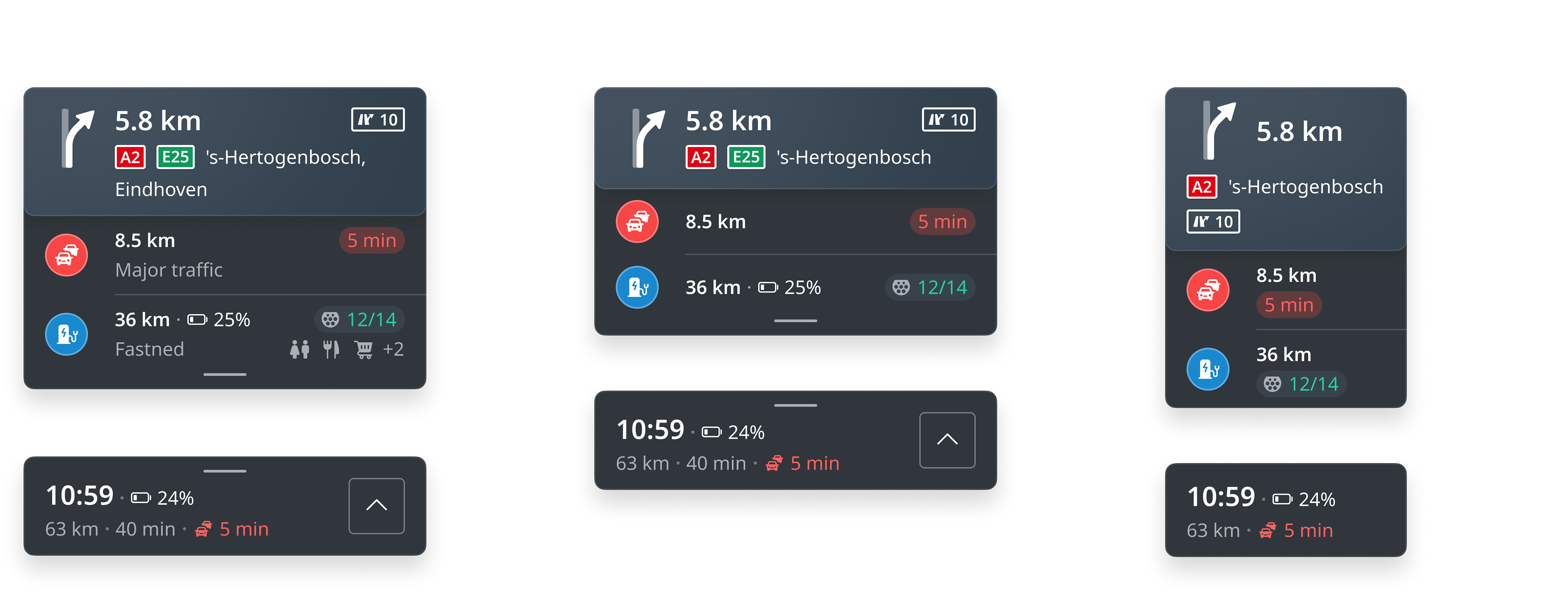
Because tactical information is the most critical, we invested significant effort into defining rules and priorities. Each type of information is assigned a priority level, and layouts adapt accordingly to the specific screen size or area. This ensures the driver always knows what comes at the next maneuver, and the one after it.
Every component of the experience has several predefined configurations that specify the data set, display order, and truncation rules. Each component can also be used independently and placed anywhere on any screen. This gives maximum flexibility, allowing configurations to switch on the fly depending on the context – for example, when the user minimizes the full-screen application into a widget.
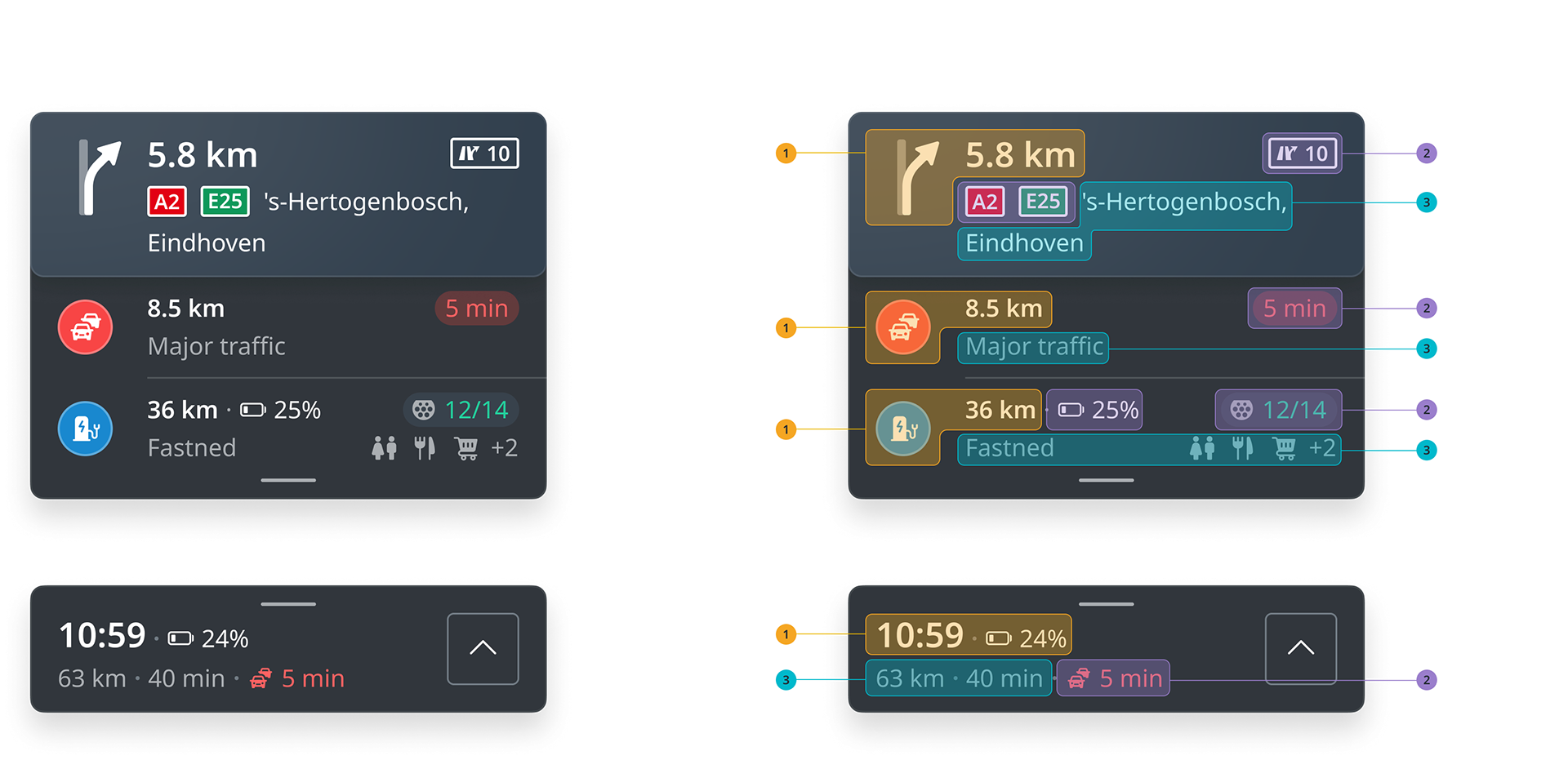
Another key aspect of scalability and visual design, present across all components, is modularity. I worked extensively on finding an information sequence that provides maximum flexibility for configuration and development. For example, information blocks are separated into rows, which allow control of vertical space on smaller screens. A third-level detail can be hidden without significantly harming the user experience: the data is still there, just presented with fewer details on screen.
08.
Customization and adaptation for Peugeot
The first car to launch with the new navigation system was the third-generation Peugeot 3008. Peugeot’s and TomTom’s design teams collaborated closely on multiple aspects of adapting our system for this and future models. The Peugeot team adjusted the visual style, fonts, color palette, and reshaped interface icons to align with the brand’s look and spirit.
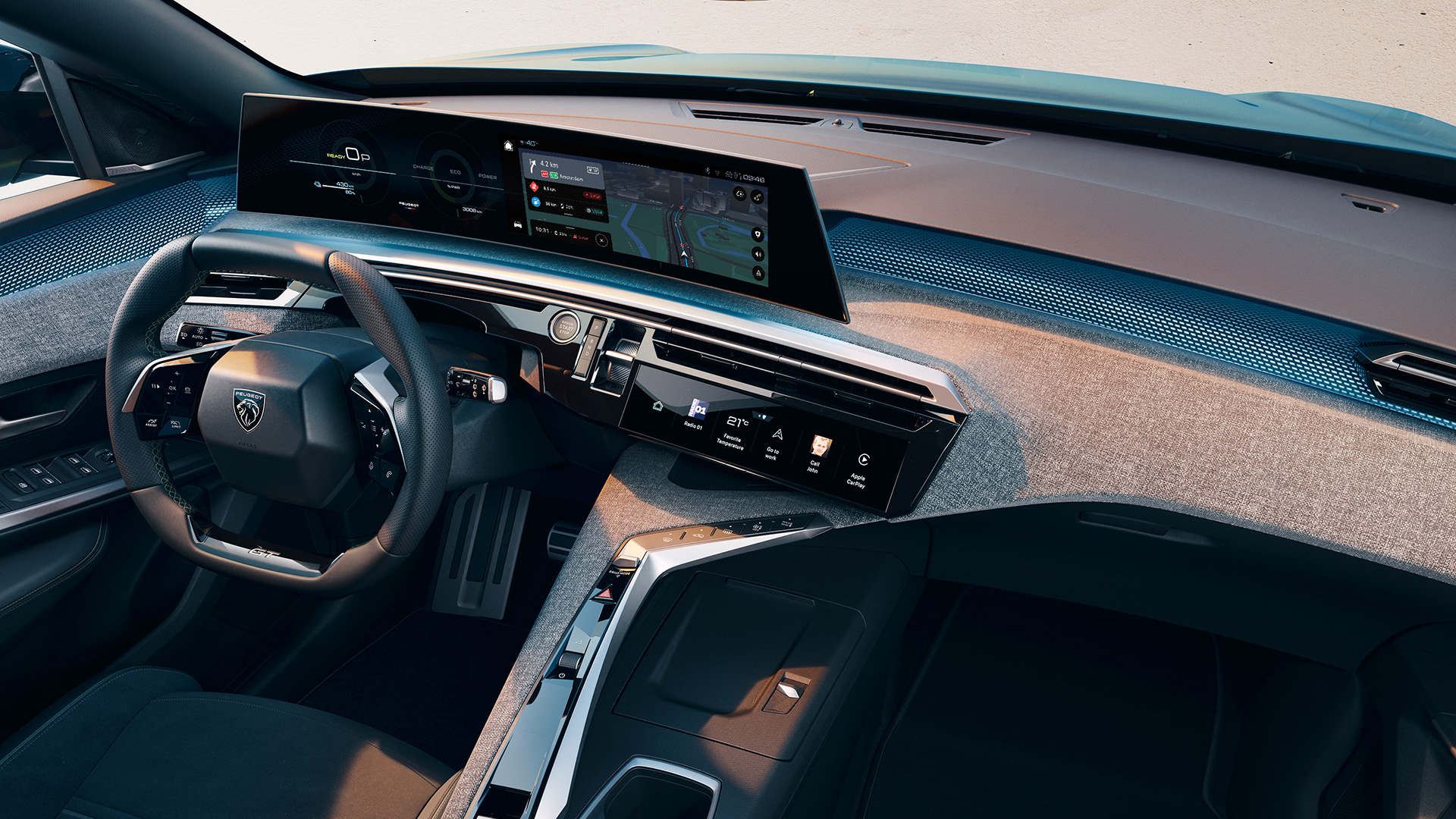
For the most part, the driving experience itself was transferred to the car unchanged. However, we worked with the Peugeot design team over an extended period, and the screen sizes and features of this model set some of the standards for scaling the product interface going forward.
The previous generation of the Peugeot 3008 is a bestseller, having charmed over 1.3 million customers in 130 countries over the past seven years. The new model has just hit the market but has already gained considerable popularity. In Europe, more than 100,000 units have been sold within six months, marking a significant commercial success.
This makes the Peugeot 3008 a very important model for Peugeot, and it was equally crucial for TomTom to get everything right from the very beginning. Peugeot’s next big step coincided with a new chapter for TomTom, and many decisions in the development of the navigation product were made in close collaboration with the Peugeot team.
I am proud of my contribution to the new generation of TomTom’s navigation system. My work on the driving experience enables adaptation for any screen in the system, as well as for any screen area, whether it’s a mini-app or even a widget. I hope all users of the new Peugeot models will enjoy the driving experience of the navigation.