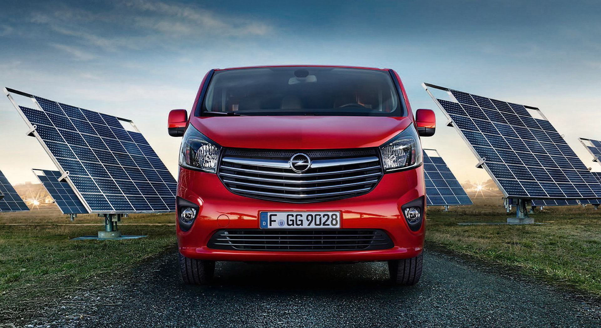
01.
Goal
The client asked the TomTom Automotive team to design the full in-dash system for the Opel Vivaro — from the home screen through all sub-menus, including charging schedule settings. A major requirement was a completely neutral UI, free of any brand embellishment.
As visual designer, my responsibilities were defining the visual style, enforcing rigorous safety standards, implementing the UI design throughout the project, and maintaining design consistency and quality across screens.
02.
Approach
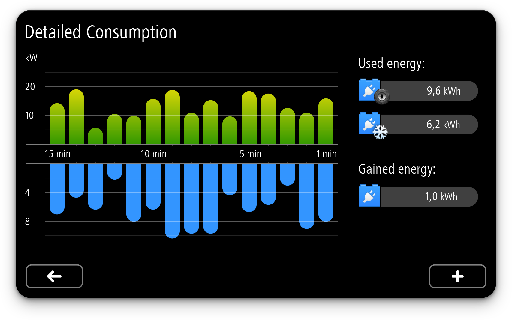
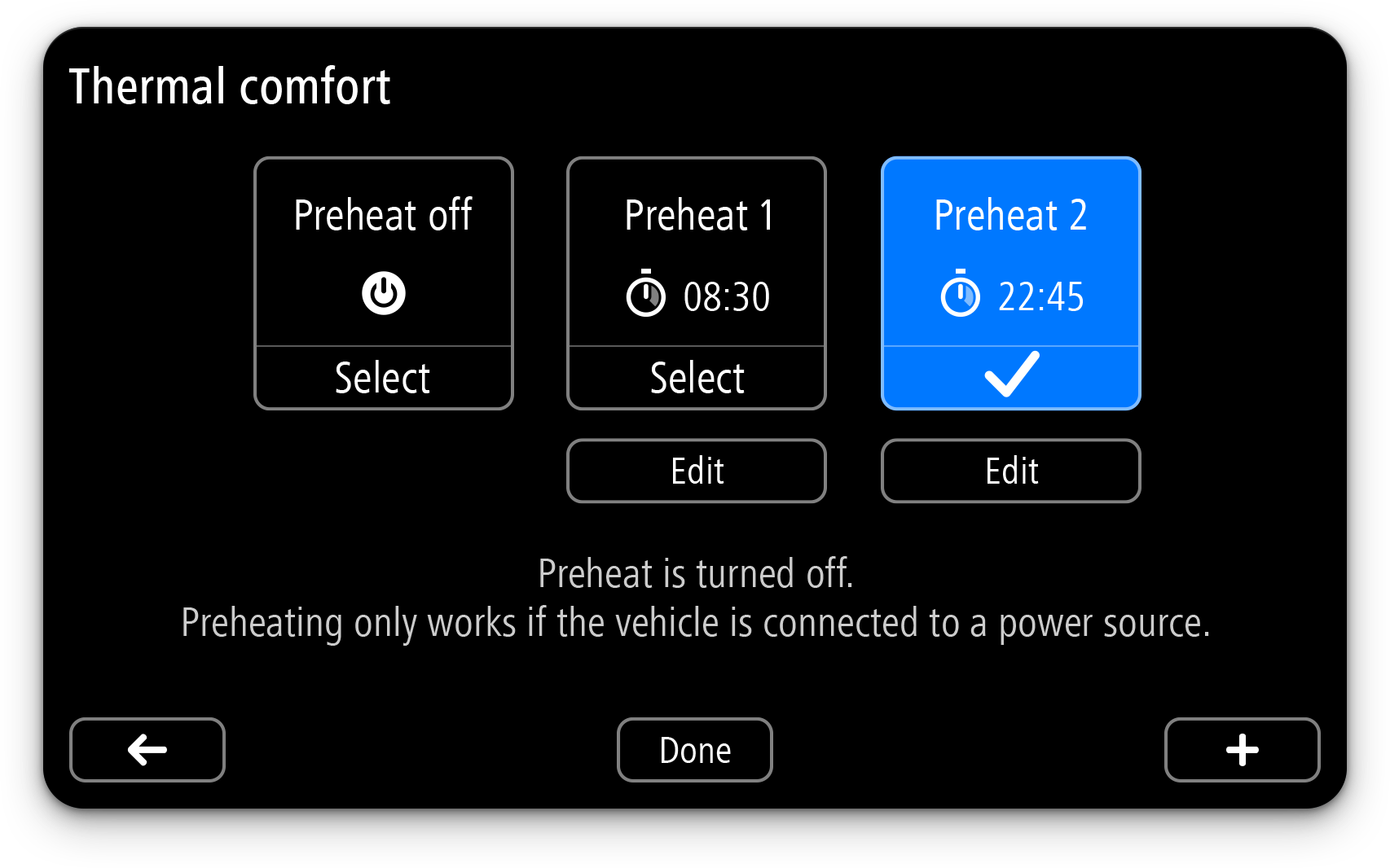
I built the visuals on top of well-specified screen layouts – control placements and navigation paths were already sketched out. With that foundation in place, I refined the visual design: crafting each control in all its states (normal, selected, pressed, focused) in a separate style file, then applying those details across every screen in the Vivaro UI.
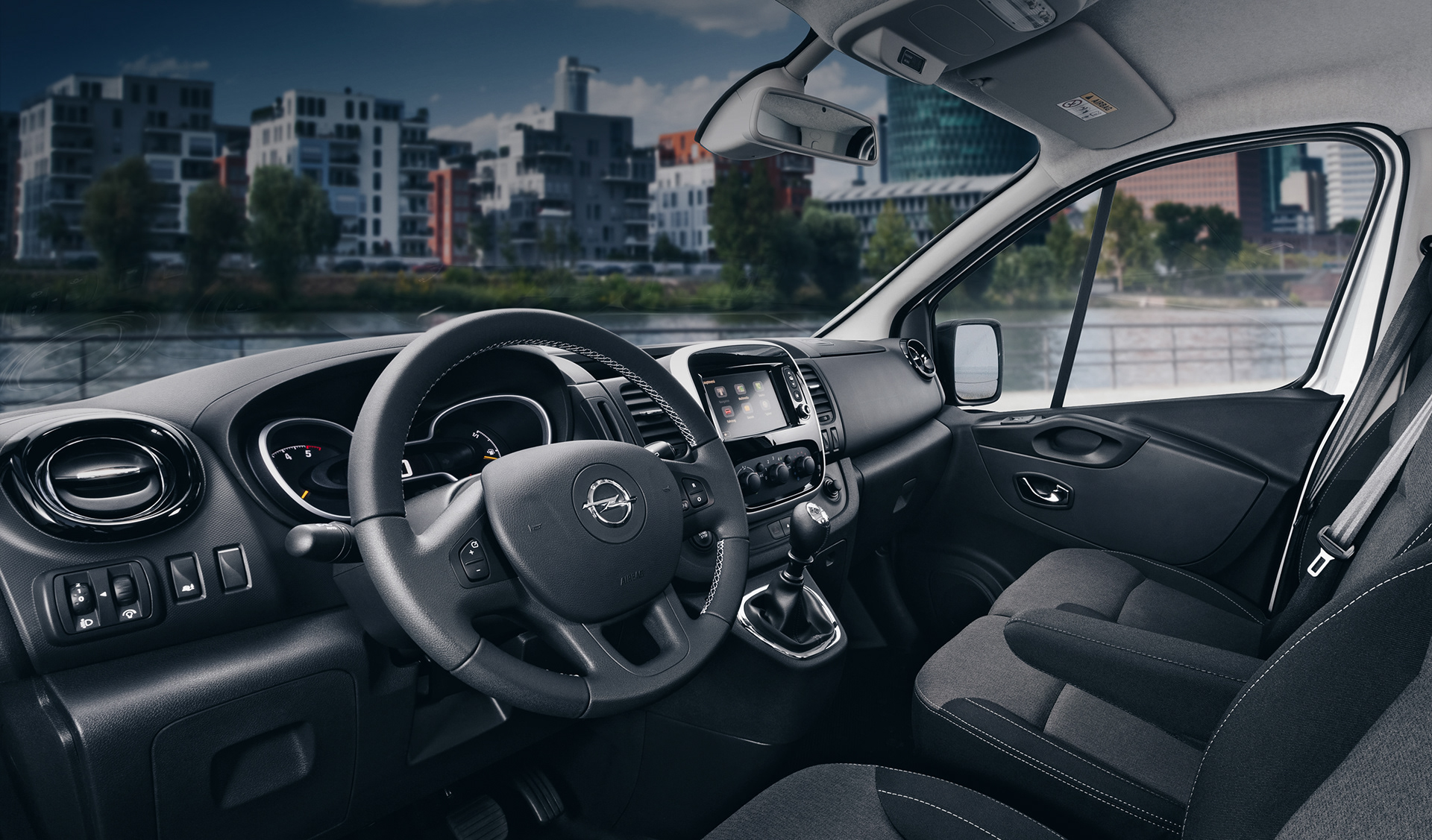
Crucially, having the actual car hardware on my desk made a difference: I could load my designs full-screen, test them under different lighting conditions and viewing distances. This let me adjust contrast, text size, control spacing – ensuring the interface is legible whether the driver is close, in bright sunlight, or looking from a distance.
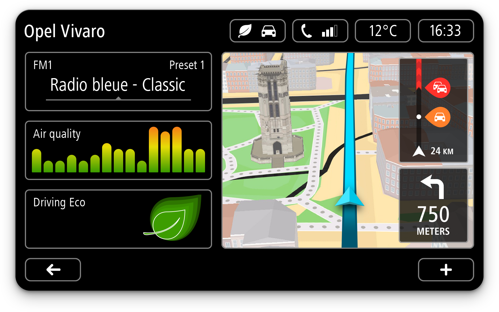
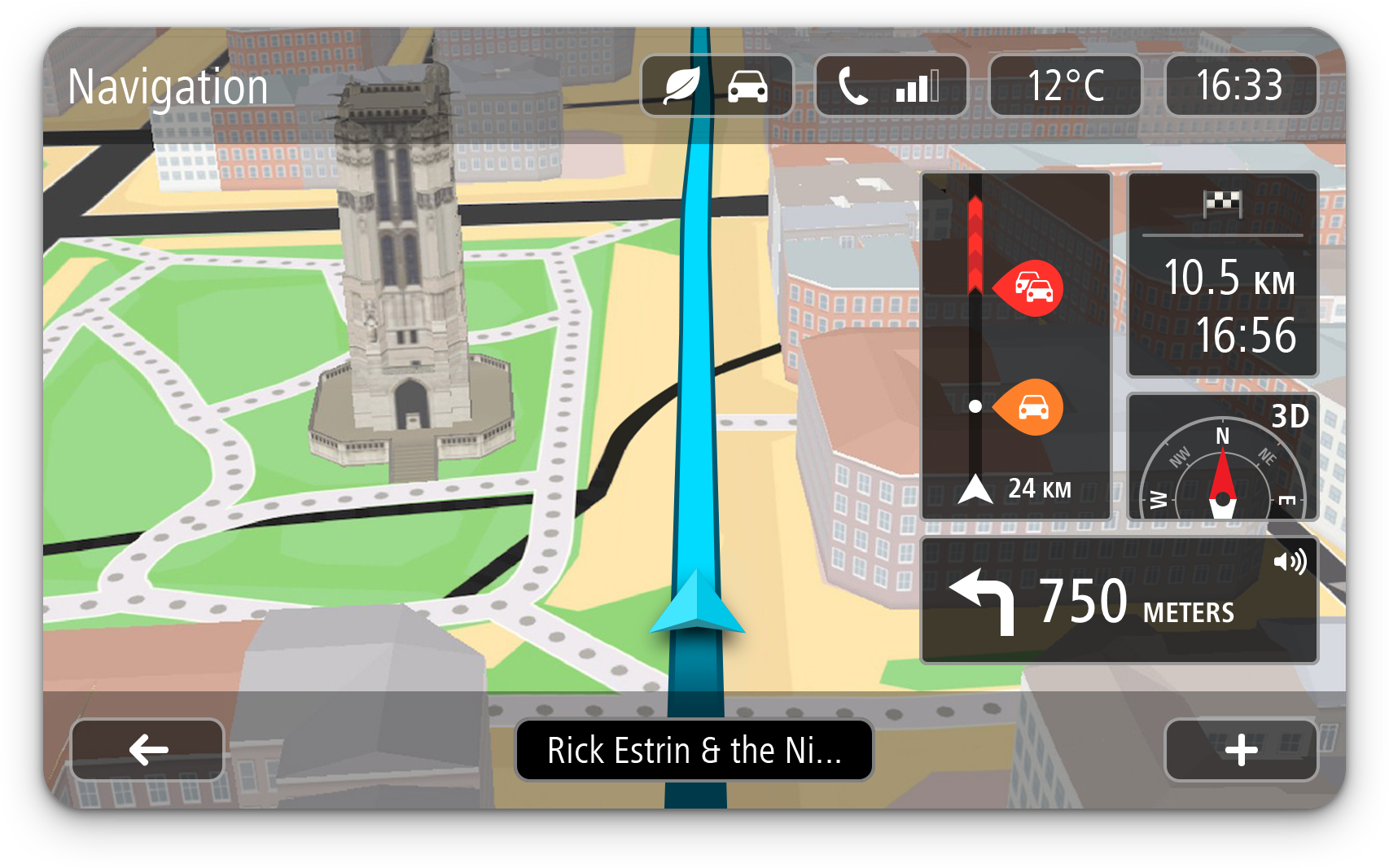
03.
Style
The design had to be stripped of decoration and brand-voice – a true neutral, minimalist interface.
Departing from the skeuomorphic trends of the time, this work emphasised clarity: content over ornament, readable text, controls sized for safety, contrast for visibility. Every element was reduced to what was essential, with usability and safety front and centre.


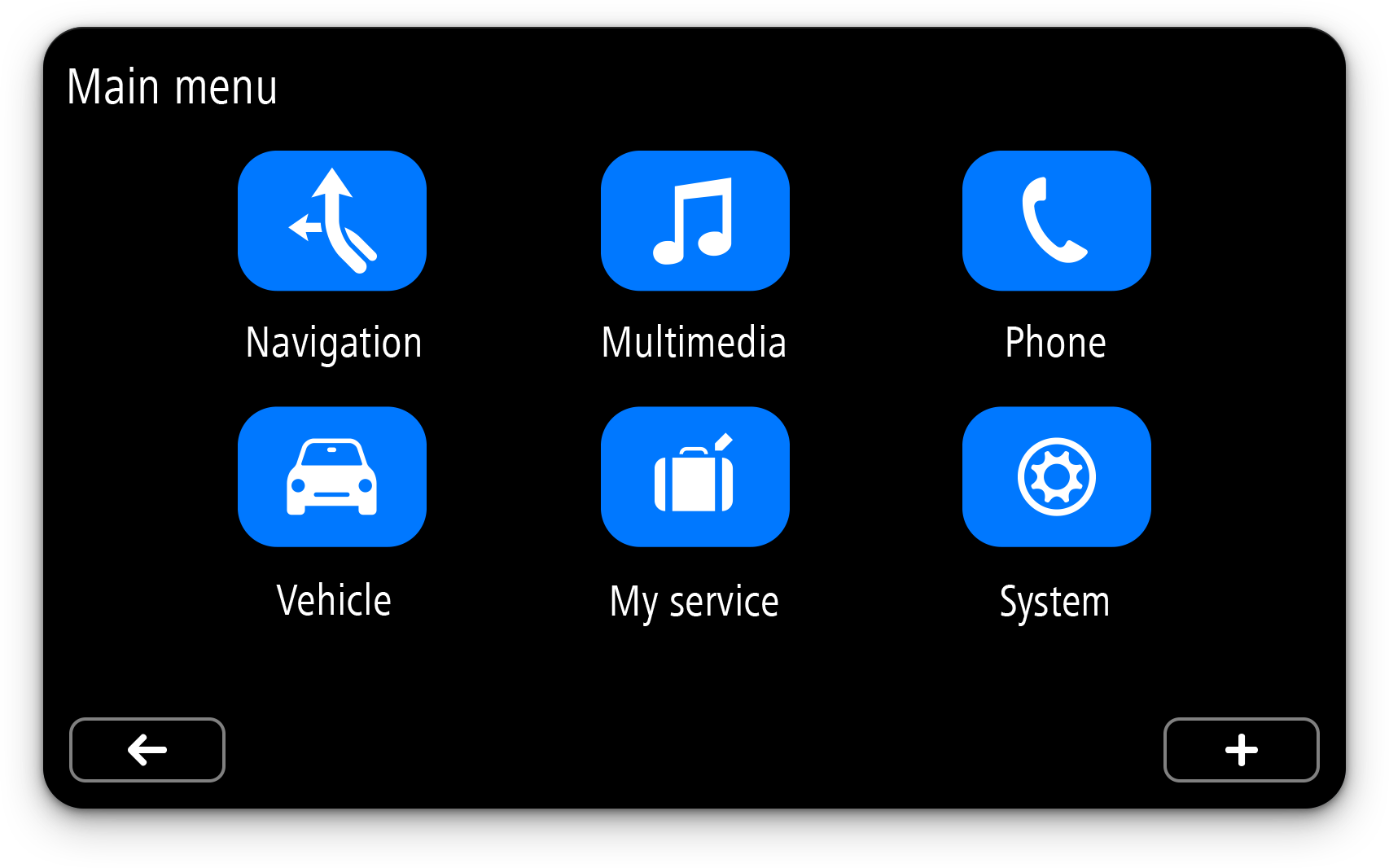
04.
Outcome
This project was meaningful for both scale and timing. It came just before the wider shift from skeuomorphic to flat element designs – giving me the chance to push toward minimalism ahead of the curve.
I owned every part of the UI system – home, navigation, radio, climate control, settings – delivering a coherent design from root to leaf. To this day, whenever I catch an Opel Vivaro with that system, I sneak a peek – always proud of how the design lives in real context.