
01.
Goal
OHRA, one of the major Dutch insurers, commissioned a full redesign for the third version of their mobile app. As lead UI/UX Designer, I was tasked with overhauling the UI in collaboration with the client’s Product Owner and the agency’s developers. All design decisions were grounded in user analytics provided by OHRA – the goal wasn’t just looking good, but solving real issues rooted in data.
02.
Concept
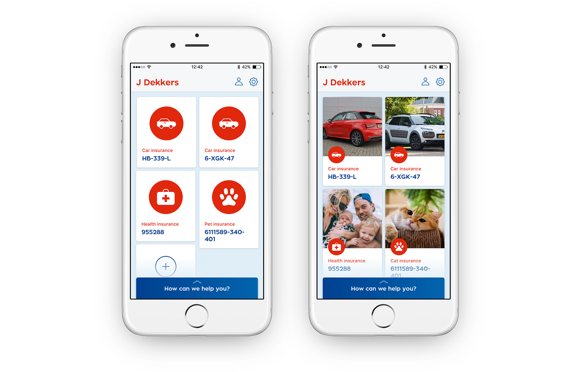
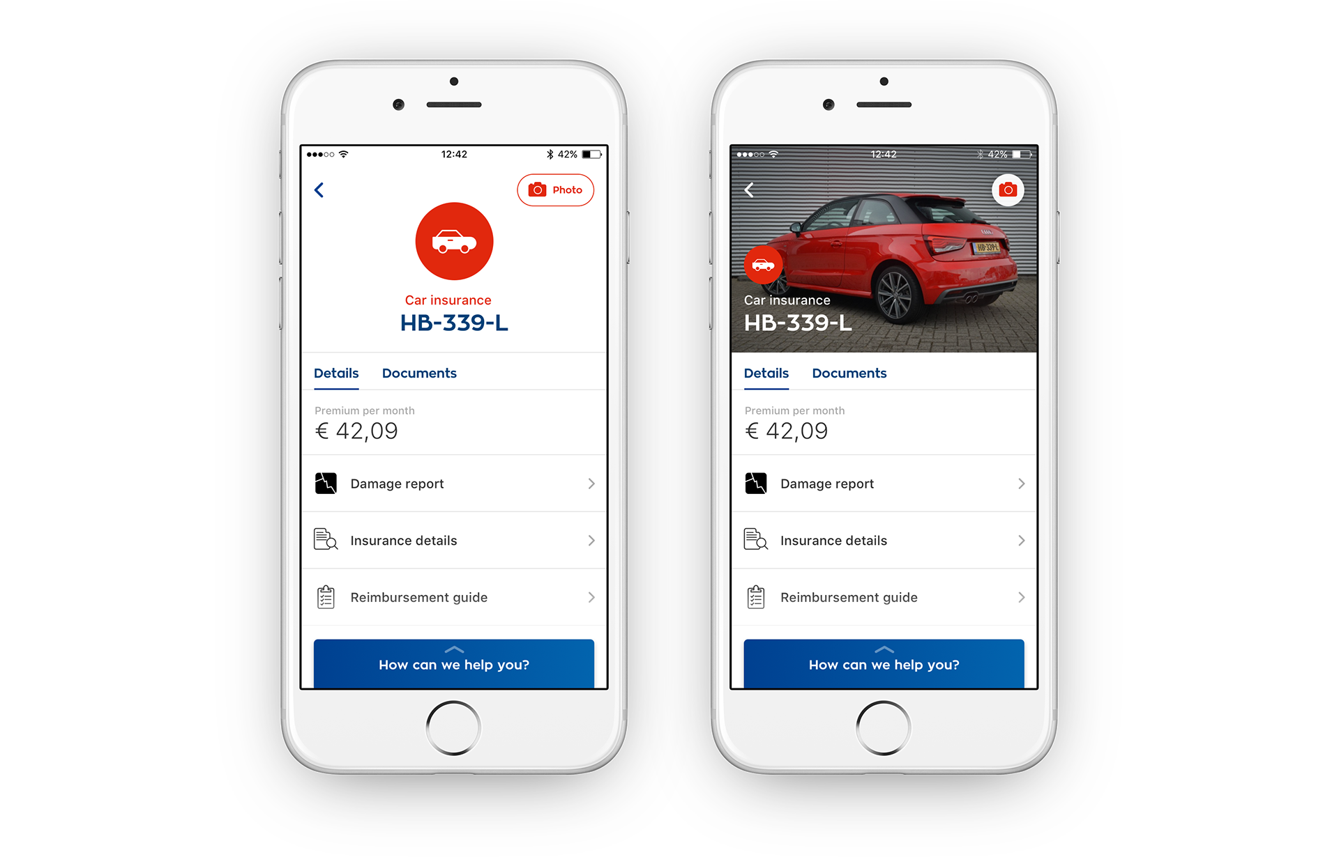
The existing app was feature-rich – perhaps too feature-rich. Rather than piling on new functions, we shifted attention to improving what was already there. I focused on simplifying user flows and making the experience feel more personal. Features were restructured so users could get to what they really needed quickly, without friction.
03.
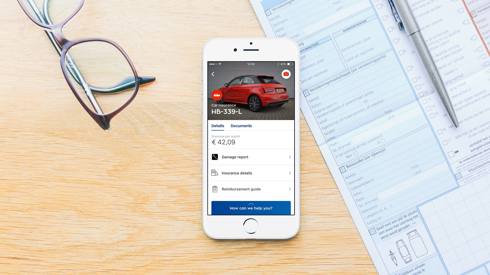
Personalisation
To help strengthen the emotional bond between users and the brand, I built in small but meaningful touches. For example, users are able to upload their own photos to represent their products in the app. These visual identifiers help the app feel more uniquely theirs.
04.
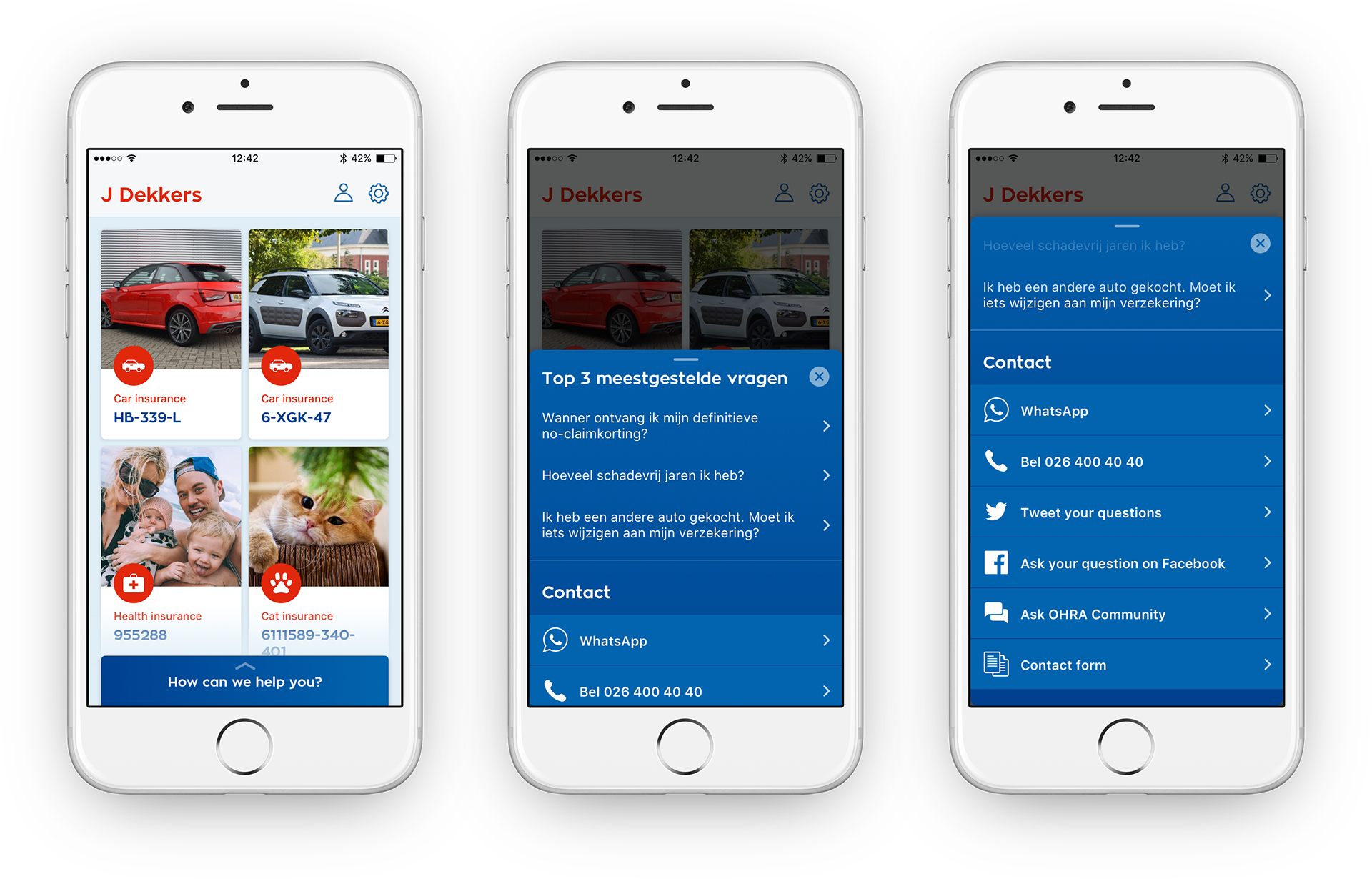
Contextual support
One major aim was to ease pressure on OHRA’s customer support center. Simplified flows and a cleaner UI help prevent confusion and reduce support queries. We also introduced a feature to call support directly from within the app – when users do, relevant context is passed along to the call‐center staff to make the support interaction smoother.
05.
Outcome
Through close collaboration with OHRA’s stakeholders and continuous alignment of expectations, I was able to deliver a UI that balanced polish, usability, and the client’s operational needs. The redesign was implemented successfully by the developers, bringing the new version of the app to life.