

01.
Goal
The goal was to create a clear design vision for the NS Stations app – a concept prepared specifically for a client pitch presentation. The concept needed to demonstrate a set of features, a well-structured navigation model, intuitive user flow, and a distinctive visual identity that could stand on its own while staying true to the NS brand.
The task was not about production, but about showing potential – exploring how a dedicated station-focused experience could connect travelers, services, and local commerce through one cohesive digital touchpoint.

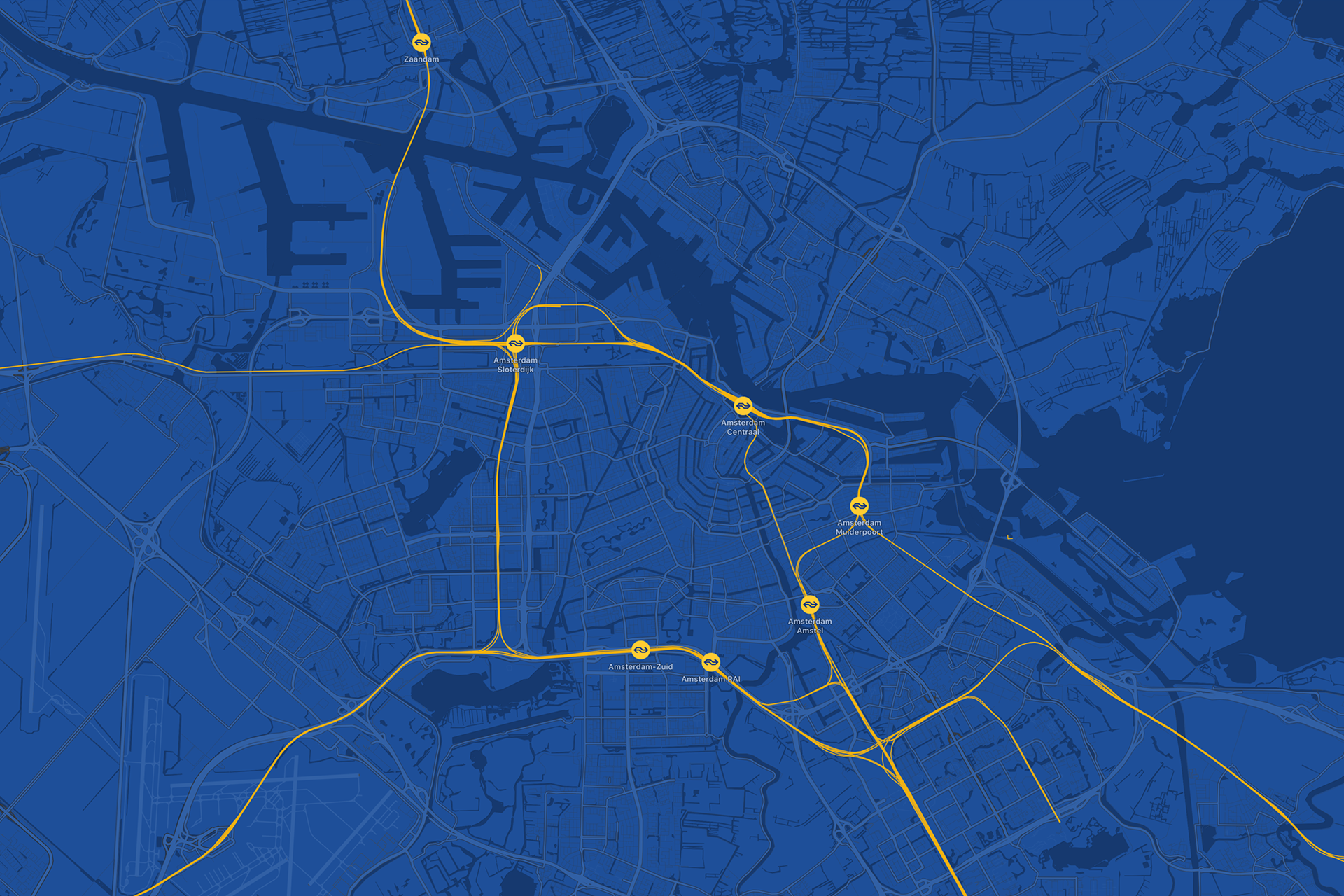
02.
Branded map
The central idea was to build the app’s visual identity around a map of train routes in the Netherlands, with emphasis on the currently selected station. The map isn’t just functional – it pulls together visual style, mood, and brand coherence, anchoring every screen around it.
03.
Personalization
Content adapts based on location and time of day: for example, during morning commutes or to return trips in the afternoon, the app surfaces promotions from station shops relevant to that user. The interface would feel more alive, more useful.

04.
Timetables
To make the station app genuinely helpful, I broadened the typical scope: not just trains, but also metro, tram, bus, rental bikes or cars, and taxis – everything around a station, in one view. This was designed before NS had a built-in trip planner; the intent was to simplify station connectivity.

05.
The outcome
The concept was presented to NS as a fully thought-through station-centric app, and the client embraced many of the visual ideas. Even though they decided not to pursue a separate app, the mapping, navigation planning, and branding explorations influenced how NS thought about station experiences.
It was a vivid opportunity to design for wayfinding in large, complex spaces – balancing clarity, usability, and brand expression – with both user journeys and merchant touchpoints taken into account.