
01.
Goal
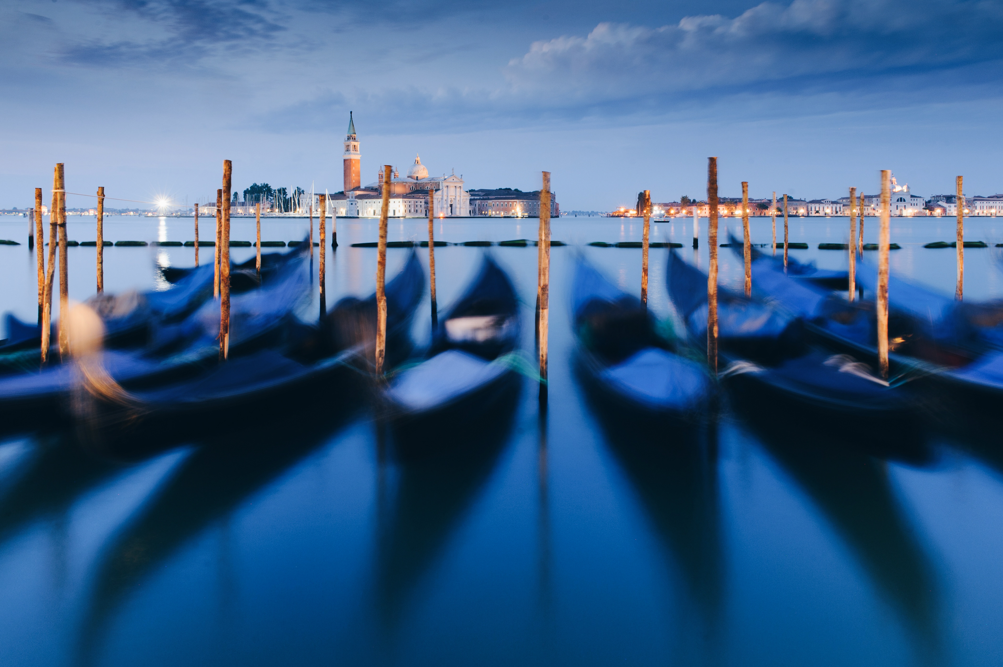
As a landscape photographer, I wanted a refined, reliable and easy-to-use app for calculating exposure times under challenging lighting conditions. The aim was to build a tool that photographers trust when light meters fail, whether shooting in near darkness, with dense ND filters, or capturing star trails.
Working closely with an iOS developer, I created a polished concept designed to stay current with evolving iOS design trends while maintaining clarity and usability over time.


02.
Key features
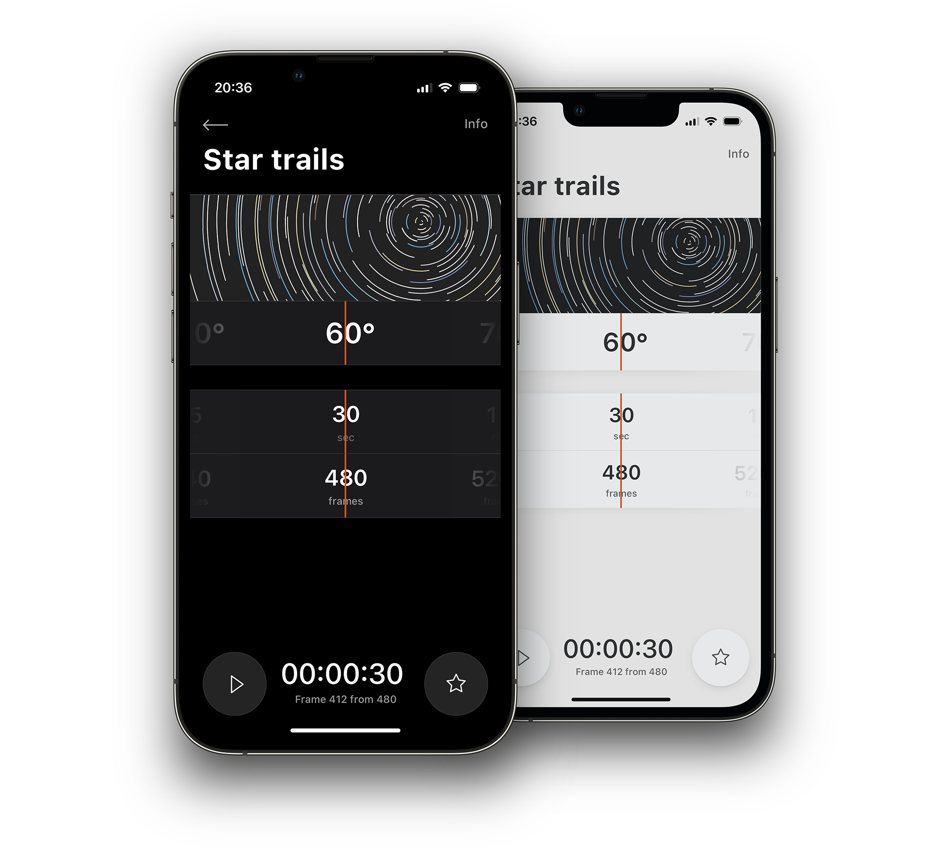
The app started as a long-exposure calculator – designed to help photographers determine correct exposure times when shooting with or without ND filters. As the idea evolved, I added a star-trail calculator, allowing users to roughly preview the desired result and find the right balance between exposure duration and the number of frames.
From there, I explored other real needs in landscape photography – moments where a precise, minimal interface could make a difference. This led to a suite of specialized tools:
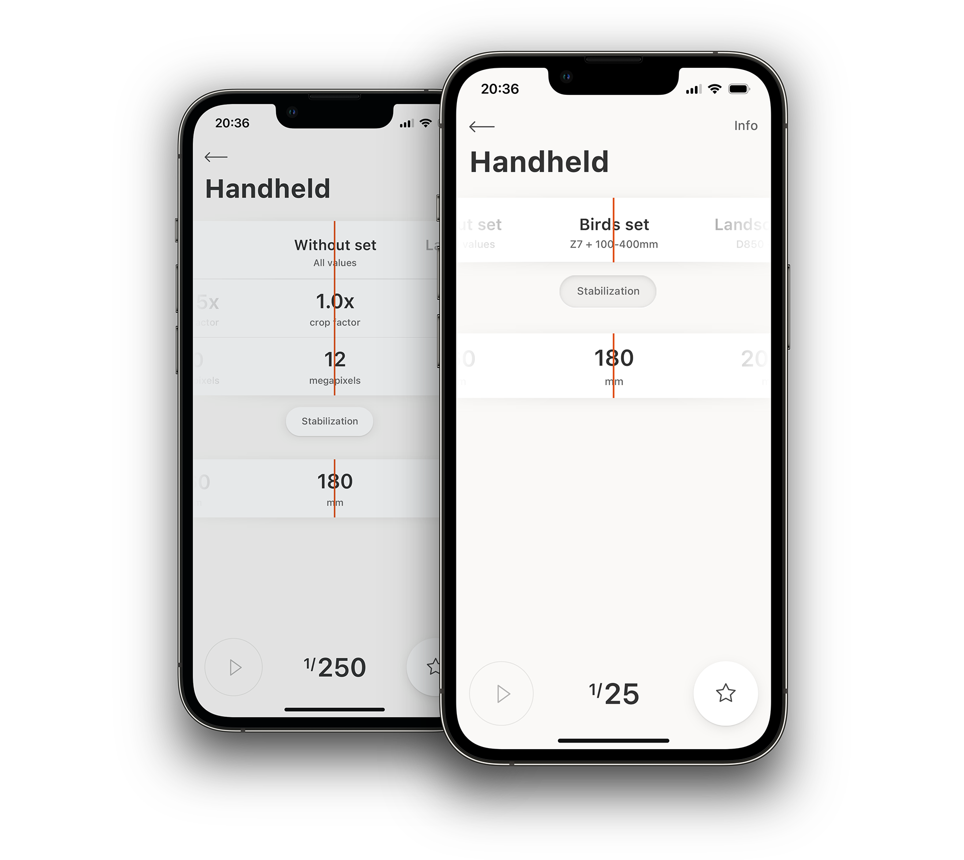
– Handheld Shutter Speed, for calculating the minimum safe shutter time when shooting handheld with telephoto lenses.
– Multiple Exposures, for composing and aligning stacked shots.
– Still Stars, for calculating maximum exposure time without visible star movement.
– Nightscapes, for shooting moon-lit landscapes.
– Moon Calculator, for framing and timing moon photography.
Despite the variety of functions, the interface remains unified – a consistent design language and interaction model across all calculators, focused on clarity, precision, and efficiency in the field.
03.
Sets and equipment
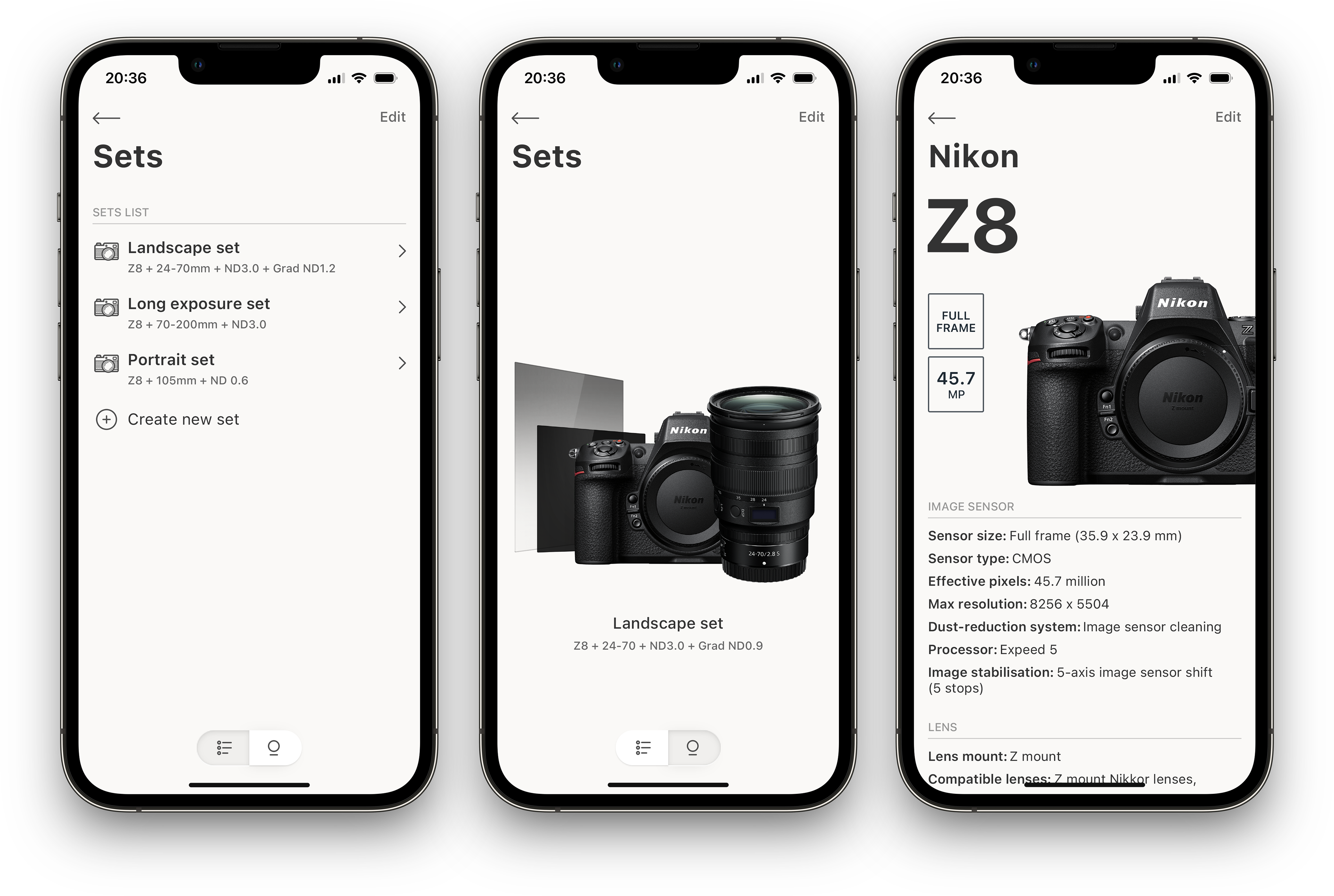
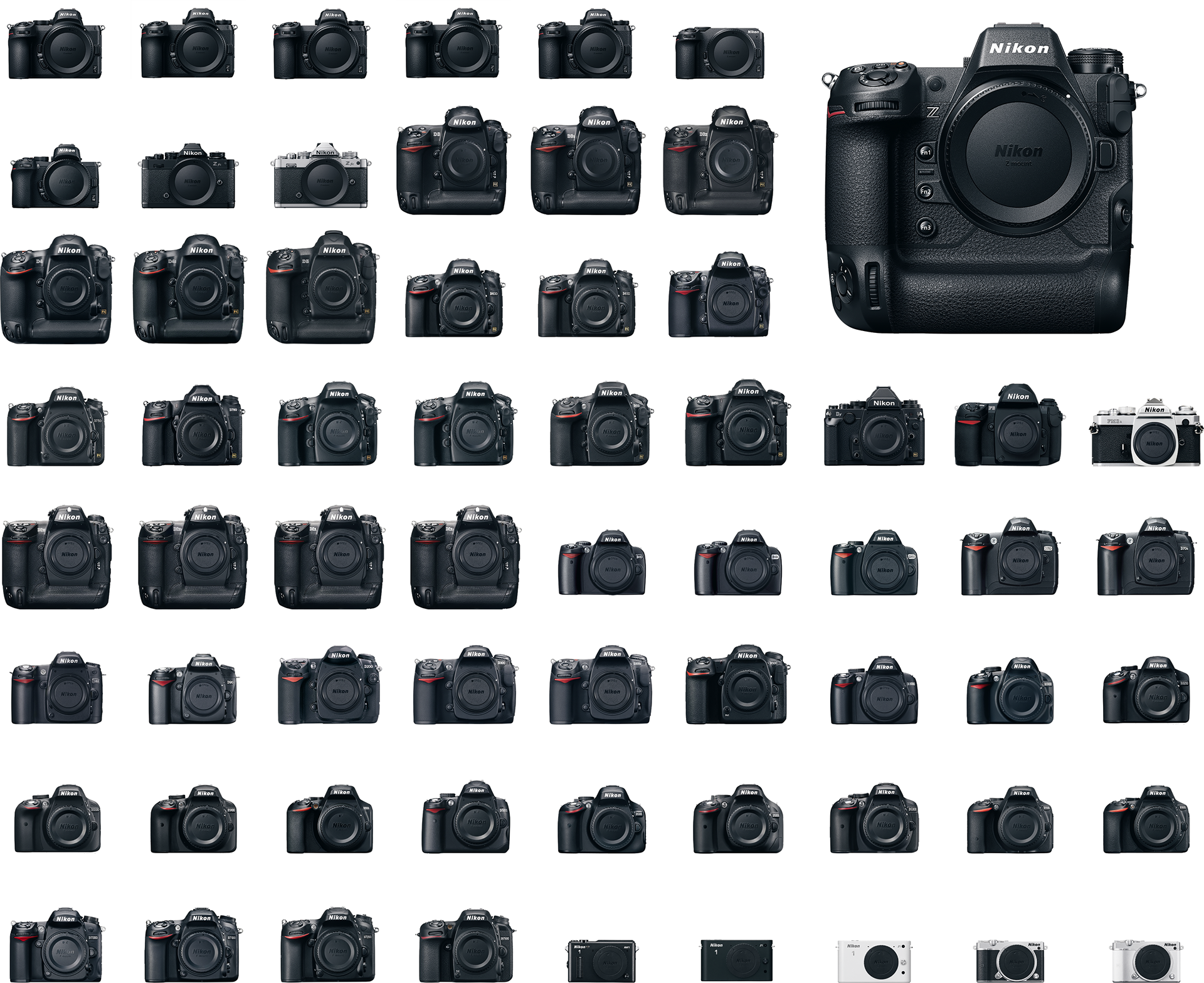
To speed up workflow, I built reusable “sets” of camera bodies and lenses. These let users load their gear profiles quickly instead of entering specs each time – many users now rely on this app mainly as a personal equipment database.
04.
Themes
Dark mode support was introduced early – before it became standard in iOS – based on direct user feedback. Design elements were reshaped over time to reflect design trends, ensuring interface remained modern but recognizable.
05.
App evolution
Since its release in September 2013, Manual Exposure has been updated multiple times: support for new screen sizes and resolutions, 3D Touch, widgets, Apple Watch. It evolved visually: from skeuomorphic beginnings to flatter, cleaner, contemporary patterns.
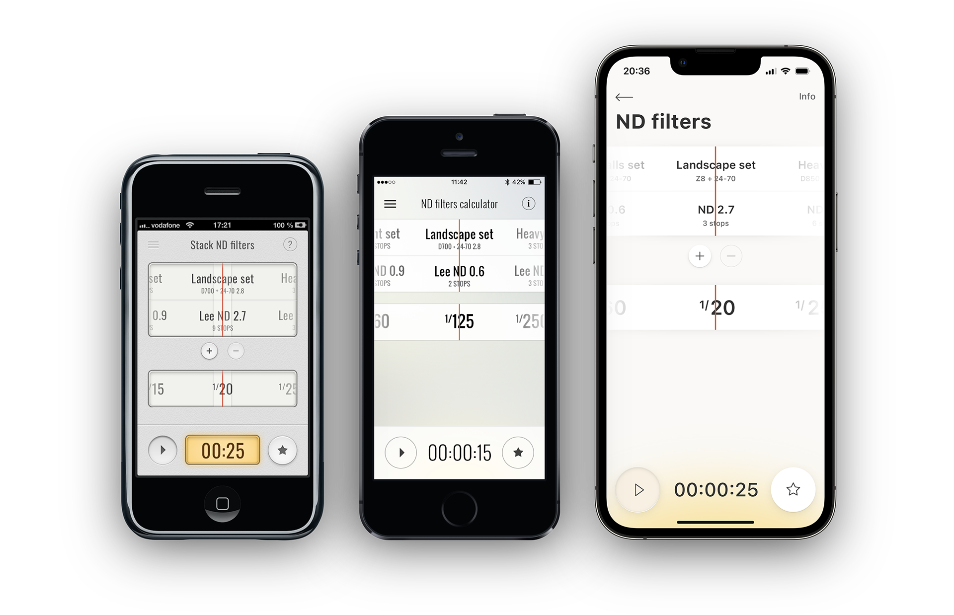
The evolution of visual trends can be clearly traced through app versions: skeuomorphism in the first release, a flatter, more geometric design in the second, and finally the adoption of modern, minimalist patterns in the latest version.
Over time, the app has quietly set a benchmark for its category. Its interface and visual patterns – from layout structure to the horizontal value selector – have influenced other photography tools, including those from major developers who later adopted the same interaction principles.
06.
Visual language
One of the most distinctive features is the horizontal value selector — intuitive, tactile, and now widely adopted across photography apps.
I also designed a custom set of icons for the app; these icons have evolved with each version, staying sharp, coherent, and consistent.
07.
Equipment database
The app includes a rich database of camera bodies and lenses (15 brands, 1000+ items), each with pictures and technical details. The guidelines for new entries were set early and still hold up, keeping data quality high.
08.
Outcome
Manual Exposure has been on the App Store for over 12 years, accumulating a strong user base with over 11,000 installations. Throughout its lifetime, it’s been shaped by user feedback and feature requests.
Its UI patterns – especially the horizontal value selector – have influenced competing photography tools. Today it remains, not just a tool, but a benchmark for clarity, usability, and visual elegance in its niche.
