Join
Mobile app UX/UI design
- Client
- JOIN Sports, Amsterdam
- Agency
- The Mobile Company, Amsterdam
- Role
- Senior UX/UI Designer
Brand Designer - Date
- August 2016
01. Goal
Join Sports came to us with an existing app (formerly called CycleWe) that brought cyclists together across the Netherlands. Their request: refine and improve key user flows to make the experience more intuitive, inviting, and social. Alongside another designer, I worked end-to-end – from concept through to execution – to help craft a version that people who love cycling would feel at home in.
We also proposed a stronger name and a fresh brand identity that matched the client’s passion for cycling.
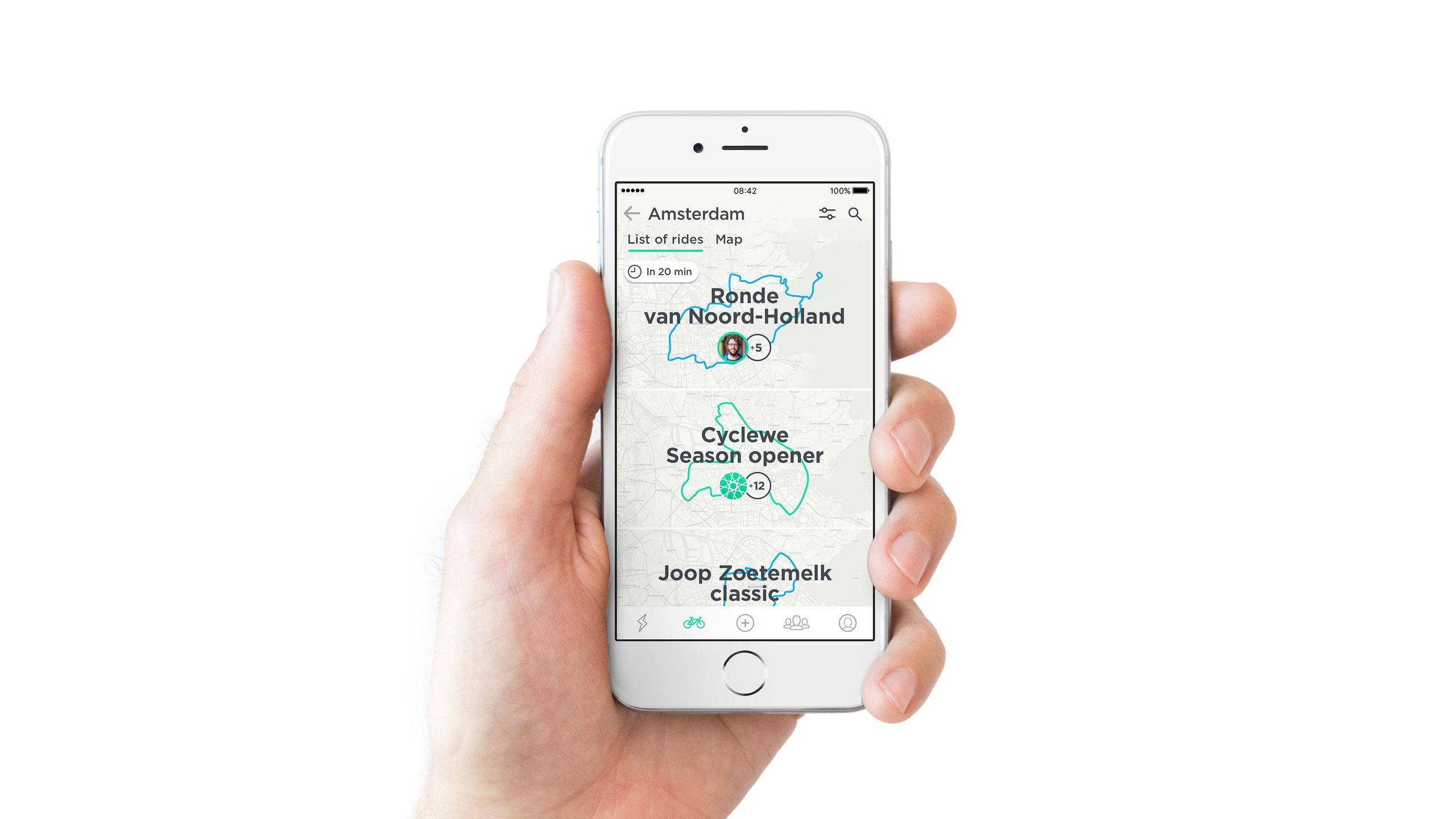
Discover community and join users updates in one place.
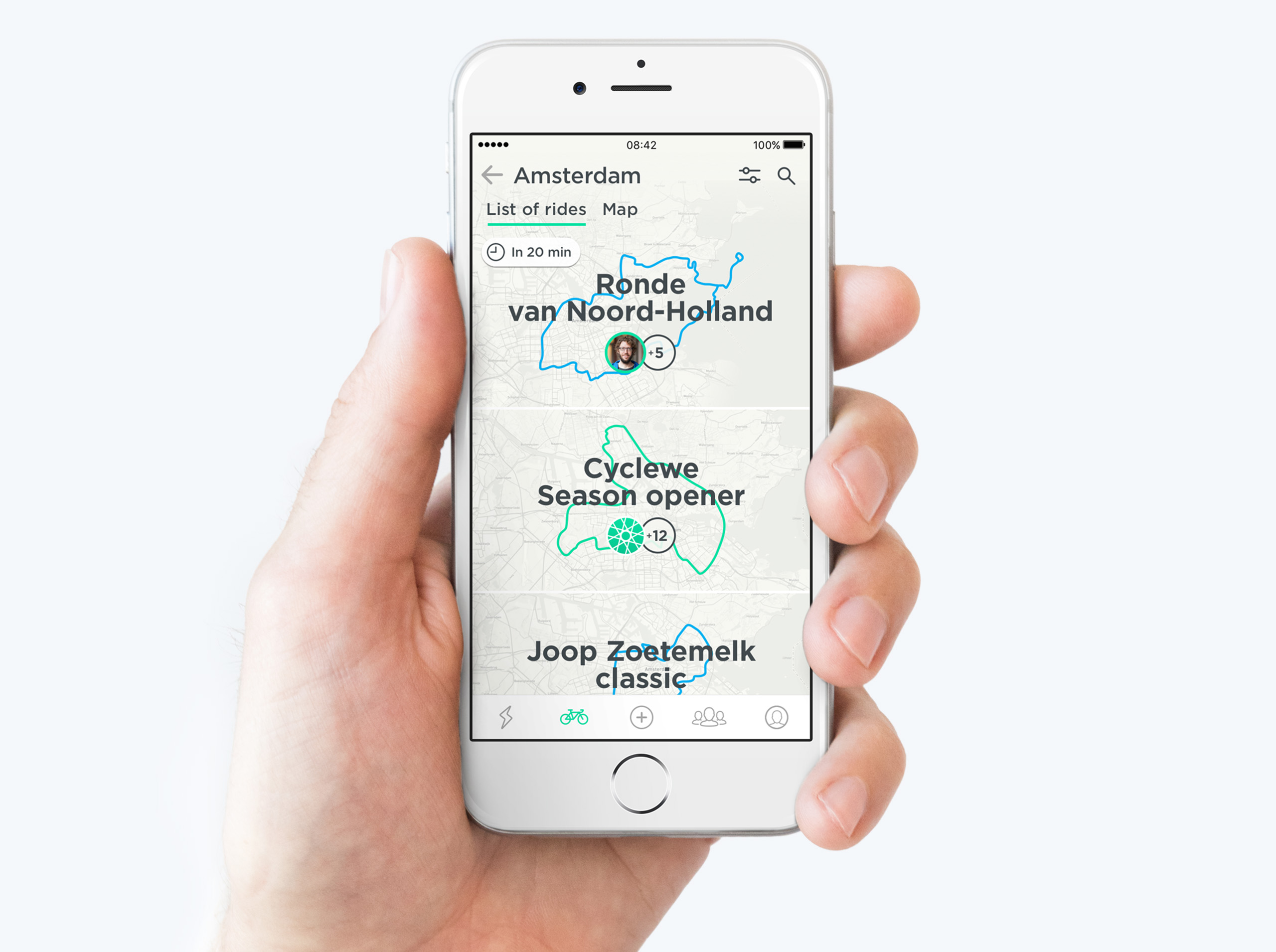
Explore beautiful rides in users favorite cycling area.
Route, ride participants, weather conditions and one single tap for join.
02. Focus and User Flow Adaptation
We defined three moments in the user journey – before, during, and after a ride – and tailored the interface to each stage so that the most relevant information and actions were prioritized:
Before the ride: showing the essentials – time, place, participants, weather, wind, route selection.
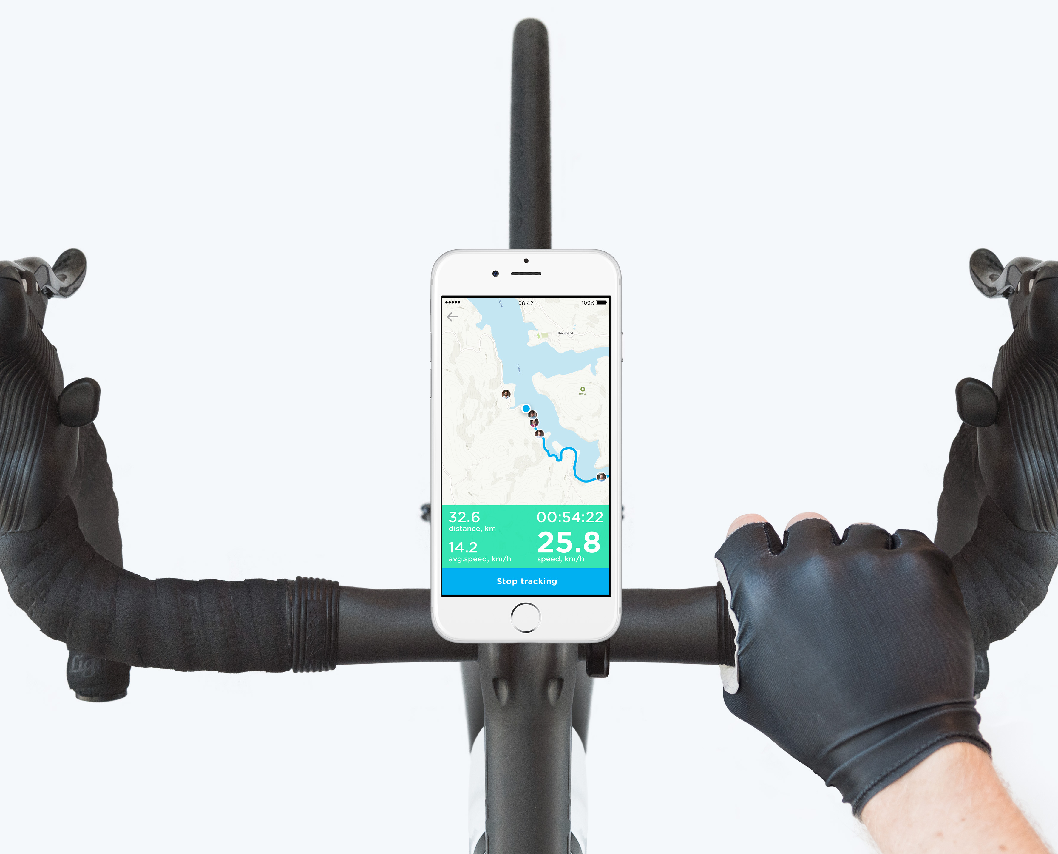
During the ride: simplifying the UI – bigger fonts, fewer buttons, minimal controls, real-time tracking/maps, important notifications.
After the ride: shifting the emphasis to reflection – photos, stats (e.g. top speed), route details, sharing highlights.
03. Brand identity and Visual design
To reflect the warmth of a shared cycling community, our visual design needed to be approachable, legible, and lively.
Typography was chosen for high readability – especially important when people use the app outdoors.
The color scheme is welcoming, with warm tones and high contrast for key information.
Maps became a core element – not just functional, but a branded, emotional anchor. Before rides they help users pick the route; during rides they show real-time context; after rides they help visualize the journey’s shape.
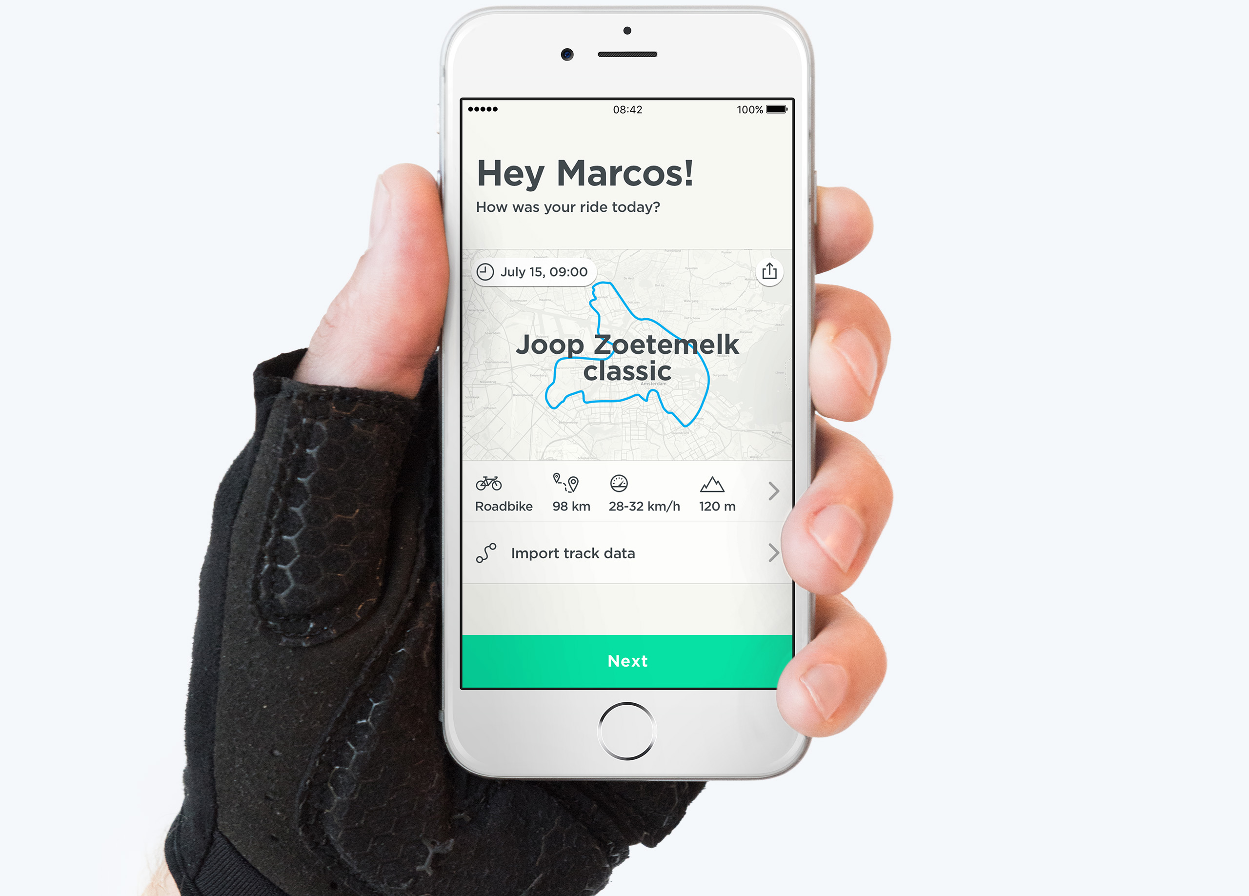
After the ride collected results in the completed rides overview with key statistics and route details.
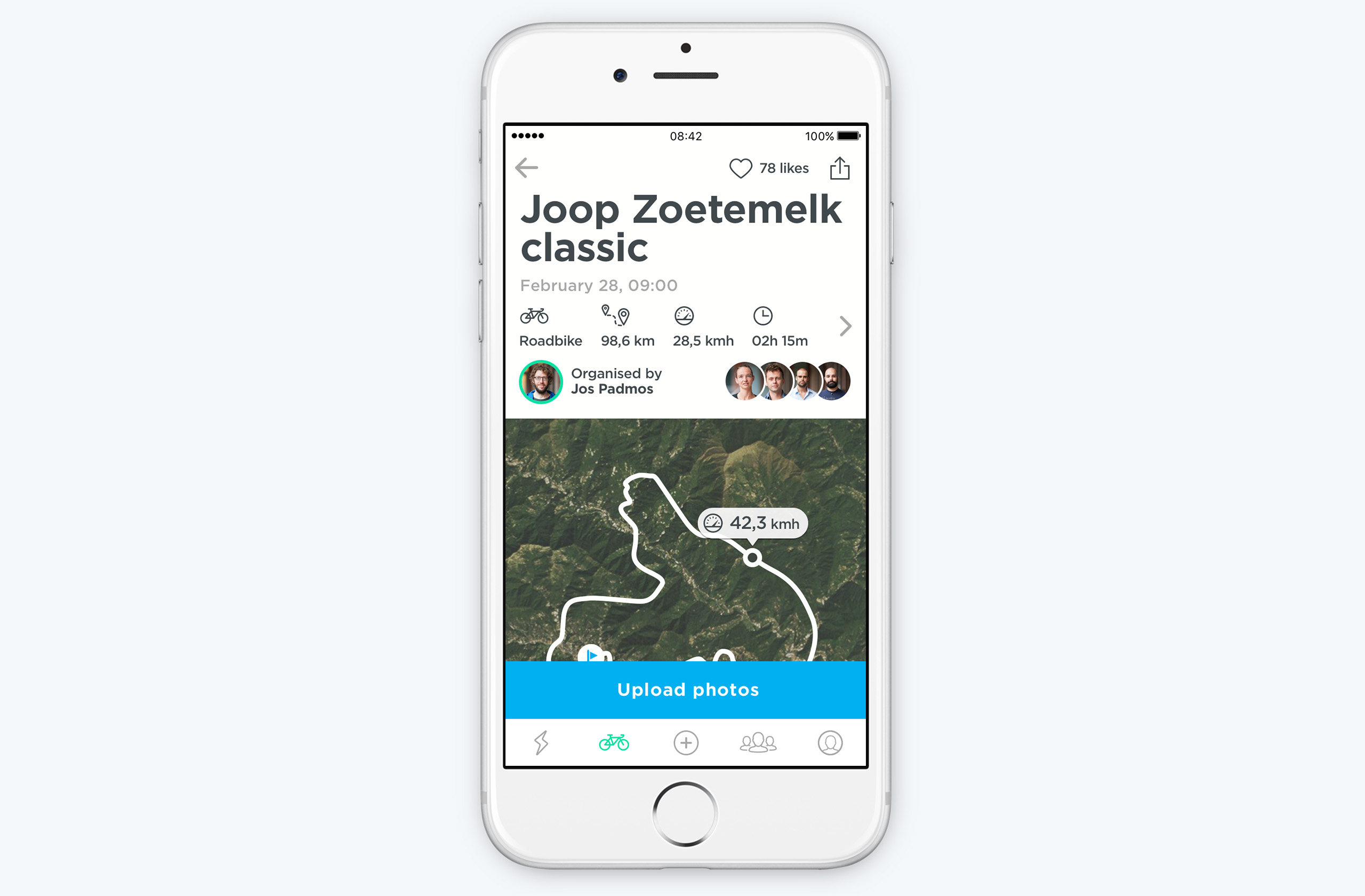
Finished ride uses a different style and invites users to share theirs moments.
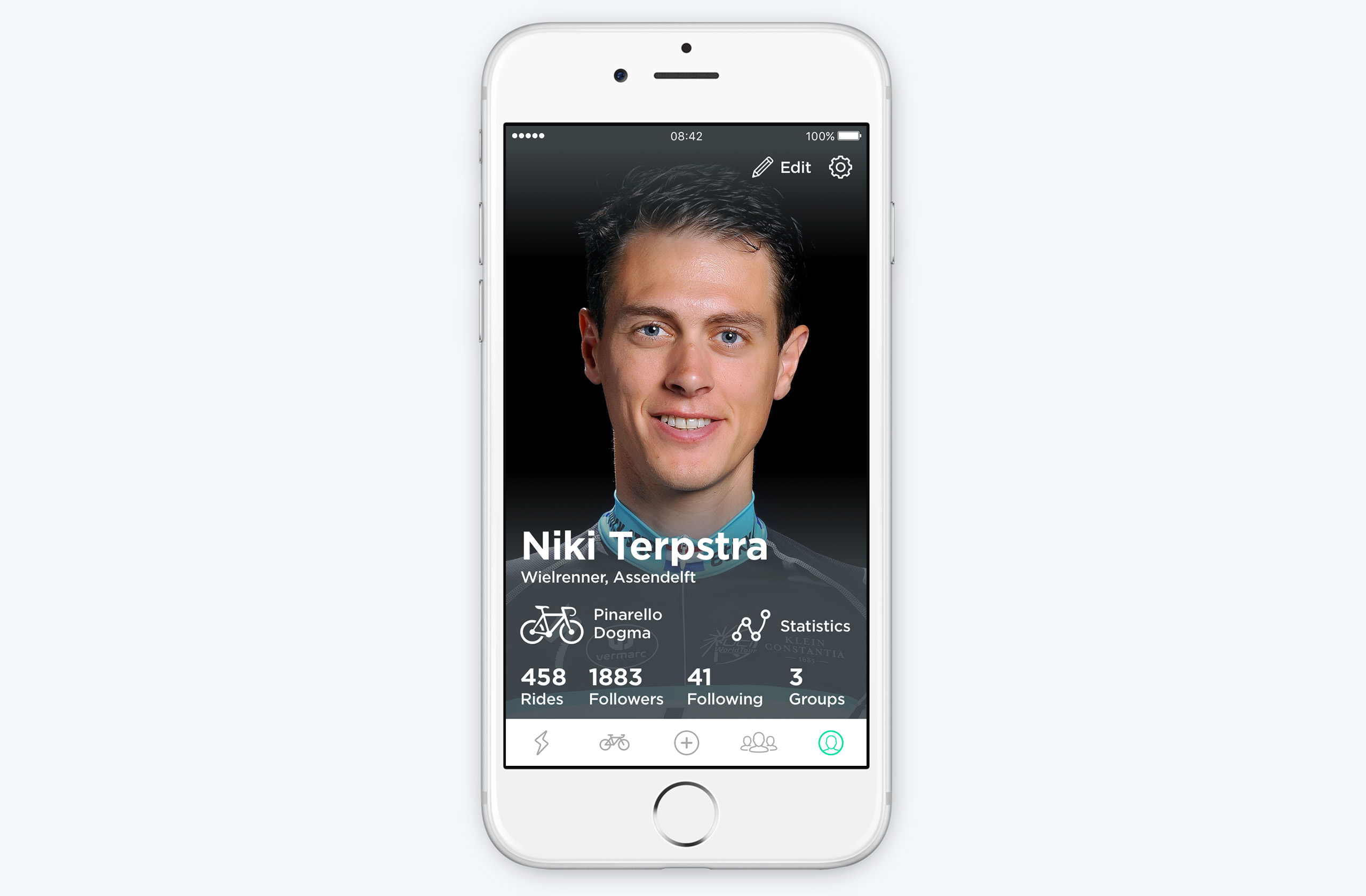
Personal accounts lets users keep track of individual records and add theirs favourite equipment.
App allows users not only join rides, but also create their own rides.
04. The outcome
The redesign in 2016–2017 delivered measurable impact beyond visual improvement:
+30% app downloads compared to the previous year (2015–2016).
User rating grew from 3.8 → 4.4 between 2015 and 2018, reflecting improved clarity and usability.
Active users tripled – from ~5K in 2015 to ~14K in 2018.
Reviews highlighted better navigation, clearer visuals, and a more personal experience. Overall sentiment became overwhelmingly positive.
In short, the redesign helped transform Join from a niche cycling app into a growing, data-driven community platform – one that truly supported cyclists before, during, and after every ride.