Delta Lloyd
Pension app UX/UI design
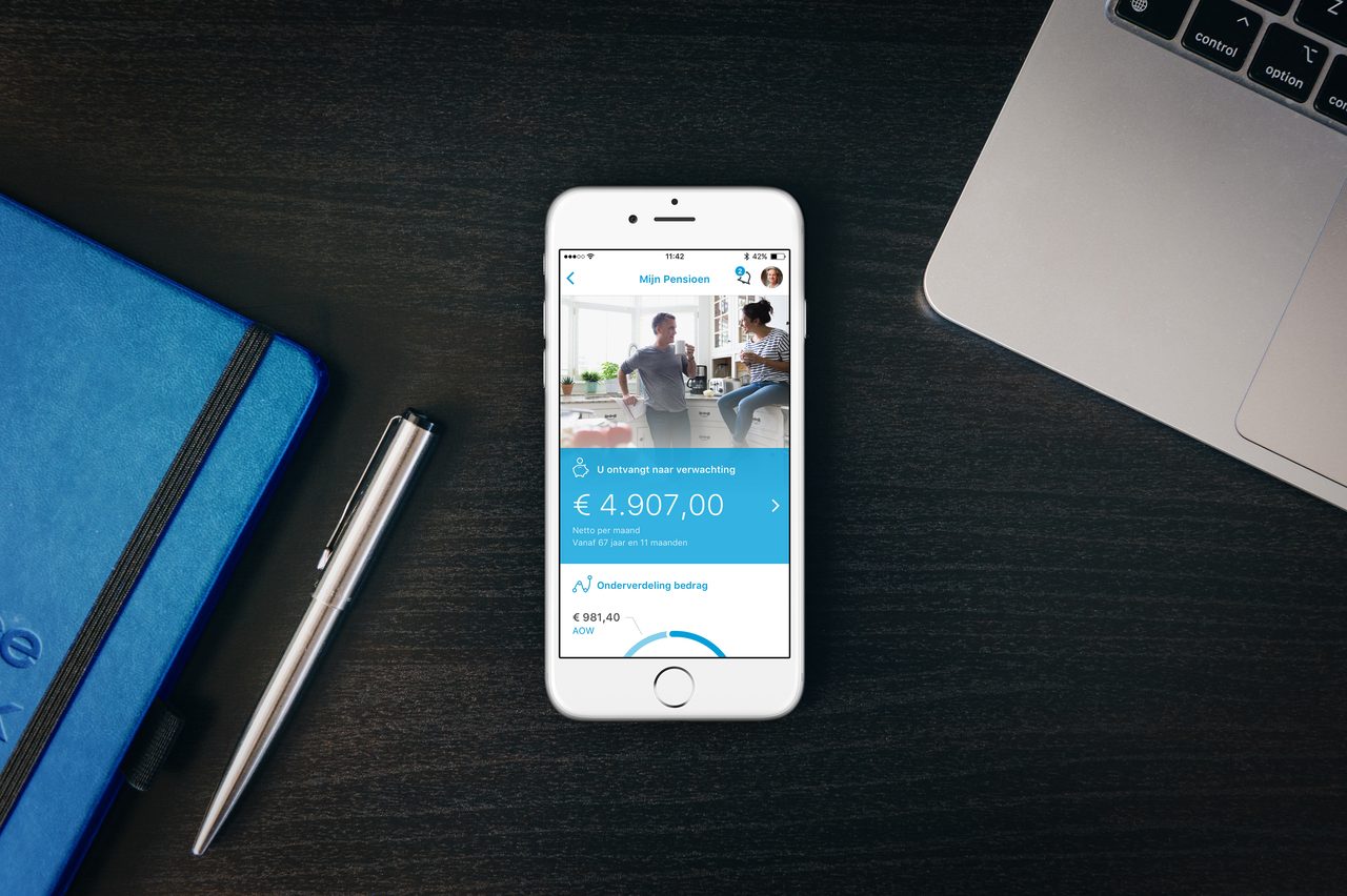
- Client
- Delta Lloyd N.V., Amsterdam
- Agency
- The Mobile Company, Amsterdam
- Role
- Senior UX/UI Designer
- Date
- September 2016
01. Goal
In 2016 The Mobile Company pitched a pensions module for Delta Lloyd’s mobile app, and I did the design, working within the existing visual language of the brand and the app. Our sales lead joined me at the client meetings and built the relationship; I presented the design decisions myself.
The task was to show how abstract pension data could become something a customer can read on a phone: how much they will receive, from what age, and what the amount is made of. This was a pitch, not a product project. The deliverable was a clickable prototype and a concept document with detailed flows, screen by screen.
02. One amount first
The module is one more tile on the home screen of the existing app, next to health-care claims, mortgage status, and other Delta Lloyd services. Tapping it asks for Touch ID and opens My Pension.
A pension in the Netherlands comes from several sources – the state pension (AOW) and one or more employer schemes – and each has its own amount and start date. I decided the first screen should answer one question before anything else: what can I expect to receive? So the top of the screen is a single block with the expected net amount and the age it starts from. Everything else sits below it.
Tapping the amount opens the breakdown: a list grouped by source – pensions at Delta Lloyd, the state pension, and pensions the user has added themselves. Every card has the same structure – amount, start age and duration, policy number and start date – so the sources can be compared line by line.
I used the data the client supplied instead of placeholder figures. When stakeholders looked at the screens, they saw amounts and schemes they recognized, not a generic template.
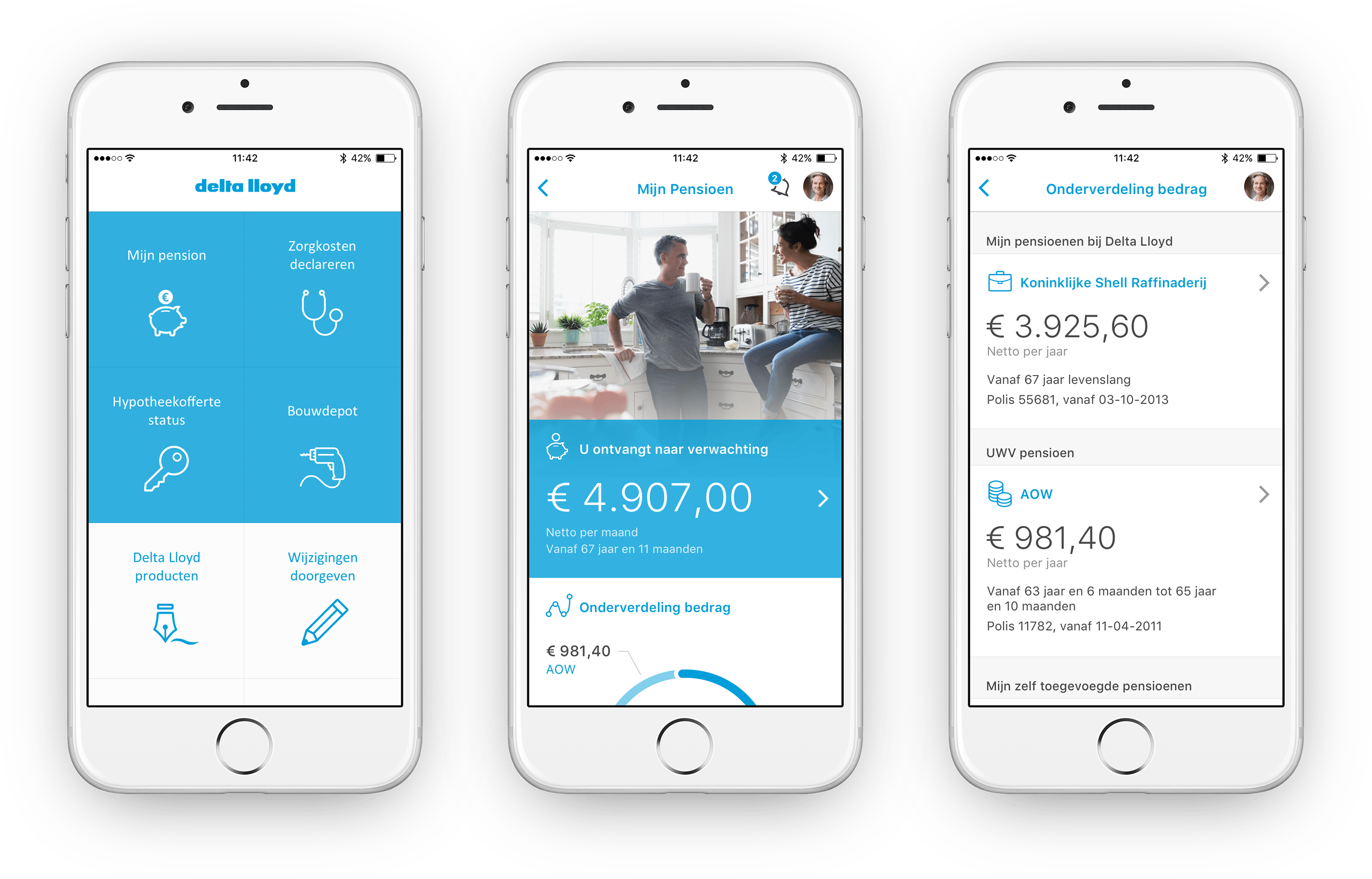
From the home screen tile to one expected amount, then to the sources behind it.
03. What the amount is made of
Below the total, a ring chart splits the amount into its two parts – state pension and Delta Lloyd pension – with the total repeated in the center. With only two segments, I labeled them directly with leader lines instead of a legend, so nobody has to match colors to names.
The rest of the screen is a short list: other income, “What happens if,” contact, and settings. Rows carry their own content where they can. Other income shows its total right in the row, and “What happens if” lists examples in its subtitle, so the user knows what is behind a row before opening it.
“What happens if” opens Life events: six situations, from being unable to work or changing jobs to having children or separating. The entry points are named after the situation, not after the insurance term. Both sections came from the client’s brief; my part was how they are presented.
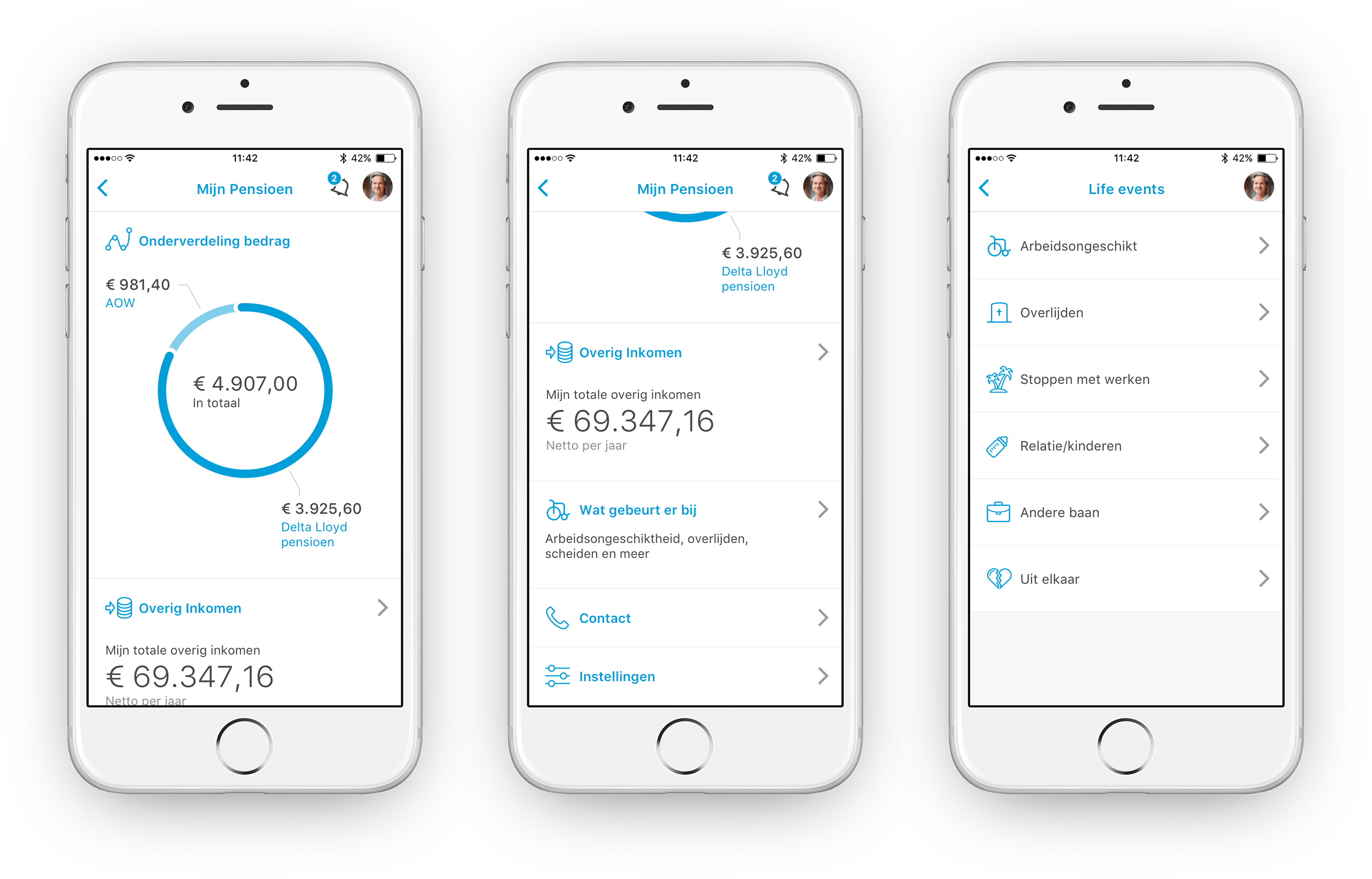
The total split by source, the sections below it, and the life events list.
04. Fitting into the existing app
I didn’t stop at the pension screens. A pension module brings its own stream of content – yearly statements, cost overviews, scheme documents – and that content needs a place in the app.
In the mockups, a notifications icon with a counter sits in the navigation bar of the pension screen. It opens a dated list of pension documents, newest first. Unread documents are marked in blue, and their number matches the counter.
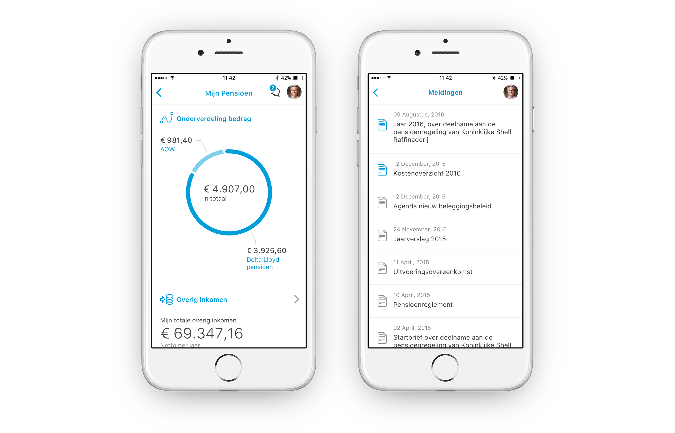
Pension documents arrive in the app’s notifications, linked from the pension screen.
05. Outcome
Delta Lloyd responded enthusiastically to the pitch, and the next phase of the project started. Then the company was acquired by Nationale-Nederlanden. The Delta Lloyd brand was discontinued, the app was no longer needed, and the work stopped.
So this case is a pitch and a set of UI designs: no release, and no data on how people would have used it. I keep it here because the problem is one I still work on – deciding which piece of information comes first, and how the rest lines up behind it.