Many projects use maps to display data. Usually we are talking about Google or Apple maps in case of iOS devices. They are so popular because they work so well, but sometimes default functionality is just not enough.
De Lijn app – a good example of Apple Maps use case. Hiding some of the info layers would only advantage the user.

I always liked using maps and I was never happy with the standard ones: there is always either too much or too little information and the style of the map never matches the style of the project. An obvious solution that I used sometimes is to create a custom illustration. So I was taking a Google maps screenshot or some old map scans and adding my information on top of it in Photoshop. The problem here is that an illustration is not interactive and is never fully integrated in the app.
In my latest projects I started using MapBox both for design and development. I’m not going to focus on MapBox itself since there are other good tools as well. You can even customize Google maps nowadays, though in my experience it is more complicated and the functionality is limited. Instead I’d like to tell you about my experience with using custom maps.
* *. *
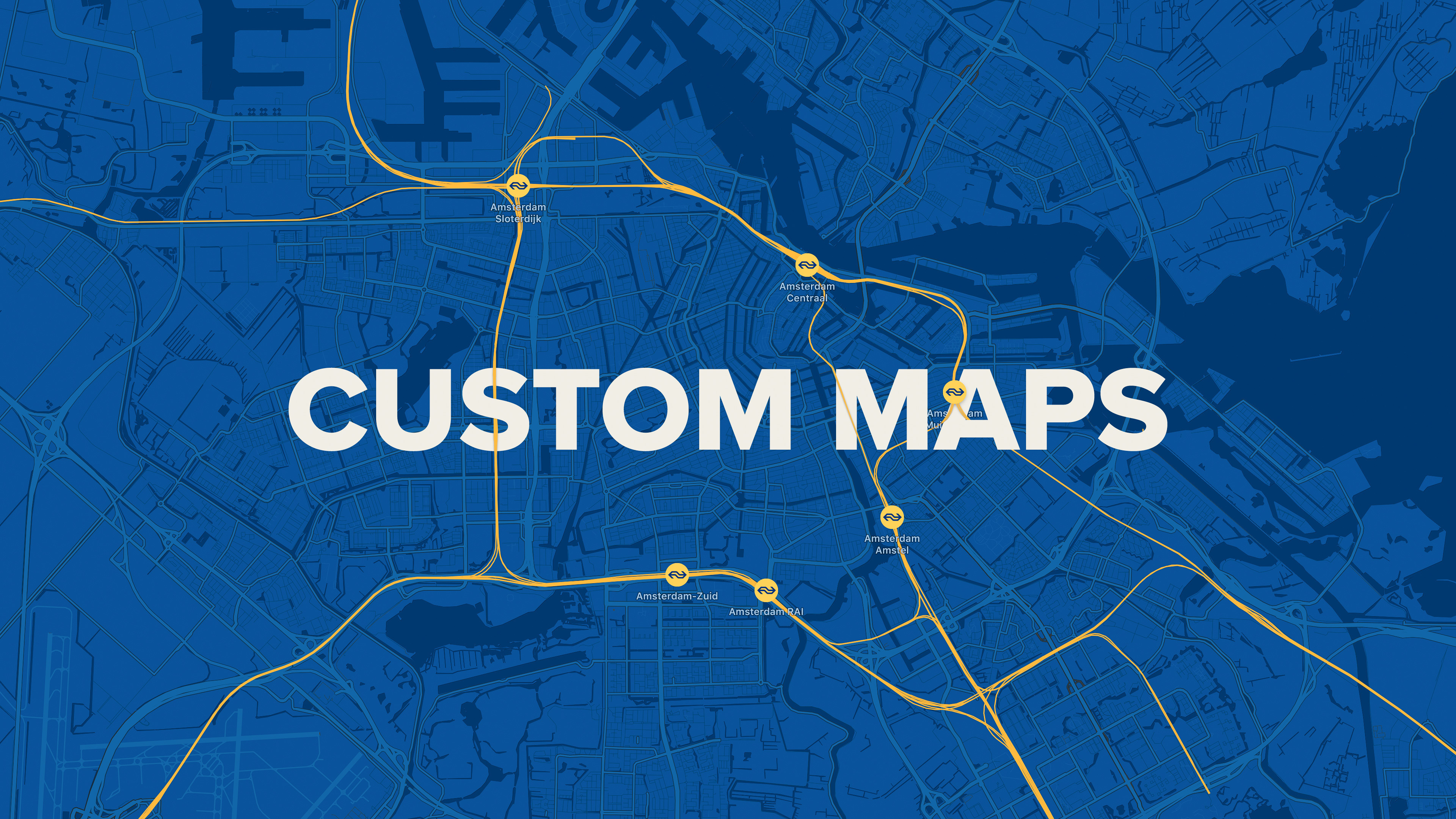
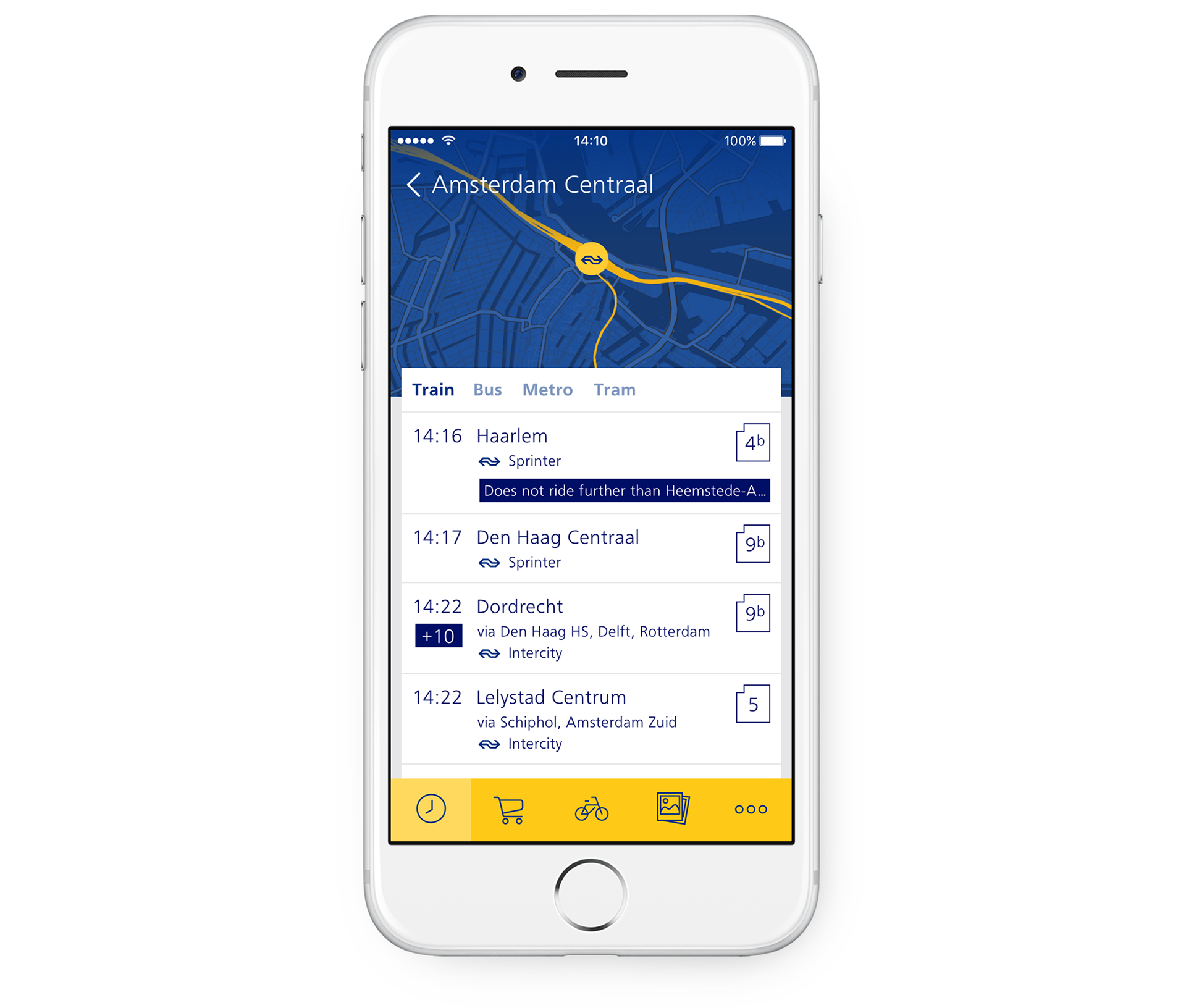
First time I used custom maps for an app for NS — main railway operator in the Netherlands. NS asked us to come up with an idea of an app for all the train stations in the country. In my proposal I put a map on the background and I built the interface on top of it.
A train station is more than just a pin on a map, right? It is a part of a network and it is connected to other stations. If we highlight all the railways we get a unique fingerprint of every station.
NS Stations app – blue and yellow are brand colors of NS, so the map supports both the brand identity and the rest of the UI.
* *. *
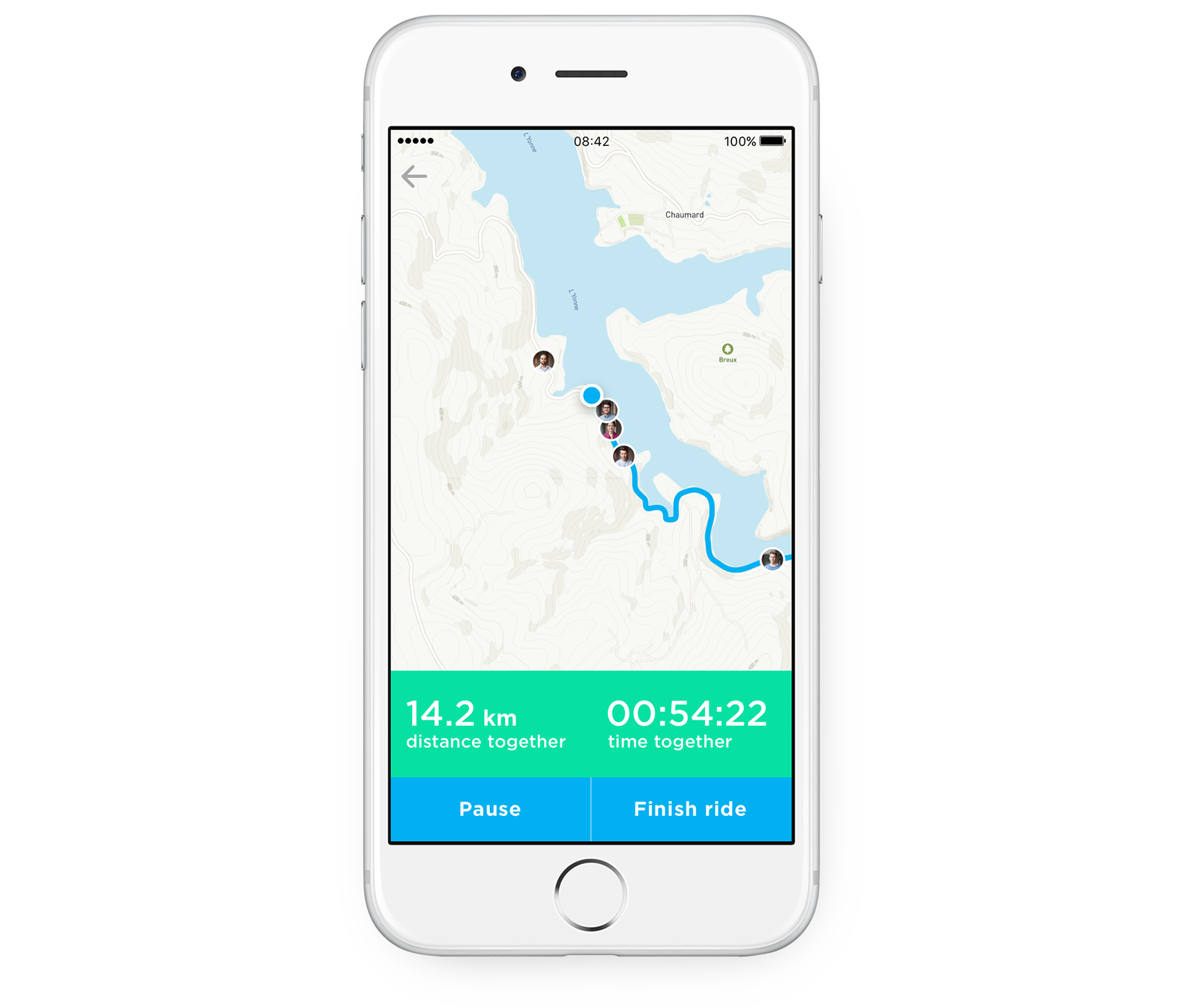
Another big project is Join — an app that helps cyclists to find a company to ride together. Cyclists create rides that other cyclists can join. Sounds simple, doesn’t it? Yet every ride is in fact a big piece of data and we needed to highlight what is really important for a user.
We started with a list of rides for a selected location. We wanted to show a starting point and a route of each of the rides on a map. We decided to use the same zoom level for every map in a list. It allows users to visually compare and estimate the rides without even seeing any numbers, like length or duration.
Join app – customised map gives a good overview of the data.
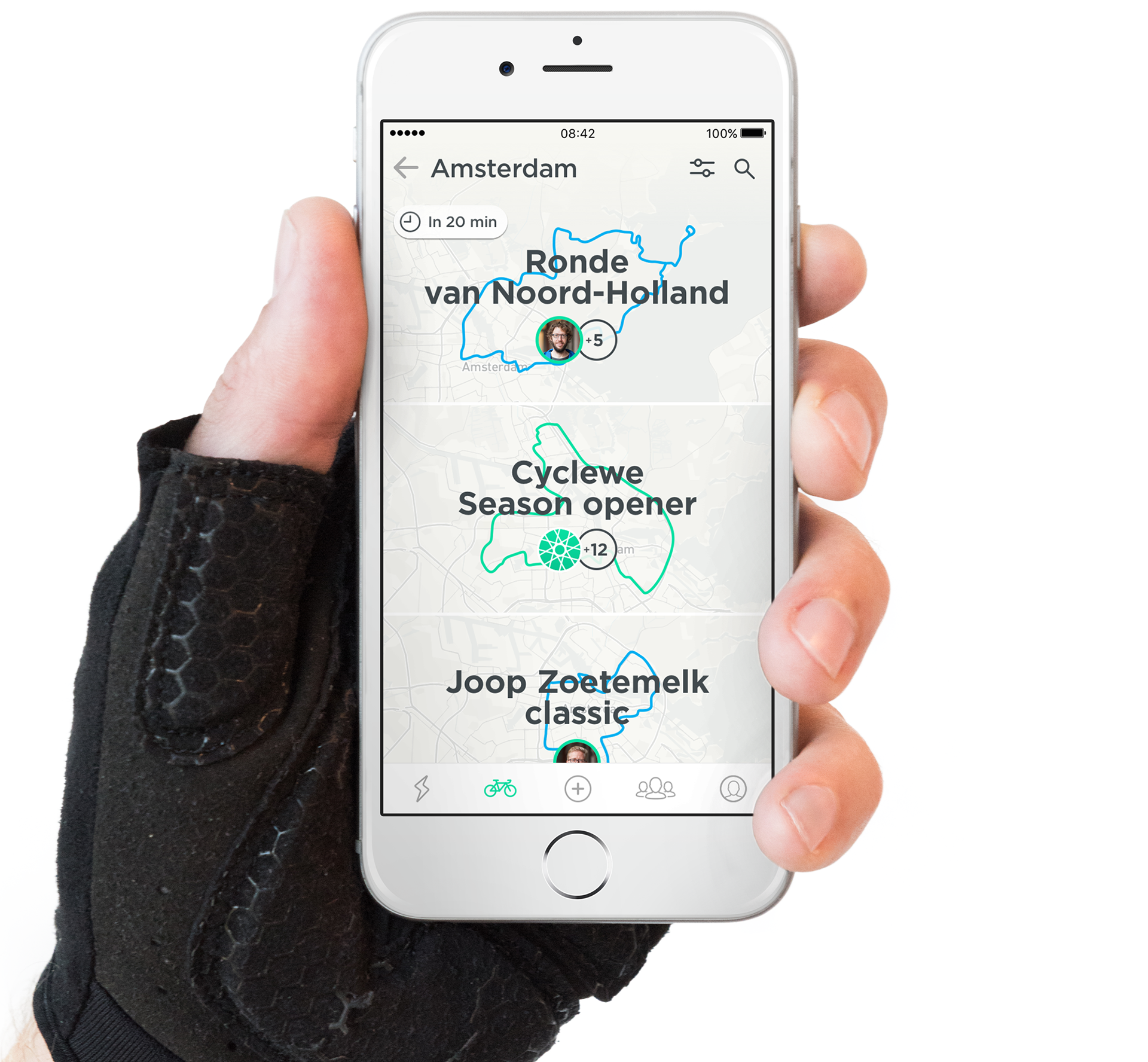
Another great feature is that the map adjusts its style depending on a zoom level. On a country level the map is very pale and has almost no details. The more you zoom in the more colors and details you get. Standard maps also hide some of the information layers when they are zoomed out, but they stay bright and invasive. Here we wanted a user to focus on the routes and not on the map itself. So I worked with colors and data layers for each zoom level.
In this use case a neutral map with colorful routes became one of the main branding elements. It made the app recognisable and unusual.
Ride mode in Join app – custom map became one of the most recognisable features of the app.
* *. *
The last project I’d like to share is a completely different one. Recently I worked on a typical big boring corporate kind of app for an insurance company. As you can imagine, the client has a brandbook and strict guidelines for all elements and controls… except for the maps. That’s awesome, at least something you can still play with!
I proposed to use brand colors for a map that displays locations of car services, legal firms, etc. The feedback from the stakeholders was more than positive. It was an unexpected bonus and worked as a pleasant surprise.
Custom map for Delta Lloyd app – happy client always makes my day!

* *. *
I could go on and on with more examples of maps and maps designs, but I’ll better stop here. I think it is a really powerful, flexible and underestimated tool for designers. A well made map will never harm but only enchance the user experience of your project. For sure it will add more visibility to the brand and can support the visual language of you interface.
So, next time you have a chance to customize your map, do it!