Today I‘d like to talk about important part of any design process that often gets neglected or forgotten. It is not the tooling or typography or colors. I want to talk about design principles.
First of all let’s align our terminology. Here is a good quote that matches my personal definition: “Principle is a fundamental truth or proposition that serves as the foundation for a system of belief or behaviour or for a chain of reasoning.” Oxford Dictionary.
So, what is a design principle?
Design principle is a simple rule that sets foundation and steers your design process. It is a source of validation of design decisions at any point along the process.
Let’s think about it. As designers we often intend to look for more elegant, beautiful solution. We love to spend time polishing things, making top notch designs out of pixels and shapes. But in the end we all have our dear clients and our beloved project managers. Very often they ask us to add something… let’s say “less beautiful” to our state-of-art designs. Like ten more important details to an already complicated screen or more slots to customise your character in a game. Sure, we often get disappointed, but we have to continue our work. And this is when our design principles come to rescue.
How? In the beginning of the project we set a list principles. They are high level, not too much into details rules (“no pink buttons” is not a principle). Together with all the stakeholders we agree on this list. We take principles along through the whole project. Each time we need to make a decision we stop and check with the principles. Will this new change align with them? What will be the impact?
Sure, a lot might still go wrong in the process. Design principles are only one part of the picture. But they make a good base that will hold your design together and provide a framework for the extensions.
* * *
Below is a list of my favorite principles. They are tested by me and my colleagues on real projects with real clients. Yes, clients were happy with results. Yes, we got paid for our work.
It is not a one-size-fits-all solution. Actual set of principles is different for every project. For a game I would add a couple of points regarding emersion, for a mobile app I would put more focus on accessibility.
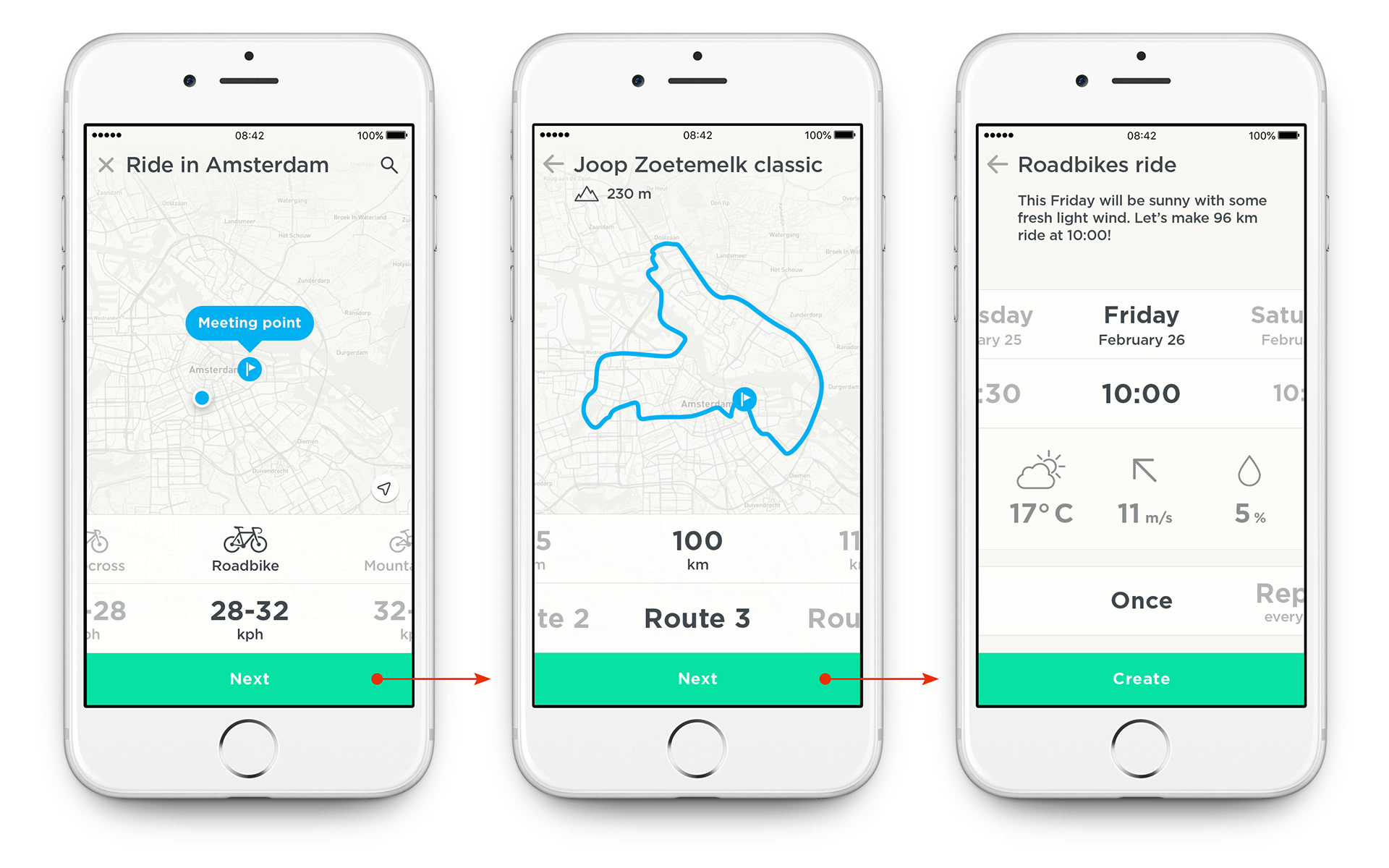
I added some examples from my recent projects. I will show examples from two completely different areas to demonstrate how the same principle can be applied to different areas. First project is “Join”– an app that lets you find buddies to cycle together. Second project — “World of Warships: Blitz”– a mobile game that gives players a chance to battle on historical warships from WW1-WW2 era.
* * *
Clear focus
At every moment provide only information essential for decision making
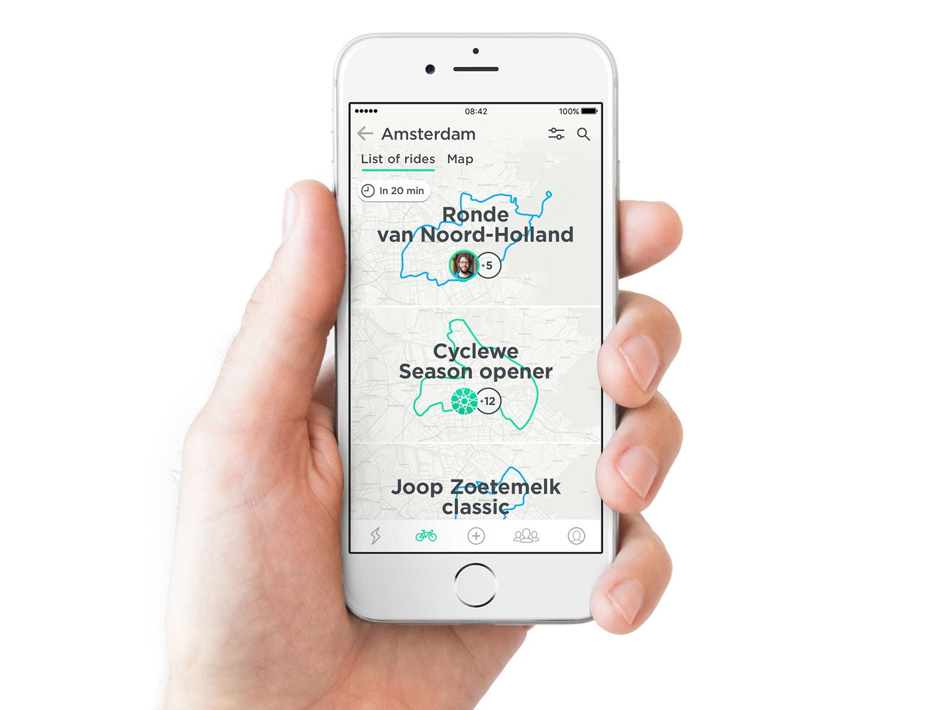
Eventually every single project that we do has a focus, it is designed and developed to help end users. Let’s take the Join app. The core feature is to provide a list of rides that people can join to cycle together. Everything else might have its place in the app but only a second one. An option to chat to your buddies? Sure, but as a tool to support rides. Upload photos of your ride? Sure, why not, but only as a secondary feature.
We all know that if everything is important nothing is important. By keeping our focus clear we insure that we provide only essential information at the right moment.
Join app: list of rides. Focus on essential information such as a route for each ride. Everything else is available at the secondary level and does not clutter the screen space.
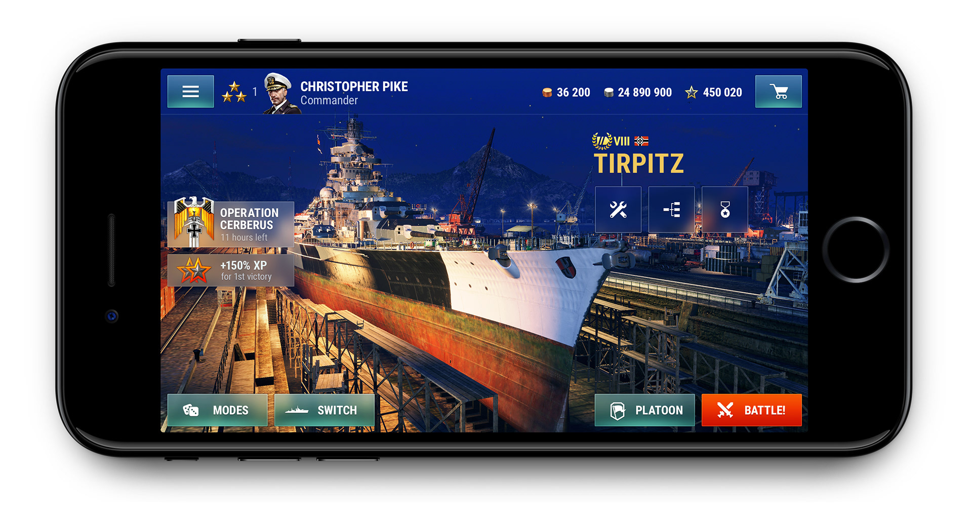
The same principle is valid for a game. Players join the game to battle, not to explore hundreds of features and menus. So we keep our focus clear on the “Battle!” button. All features that aren’t part of the battle flow go to the secondary level.
In both cases (Join app and WoWS Blitz game) UI enforces clear focus and helps users to achieve their goal.
WoWS Blitz: lobby screen. Focus on a warship as a main hero and the “Battle!” button as a main action.
* * *
Flow support
Build UI around users flow state and aim for seamless experience without interruptions
Let’s align our terminology one more time. By “flow state” I mean the following:
“In positive psychology, a flow state is the mental state of operation in which a person performing an activity is fully immersed in a feeling of energized focus, full involvement, and enjoyment in the process of the activity.” Wikipedia.
“In positive psychology, a flow state is the mental state of operation in which a person performing an activity is fully immersed in a feeling of energized focus, full involvement, and enjoyment in the process of the activity.” Wikipedia.
We do not distract our users from their state, instead we support their flow state as much as we can. We might have tones of details that might be important, but not at this particular moment.
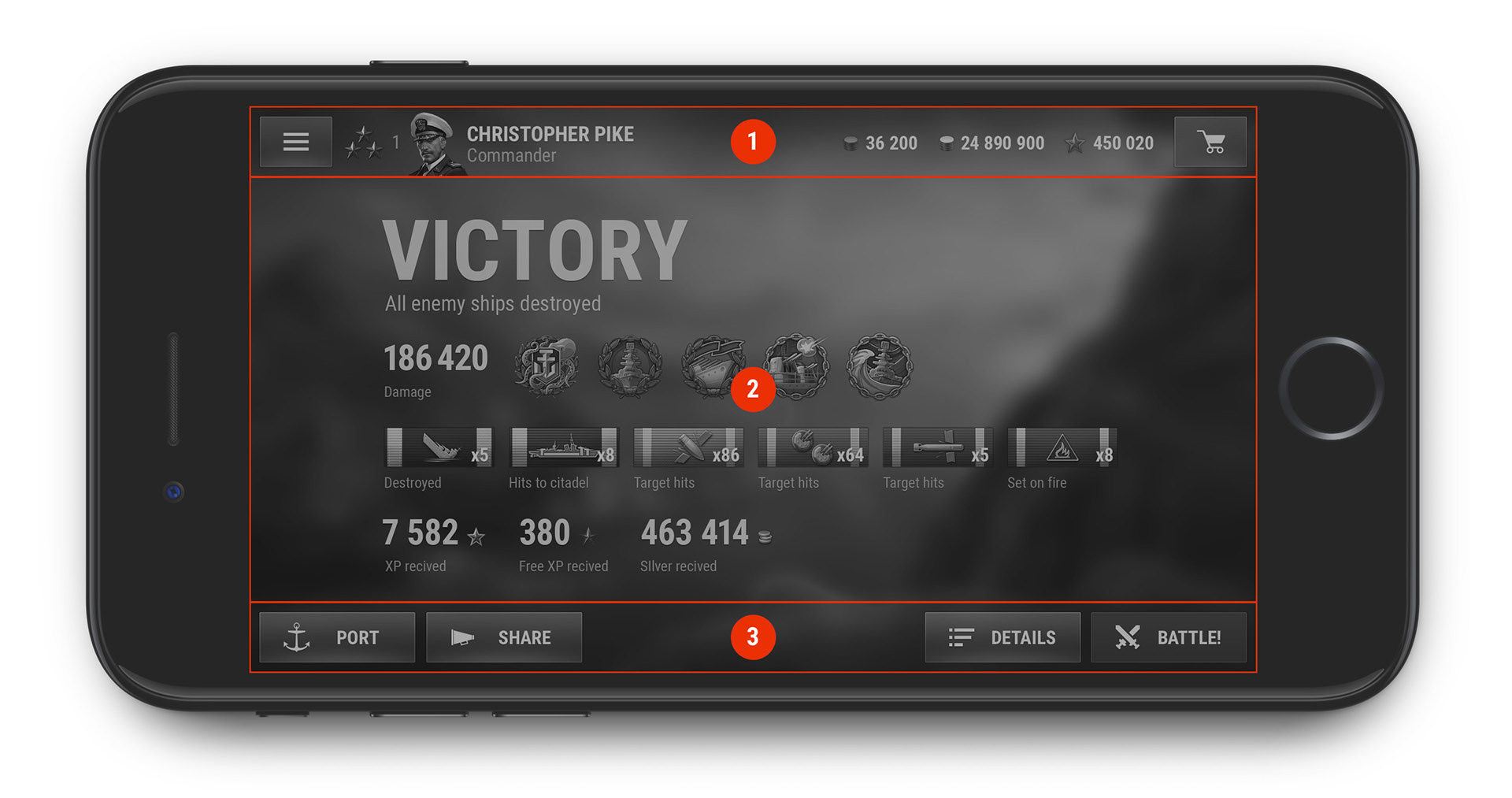
Let’s say, a player just won a tough battle, he just brought his team to victory. Sure, he got some rewards for that. But he is in his flow state and the most important action after a battle is to battle. That is our primary action and all the statistics and awards are on the secondary level. He will find all those details afterwards when he returns to the lobby, but for now we must support his flow state.
WoWS Blitz: post battle. After battle we provide a clear trigger to start a new battle.
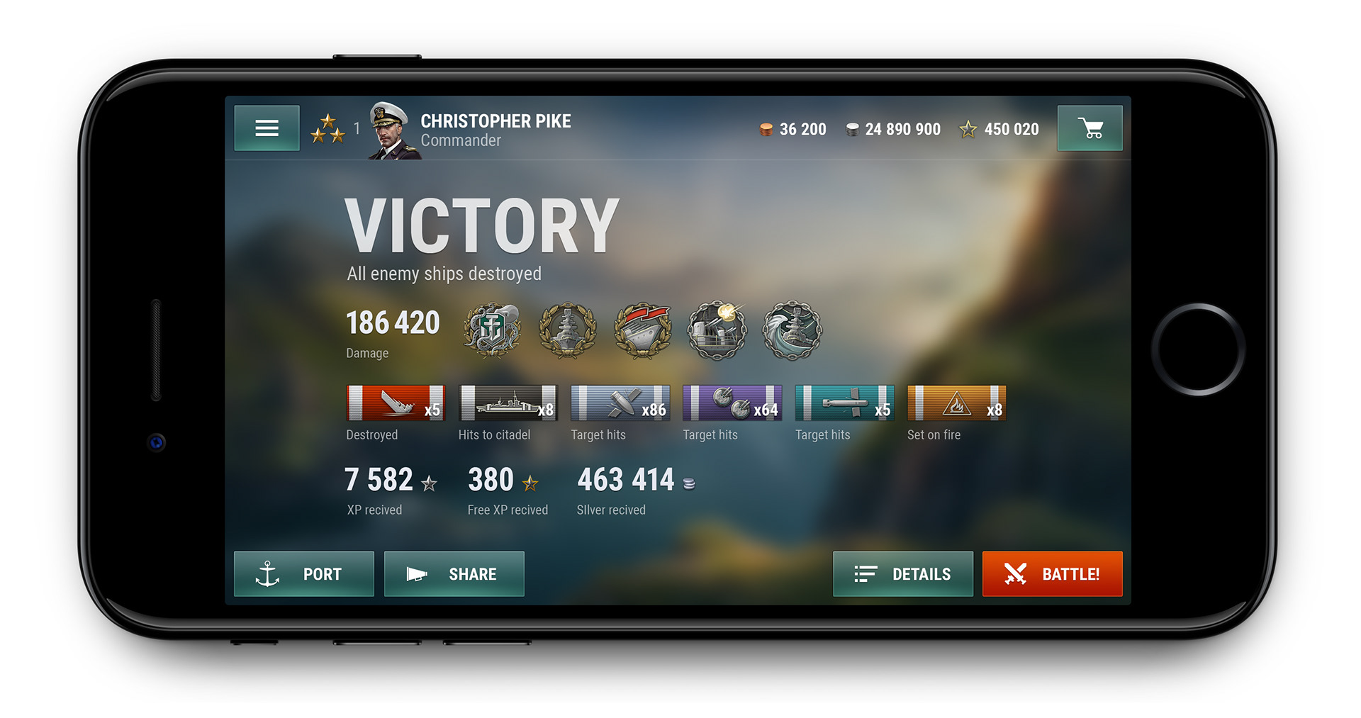
WoWS Blitz: post battle. We give player a possibility to change the warship before the battle without returning to the lobby.

This principle might sound only game-related. But it is equally important for any mobile app. We need users attention to help him successfully achieve his goal. So we are doing our best to not distract him.
For the Join app we distinguish three core states of the user: exploring rides, actual ride and sharing experience. The first and the third states can be completed at any time and place, but the second one is very specific and can be completed only while cycling. We still want to make the app useful so we dismiss everything and keep only valuable information such as a map with the participants and current speed. No distractions, only gentle support.
Join app in riding mode. App gives only current locations of buddies on the map, route, time and distance overview. More detailed information is available after the ride.

Predictable schemes
Use less variety in system to help users learn it easily
Industry standards, platform patterns and well-known solutions contribure to an intuitive and easy-to-maintain UI. Because it’s easier to recognize than to learn.
How do we achieve that? By not changing layout for each screen. By not inventing a new switch control every time where we need one. We set our design system from the very first screen and we keep it consistent. That applies to each element of the system, to any control or layout.
One of the most important points in an easy-to-learn experience is a predictable place for each navigation unit. Another one is a limited number of such places.
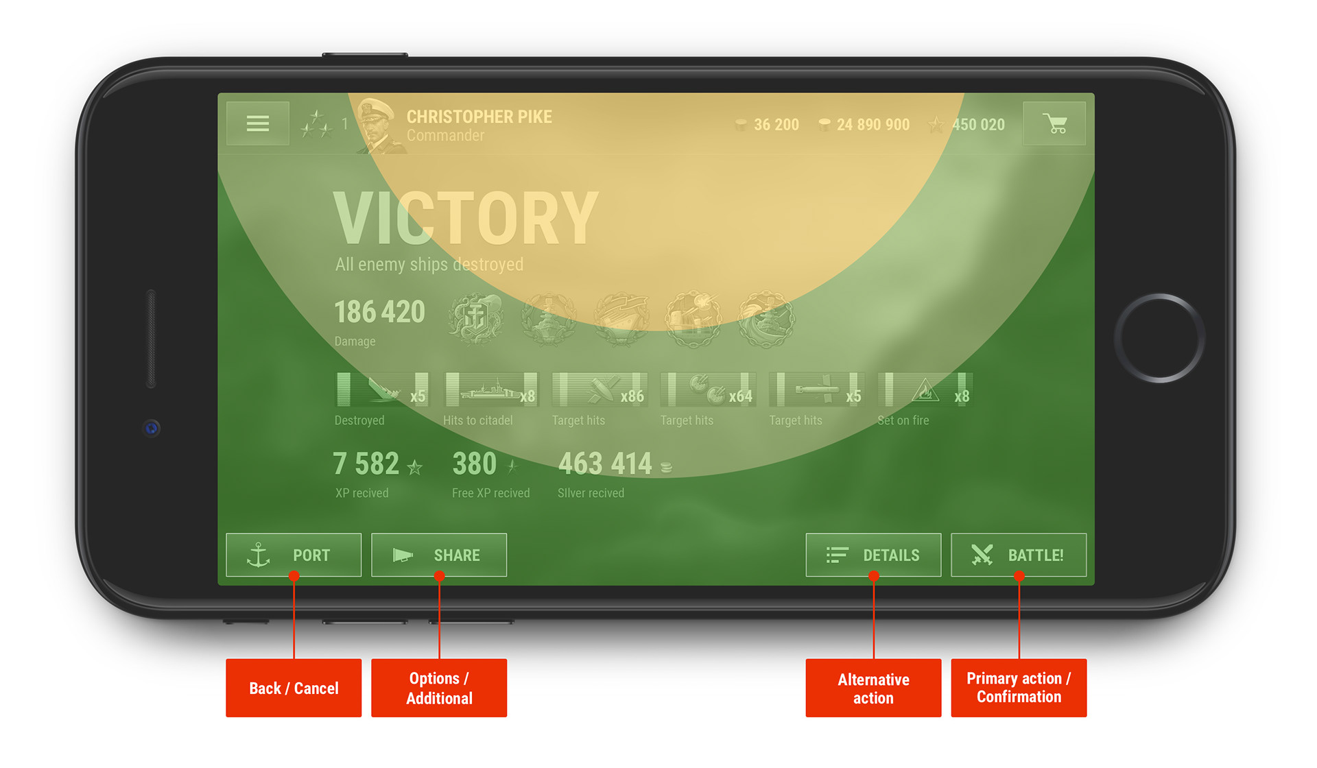
For WoWS Blitz we defined 3 semantic zones in navigation:
1. Always Available Actions bar (the most important and regular actions);
2. Action screen area (can be represented with some layout variations);
3. Contextual Interactions (1 to 4 contextual buttons with predictable actions right under the player fingers).
WoWS Blitz — post battle screen. You can clearly see 3 fixed areas of a screen: 1. Always Available Actions bar; 2. Action screen area; 3. Contextual Interactions.
With the same idea in mind we provide stable controls to automate players interactions with service UI:
– Back / Cancel (is always presented);
– Options (“Change warship”, “Setup resupply” and so on);
– Alternative Action (commands like “Platoon” near primary “Battle!” on Home screen or “Details” near “Battle!” on the battle results screen);
– Primary Action / Confirm (“Battle”, “Purchase”, “Equip”, etc).
WoWS Blitz — post battle screen. Contextual Interations bar.
This principle is applicable for both cases — for a mobile app and for a game. In both cases UI will benefit from having fixed areas and fixed places for core actions.
* * *
Feedback
Use reinforcement to educate users
We use feedback as an indicator of the current mode of our interface, but also as a powerful educational tool. We encourage our users after completing particular actions using feedback.
Here is one more quote (yes, i like to quote smart people):
“In behavioral psychology, reinforcement is a consequence applied that will strengthen an organism’s future behavior whenever that behavior is preceded by a specific antecedent stimulus.” Wikipedia
“In behavioral psychology, reinforcement is a consequence applied that will strengthen an organism’s future behavior whenever that behavior is preceded by a specific antecedent stimulus.” Wikipedia
Sounds good, but what about a real life example? In Join app we give the user a weather forecast for the time of his ride. We show it just below the date and time selector. Ones user changes the time or date, app will update the weather forecast. We give user feedback and educate him how to use features of the app.
Join app: weather feedback after changing date and time
* * *
Common case
Use common case as main case, leave space for exceptions
In Boolean logic if a proposition is true 99 times out of 100 and false one time, the proposition is false. In Human logic the proposition is overwhelmingly true.
In other words, know your users and use common case as much as you can. That will simplify your work as a designer and it will make users life easier.
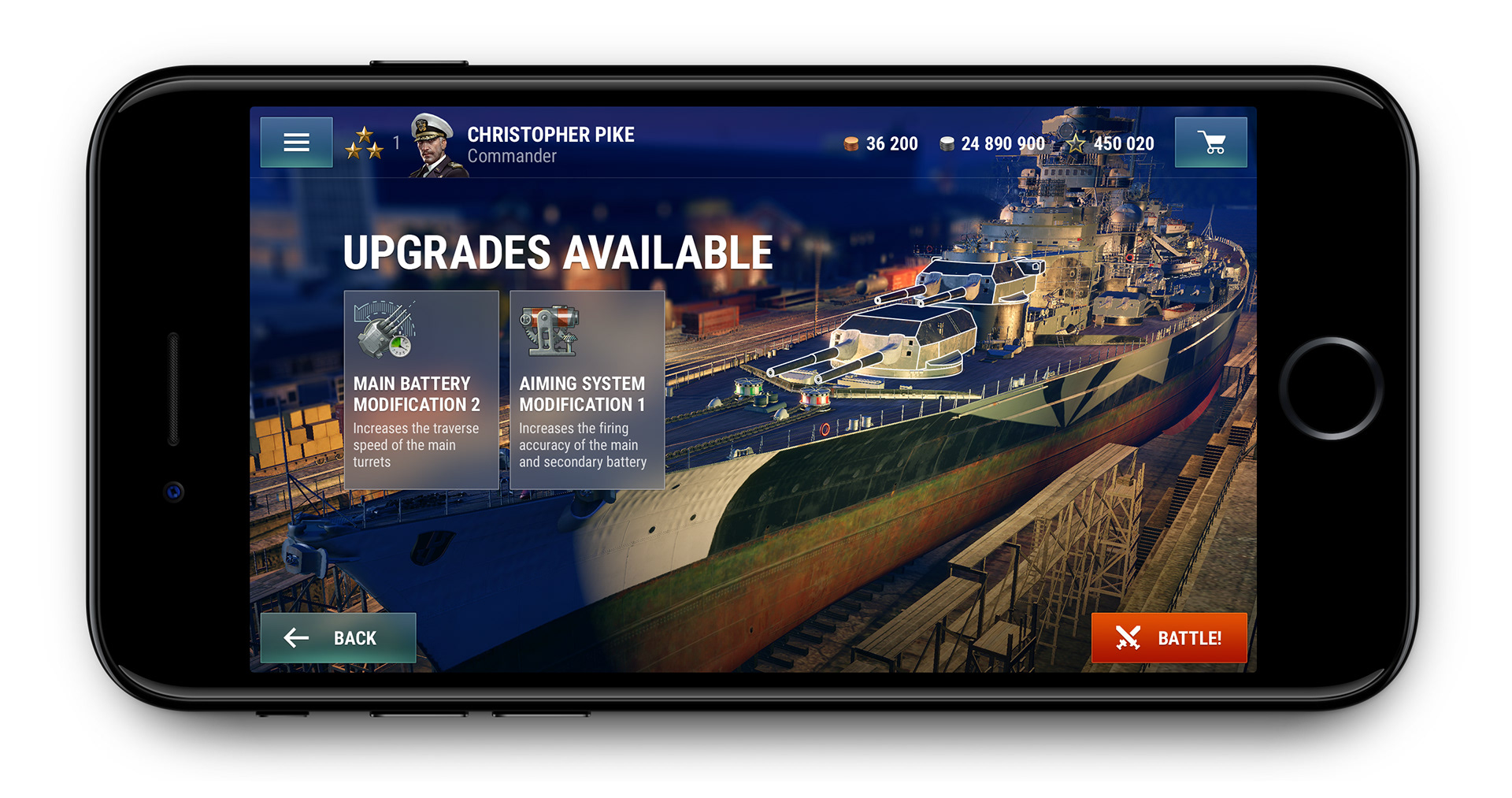
Let’s check an example from WoWS Blitz game. We know that most of the players use auto resupply of consumables. So we can move all consumables management from the home screen to one level deeper. Sure, we will not let our player to battle without consumables by gently reminding him in case he doesn’t have any. The same goes for upgrades — there is no need to put all the possible upgrades right on the home screen. We keep them on secondary level and we give user a possibility to upgrade his warship when upgrades are possible to unlock.
WoWS Blitz: fellow commander, we got some upgrades for your warship
I‘d like to make one more example of using common case from the Join app. We know our users and we use the data we have to simplify UI and flows. We do not only know users favorite bike and his current location, but also his behavior, type of rides he prefers, we know his favorite days and times for a ride. Based on this data we can make some bold assumptions and suggest perfect rides for our user. Or we can propose him to create a new ride and pre-fill almost all the fields. Actually user can create a ride just by pressing “Next” button three times. We use common case as the main case and leave enough room for user to adjust our assumptions.
Join app: creating new ride. We use collected data to prefill most of the fields. User can create a ride just by pressing green button three times.
Future proof
Provide scaleable solution that will be competitive in next years
This implies more than scalability of the UI across different devices or possibility to add extra elements to an existing UI component. We design a solution that not only covers the clients requirements, but that lasts. Each layout and control should handle future features and translations to other languages. Design should not only provide enough room for possible additional buttons or blocks, but lay out rules how new features should be added. That will allow new features become a natural part of the existing app without overcomplicating it.
To illustrate This principle I will show you two examples of WoWS Blitz lobby screen. First example is a screenshot from the first public release of the game. The screen is overloaded with all the available features and information. As you might notice this UI will hardly handle any more new features. The second example is a total rethink of both game UI and UX. We focused on the most important parts and moved all the secondary parts to the deeper levels. By doing so we got much more room for the future. We also provide more modern and competitive game UI rather than sticking to desktop games paradigms from the previous decade.
WoWS Blitz: beta where we started. To show you the informational overload I ask you to find the name of the warship

WoWS Blitz: radical change of UI. Enough space for new features.

This last set of images is also a good example of using design principles in a design process. You can clearly see the difference between a messy and chaotic interface and an interface built on concrete design principles.
* * *
That’s it, my fellow designers. I would like to emphasize one more time that the list of principles is just a set of my favorites. The list is flexible, so you can easily add and remove items from your deck. Also I would advice to shape each principle into a clear and tangible sentence to avoid misinterpretations. You know, not to long and not to short.
I hope you will find a good use of this powerfull tool. And please share your thoughts if you already use principles for your work!
* * *
Big respect to Florian Laroye for great support on Join work and Alexander Volyanyuk for a lot of psychology theory and for the help of shaping principles into tangible list.