
The very first in-car navigation system came with a set of paper maps that scrolled while the car was moving. It worked perfectly fine for the 1930’s, provided that you didn’t need to get off the route a lot.
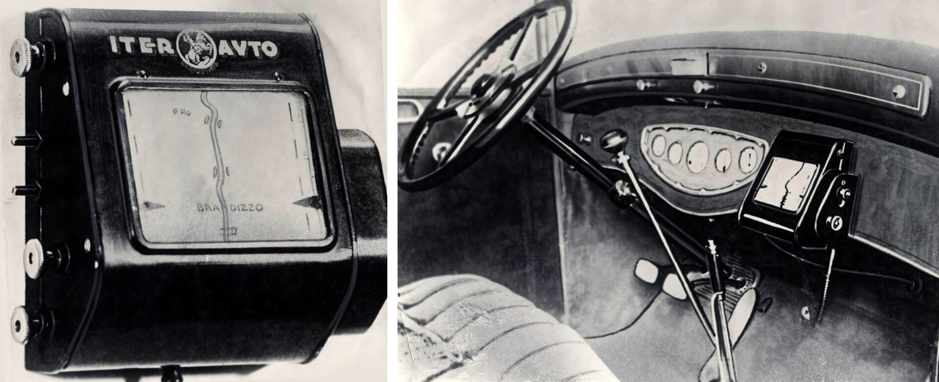
Iter Avto (source: http://www.dailymail.co.uk)
Thanks to the progress of technology, now we don’t need to insert a new paper roll to change our destination. In most cases we can use voice control or buttons on a control panel or on a steering wheel.
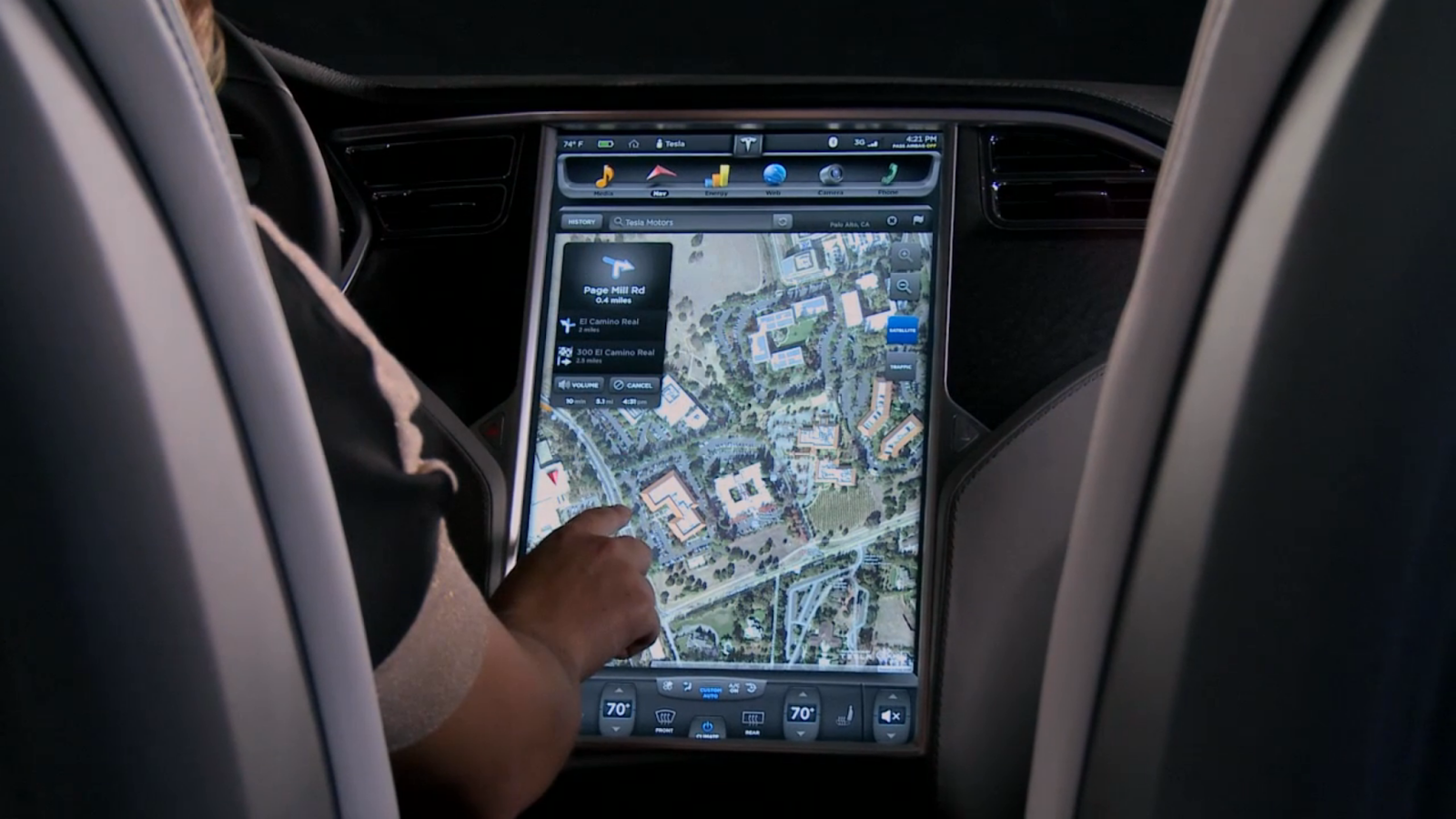
Tesla touchscreen (source: http://www.teslamotors.com)
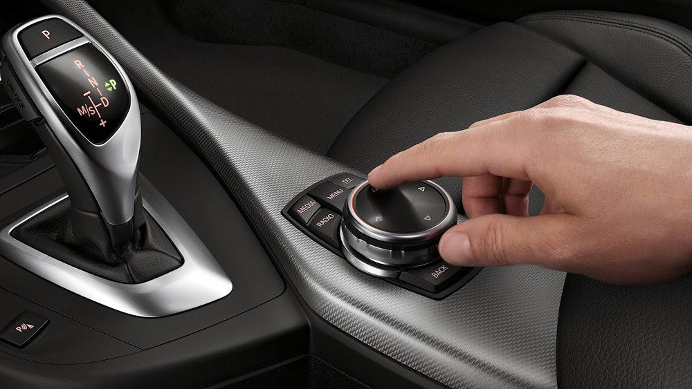
BMW iDrive touch knob (source: http://www.bmw.com)
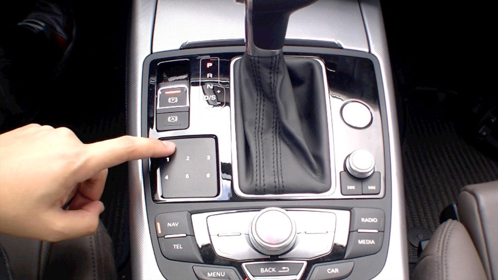
Audi MMI touch pad (source: http://www.audiusa.com)
In fact, there are even more interaction options. There is, for example, a knob that can be pushed and rotated. It was introduced by BMW in its iDrive system back in 2001. It turned out to be a good idea and now the whole iDrive interface is built upon it. Audi added a similar control together with a multitouch trackpad in its MMI system. BMW went further and made the knob itself respond to multitouch gestures.
It might sound strange, but not so many systems have a touchscreen. With all the smartphones and tablets all around, a multitouch screen seems to be a common thing, but for in-car systems it is still fairly new technology. Yes, Renault uses one in its R-link system, Volvo is adding it to its next model, and Tesla, of course, is famous for its huge touchscreen display, but most of the car brands are not there yet.
Built-in car navigators have access to all data input and output methods provided by the car and can thus provide a very consistent user experience. Unfortunately, this is not always the case. Some manufacturers just don’t invest enough into the navigator’s design and it looks a bit outdated and out of style. And some, like Tesla, use third-party navigational systems that were not even initially designed for in-car usage and might even have different styling than the native system. It is a pity that Tesla with its innovative technologies and huge touchscreen display doesn’t offer anything new in terms of navigation.
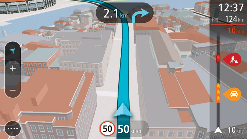
So how does one design an in-car navigation system? When you think about it, imagine that you are looking at a map at arm’s length and a bit from above. Now imagine that you are in a moving car and that you need to stay focused on the road. UX design is very important here. Every element should be visible, readable and at the same time not distracting. Focus should be on what is important to the driver: current route and relevant route info.
BMW iDrive (source: http://www.bmw.com)
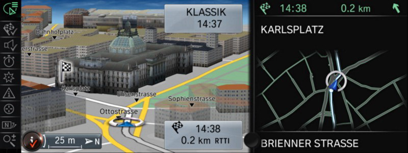
The readability of this map in BMW iDrive it is pretty low. This dark text is hardly visible. The designers tried to fix it by adding some white strokes, but it didn’t really help. What they could have tried instead is to give the buildings less contrast. After all, they are not there for decoration; they are supposed to help to navigate. Now they only add to the confusion, and the current route gets lost. The panel with the next instructions contains a simplified copy of the map where most of the information is duplicated. Luckily, iDrive has a screen that is big enough, but it wouldn’t be needed if the main map was readable.
Renault R-Link (source: http://www.renault.com)
Renault R-Link doesn’t have a problem with buildings with too much contrast because it doesn’t show any buildings in 3D mode. There is not even a difference between land texture inside and outside of the city. This is also not good. When used wisely, buildings help to navigate. Over saturated colours here are a legacy of old times when screens had less colour depth and designers had to use contrast and bright colours. It’s not needed now, and auxiliary elements could be less invasive if they were not so bright. Notice also the panels with info and route instructions: they do not take a lot of screen space, and the next instructions and traffic info is still perfectly readable.
Audi MMI (source: http://www.audiusa.com)
Look at how Audi deals with the buildings: everything except for the landmarks is just a plain white box. The font could be thicker and more condensed and so precious screen space would be used more wisely — the two panels on each side of the screen take too much attention from the map itself. Still, the readability of this map is pretty high.
Another class of in-car navigators are third-party navigation devices that people buy when the built-in system is not enough. External devices can’t offer the integrated feeling that built-in systems provide, but they can focus on navigation and make it good.
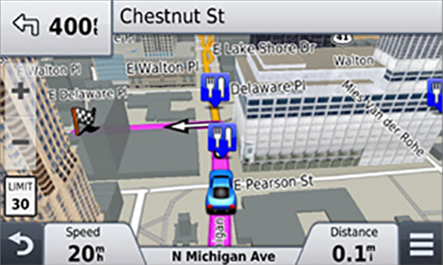
Garmin Nuvi (source: http://www.garmin.com)
Garmin is one of the most popular navigator brands. But it has followed its classical style ever since it first launched in 2005. Ten years later, their interface definitely needs a revision. All this variety of visual styles and elements on one screen is very distracting. Still, the focus stays on the map and the panels don’t take more screen space than needed. Notice also how they show non-important buildings as non-detailed blocks, the same way as Audi’s system does. Plus, these blocks are semitransparent which make all the roads more noticeable, but also add some visual noise to the picture.
TomTom Go (source: http://www.tomtom.com)
Another big company, TomTom, has recently completely revised its interface. They used soft, pale colours for buildings and backgrounds and bold, saturated colours for current road and traffic info. If we compare the new style with the previous generation, used in Renault’s R-Link, we can see how a different colour palette, buildings, semi transparent panels and simplified icons significantly improve readability. The emphasis now is only on what’s important.
An interesting approach was introduced some time ago by Apple, then Microsoft and now also Google. The system integrates into the car, gets access to all native input and output methods, and allows to use many smartphone features, including navigation. It sounds promising, but the integration with a third-party system is a very challenging task, so a lot depends on how good this idea will be implemented.

Microsoft Windows in the Car concept (source: http://www.microsoft.com)
Android Auto (source: http://www.android.com/auto/)
All three systems follow the latest trend to minimalistic design focused on the content and look stylish and modern. They all use their own maps, adapted for an in-car usage. We could name some drawbacks in all systems, but it is too early to judge yet. All three systems are still in development and there is still a lot to be done.
* * *
So where are we going from here? Something that I think is very likely to happen is that projector systems will become much more common. Attempts have been made in this direction for quite some time already, but most of them failed. Most of the companies tried to project the information right on the windshield, but it was hardly visible during daylight hours.
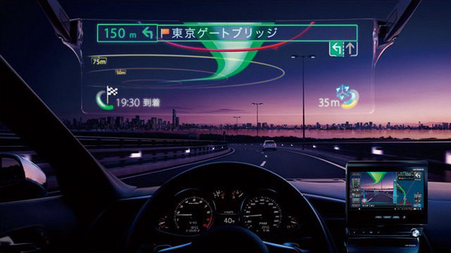
Pioneer projector system (source: http://www.pioneer.eu)
But a completely new approach is used by Pioneer. A DLP projector creates a 30-inch display which has the appearance of being three meters in front of the driver. The projection is perfectly visible even during the day. It might not be the final solution, but it is a big step. Common usage of a system like this would mean a whole new era in navigator interfaces. Imagine it. The driver won’t need a map or a 3D-view with landmarks. The route and all the important data can be projected right in front of him. It also means less distraction from the road.
Auto market is not so inert as it might seem and in-car navigator systems are evolving very fast. It’s hard to be sure in anything, but one thing I’m absolutely confident about is that in 80 years today’s in-car navigators will be displayed in the museums together with the old mechanical map rolls devices.