iOS 26 introduced a new visual language for the operating system, but one of the most fundamental changes isn’t the “liquid glass” – it’s the alarm clock UI. The design of this app stepped aside from the visual patterns in the design system and finally became user-friendly.
If you’re anything like me, the only thing you want to do when the alarm rings is turn it off immediately (ideally by tapping anywhere on the screen). Power users of previous iOS versions knew that buttons could be customized, and many of them removed the “Snooze” button entirely (keeping only “Stop”). That helped, but it didn’t really solve the problem, because the button itself was still just a small, standard target.
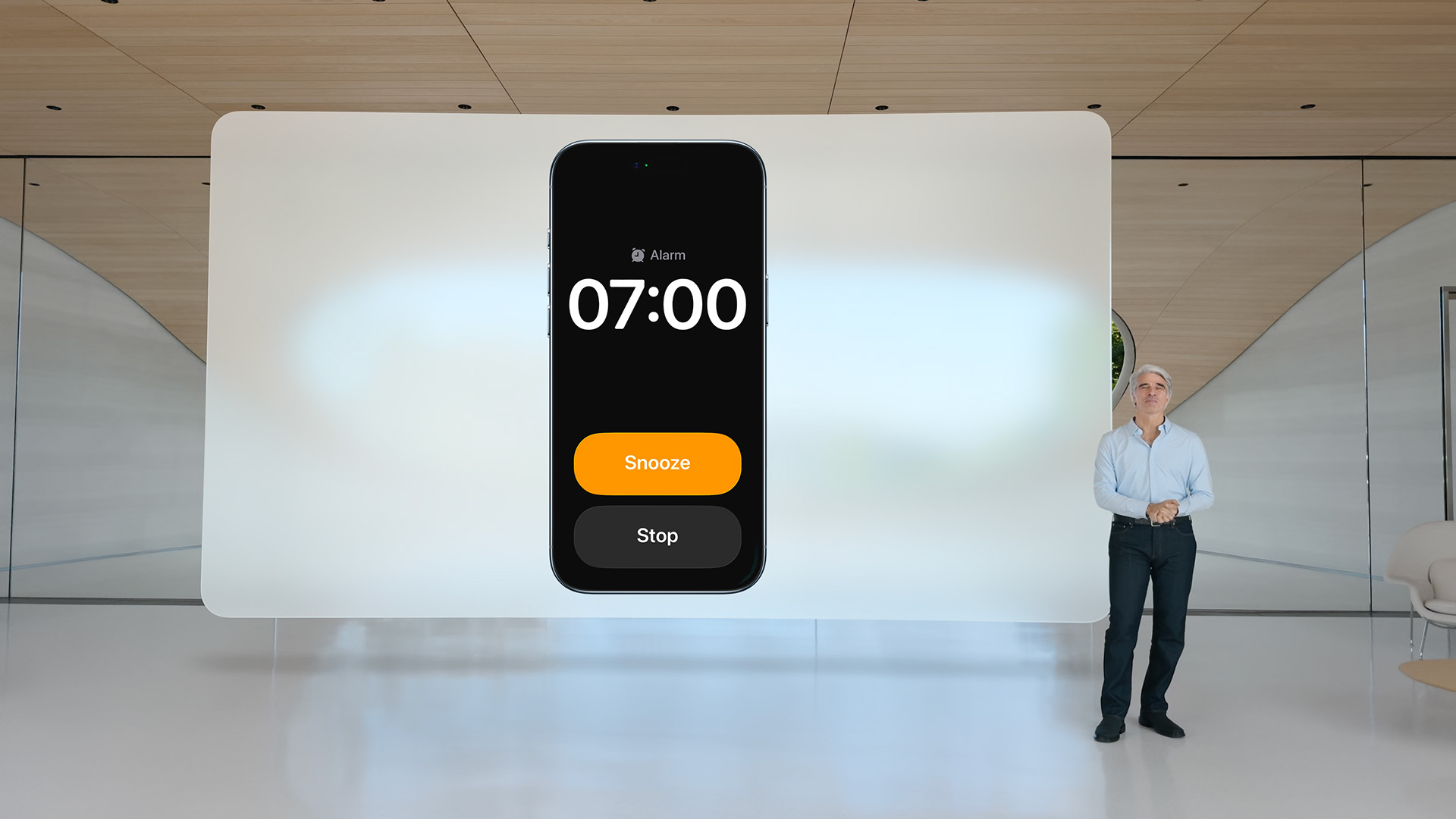
Since around 2019, I’ve been watching the iOS design team caught between two fires: on one side, consistency (all buttons look the same); on the other, use-case driven design (buttons adapt to the situation). With iOS 26, that battle seems to be settled: the alarm clock finally gives us big, obvious buttons.
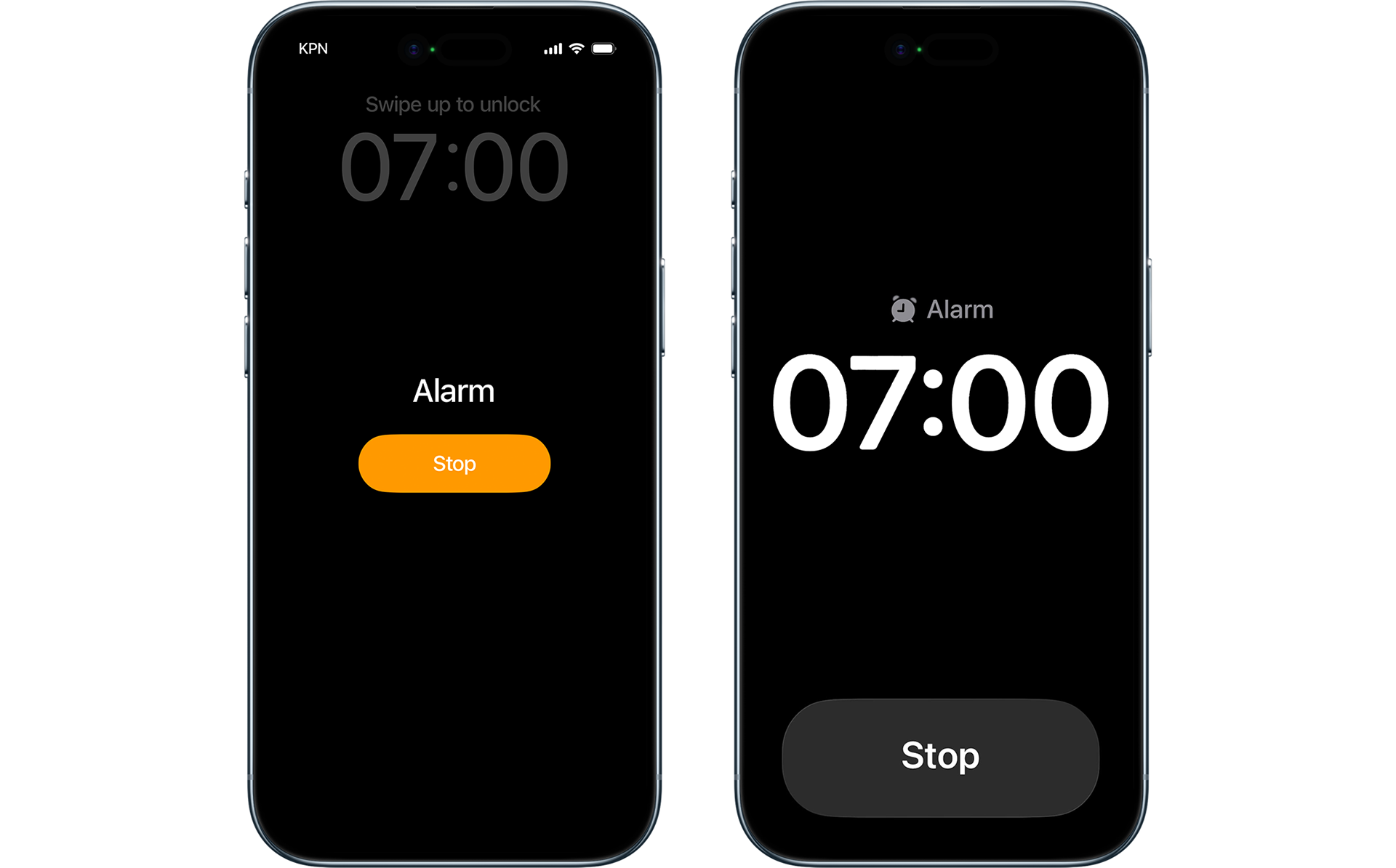
The alarm screen that greets me every weekday. Left: iOS 18. Right: iOS 26. I never use “Snooze,” so that button is disabled.
If you have ever used Apple Maps in the car on an iPhone screen (or if, like me, you design car navigation systems and know what button sizes the major players in the navigation industry rely on) then you’ve already seen another case where Apple bent its own system several versions ago. In guidance mode, Maps uses one set of buttons when you’re just exploring the map, and another when you actually start driving. The principle is simple: on a small phone screen in a moving car, the driver needs the largest possible touch area.
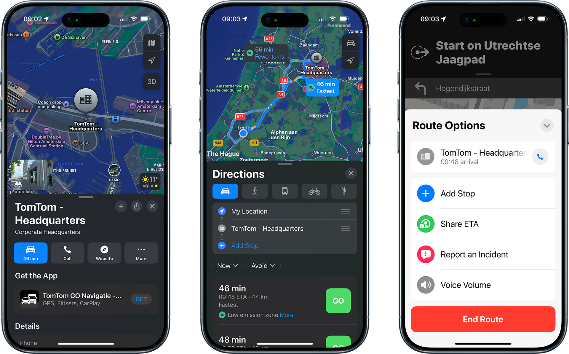
Difference in button sizes: browsing (left), route planning (center — note the difference between “Go” and the close panel button), and route options while driving (right). Example from iOS 18.
This alarm clock interface fascinated me for years. How many product designers inside Apple must have argued over it? And why did the alarm clock, of all things, remain so stubbornly difficult to use?
At some point, I even came up with a theory. It reminded me of the spacecraft Vostok-1.
In 1961, Soviet cosmonaut Yuri Gagarin orbited the Earth in a fully automated spacecraft. But there was also a backup system. He carried a sealed envelope containing a math problem. Solving it revealed a code that unlocked manual control — in case of an emergency. This precaution was meant to address the unknowns of human behavior in extreme conditions, including the possibility of panic or loss of control.
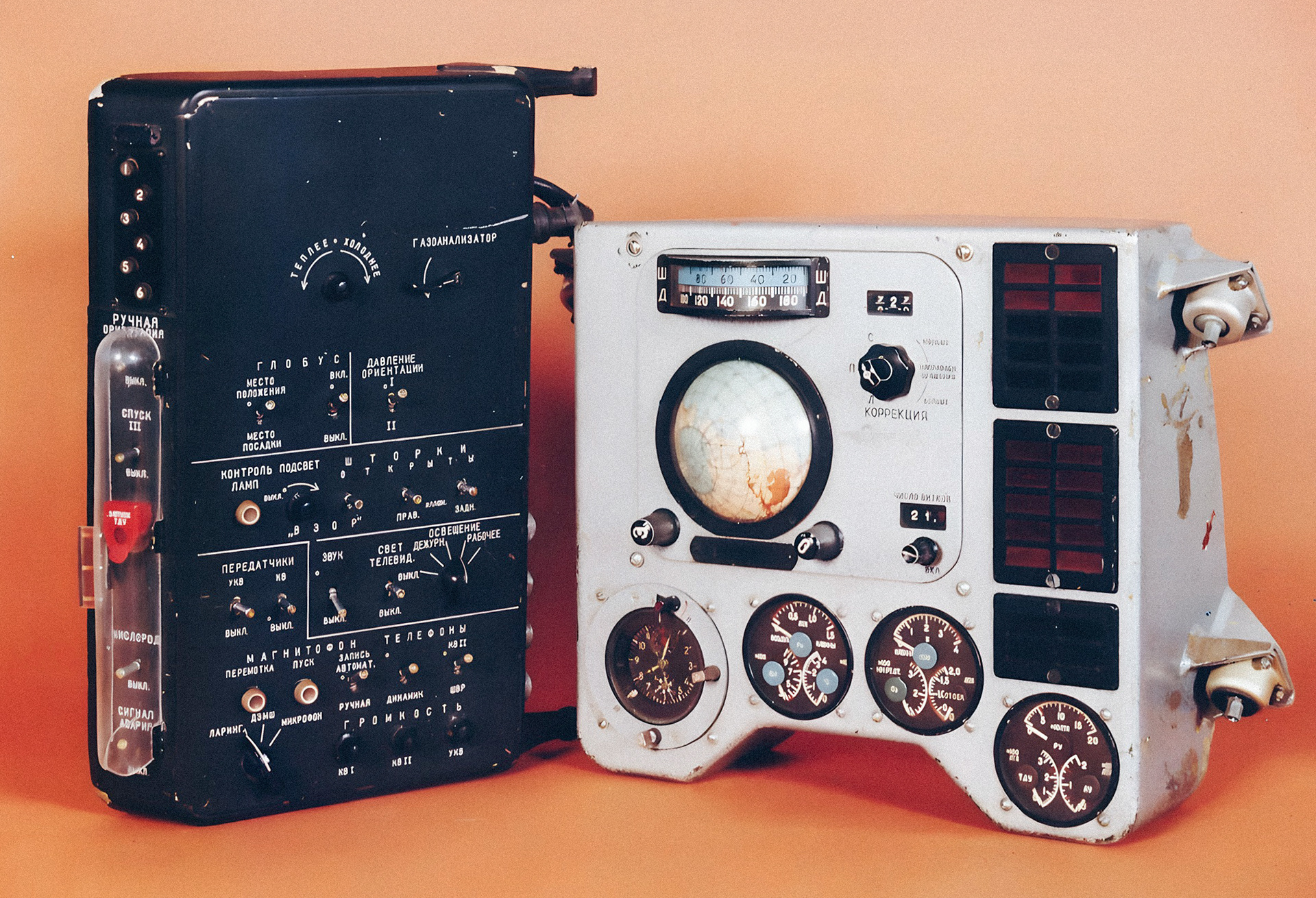
Control panels of the Vostok-1 spacecraft. At the top left are six buttons for entering the code to unlock manual control.
So I guess the alarm clock interface worked much like that manual control code on Vostok-1, at least until iOS 26. It didn’t let you casually kill the alarm and drift back to sleep. Instead, it forced a series of deliberate actions: open your eyes, find the right button, and press it with precision. Only then could the system be sure you were truly awake.
With iOS 26, Apple chose the human over the system for this small but essential interface. Just like Gagarin’s sealed envelope on Vostok-1, the old alarm clock design forced you to prove you were fully awake before you could take control. Now that barrier is gone, and I wonder, will we see more fluent interfaces that adapt to the situation and focus on essentials?