
01.
Goal
To envision an Apple Watch experience for Connexxion that lets users take public transport effortlessly – keeping their phones in their pockets, yet never losing control of their journey. The concept needed to clearly define the app’s feature set, structure, and visual identity – strong enough for a client pitch, refined enough for smartwatch use.
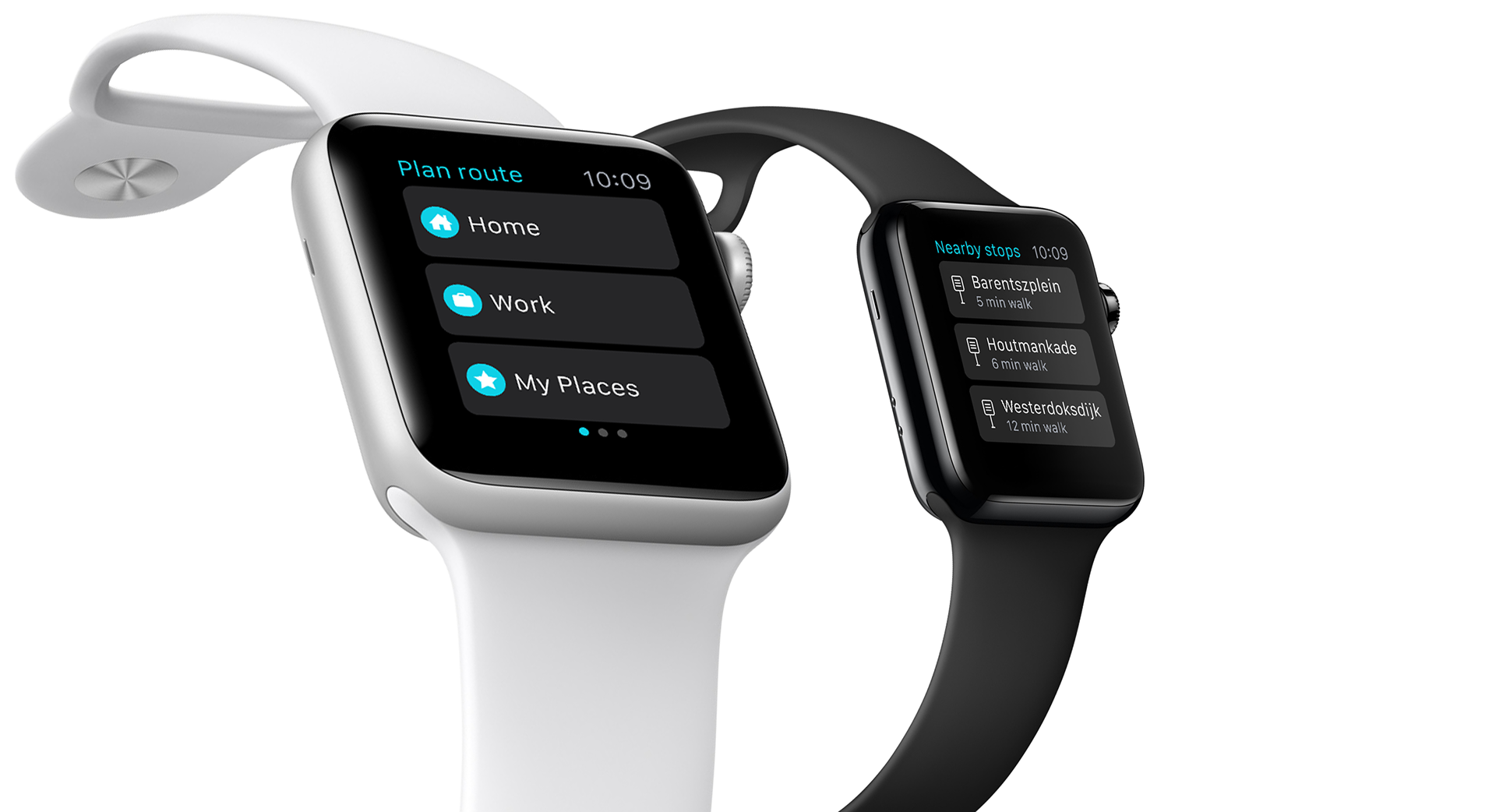
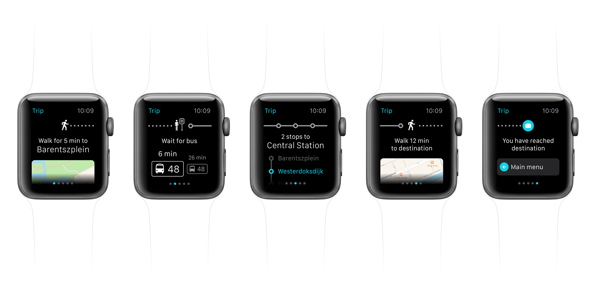
02.
Trip planning
Users pick their destination, and the app suggests the optimal route. Each step of the journey is broken down into clear instructions, with essential travel information at a glance.
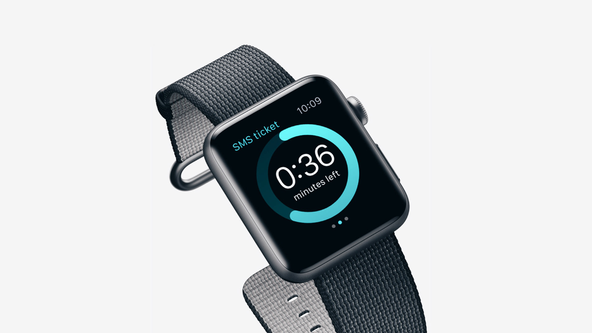
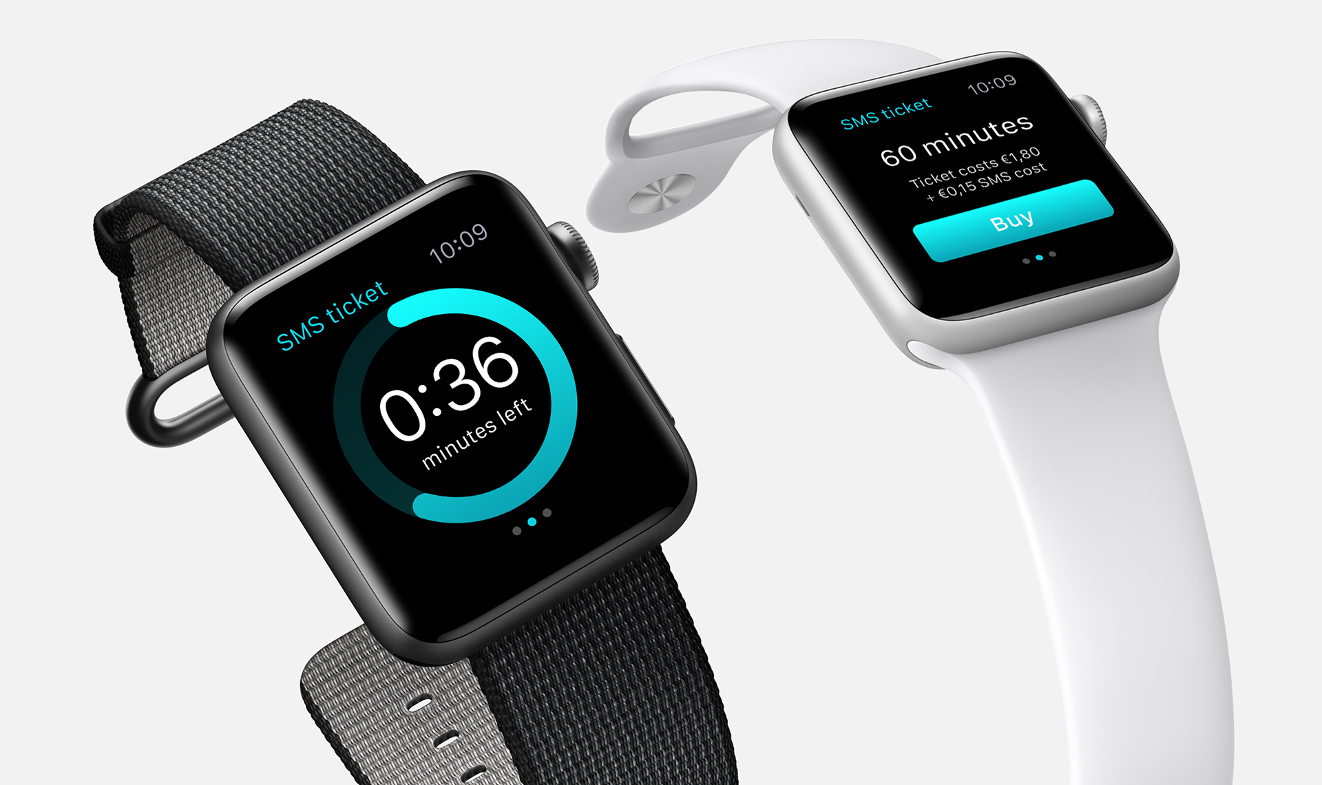
03.
Ticket purchase
A streamlined UI lets users buy tickets right from their watch. A progress bar shows how long the ticket remains valid, and a notification warns before expiration – so users never ride without keeping track.
04.
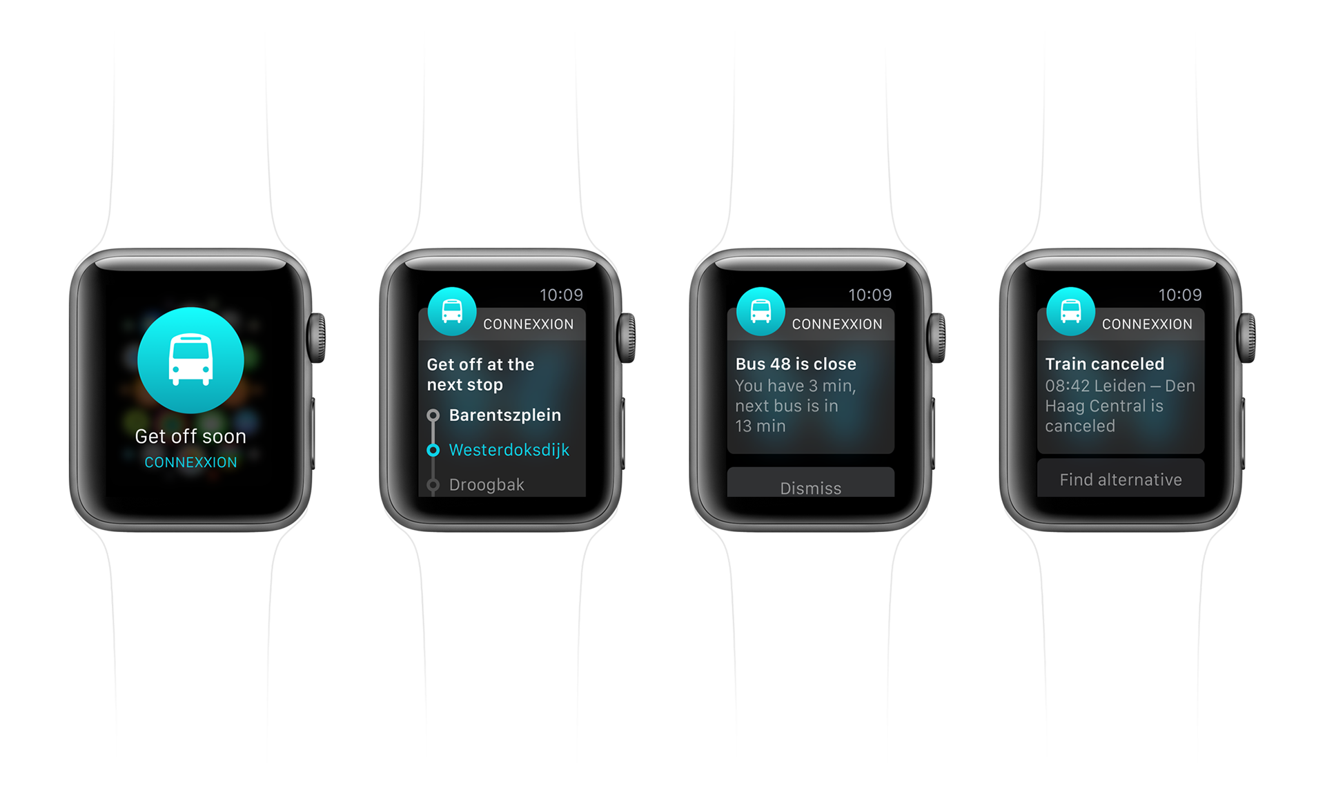
Notifications
Push communication without disruption: alerts for delays, cancellations, or ticket expiry. All delivered even when the app is closed, so users are always up to date.
05.
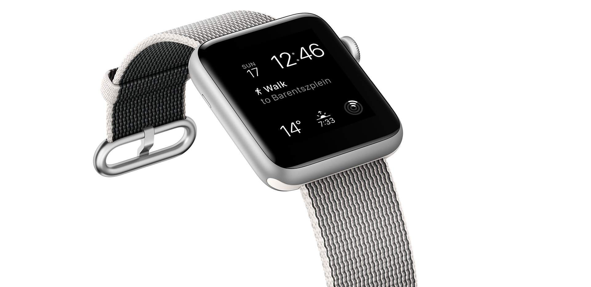
Complications
Vital data surfaces directly on the watch face. Real-time travel updates: current navigation step or ticket status, always visible without extra taps or unlocking the app.
06.
Result
The full concept was designed, documented, and presented to the client. Although development was postponed due to shifting priorities, the exercise sharpened my understanding of designing for wearables — what matters in glanceable interfaces, what users expect from notifications, and how visual simplicity becomes critical in small form-factors.