
01.
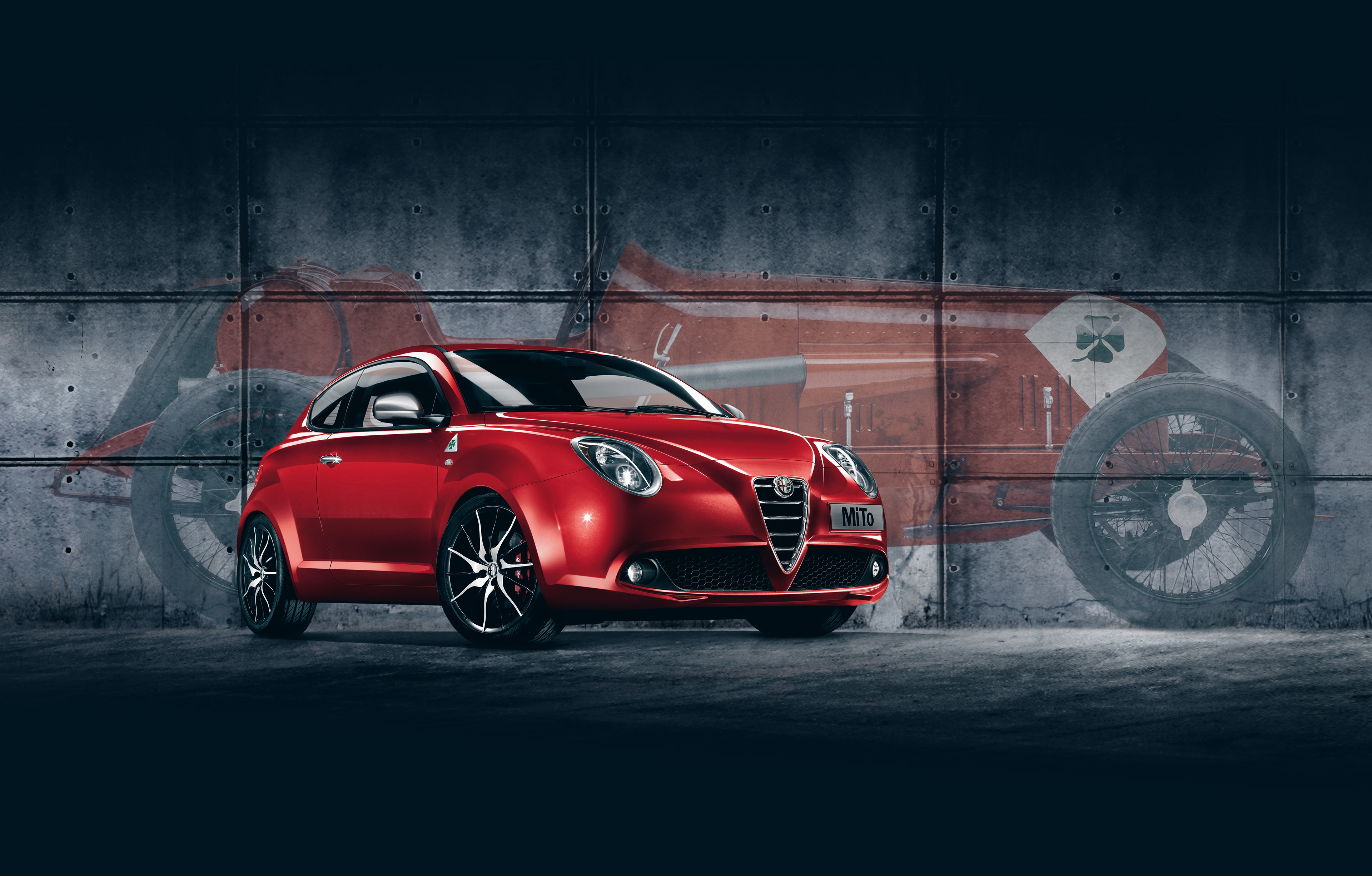
Goal
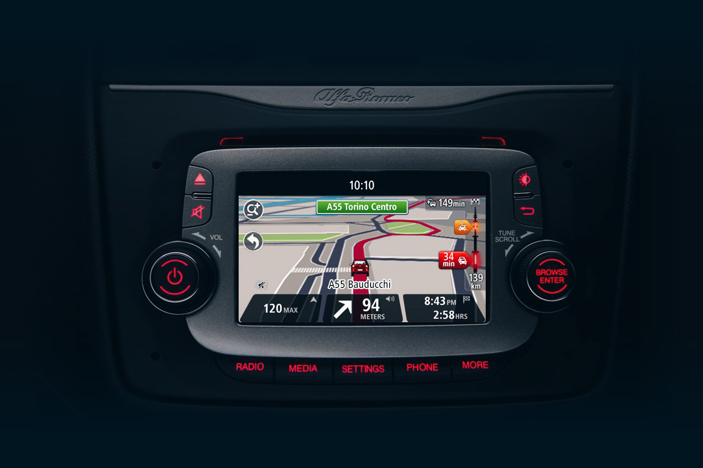
Adapt TomTom’s navigation interface so it feels native in the Alfa Romeo Mi.To – preserving full functionality while aligning with the brand’s styling. The aim was to deliver a UI that looks and behaves like it belongs in Alfa’s cockpit, yet remains fully usable, meeting all in-dash demands.
02.
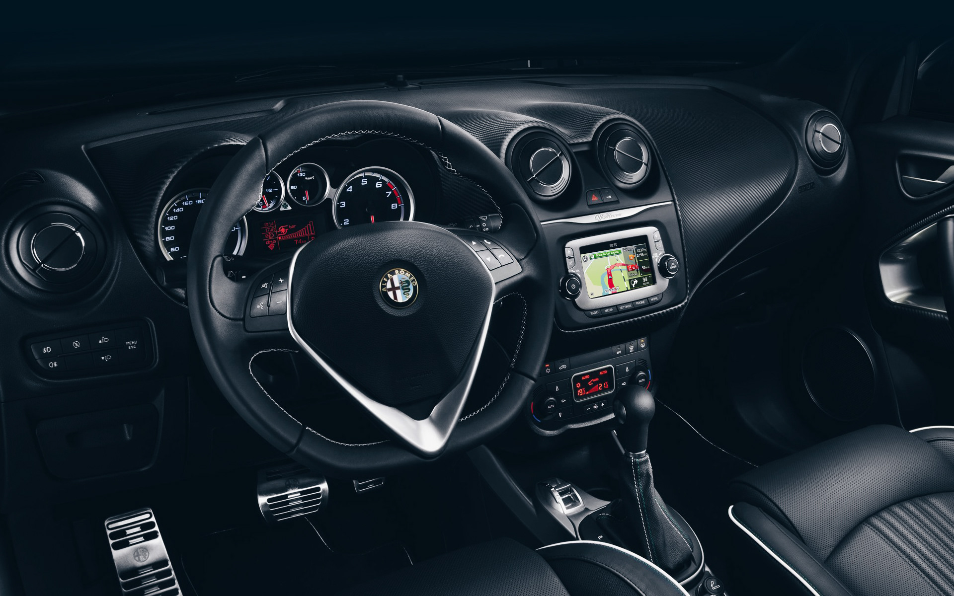
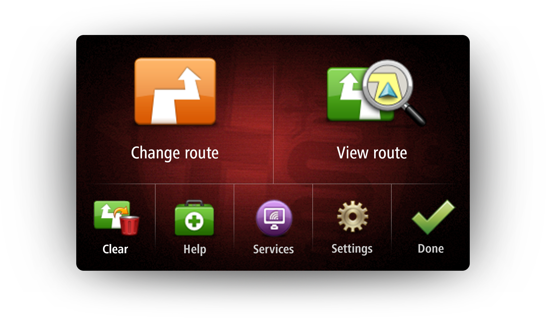
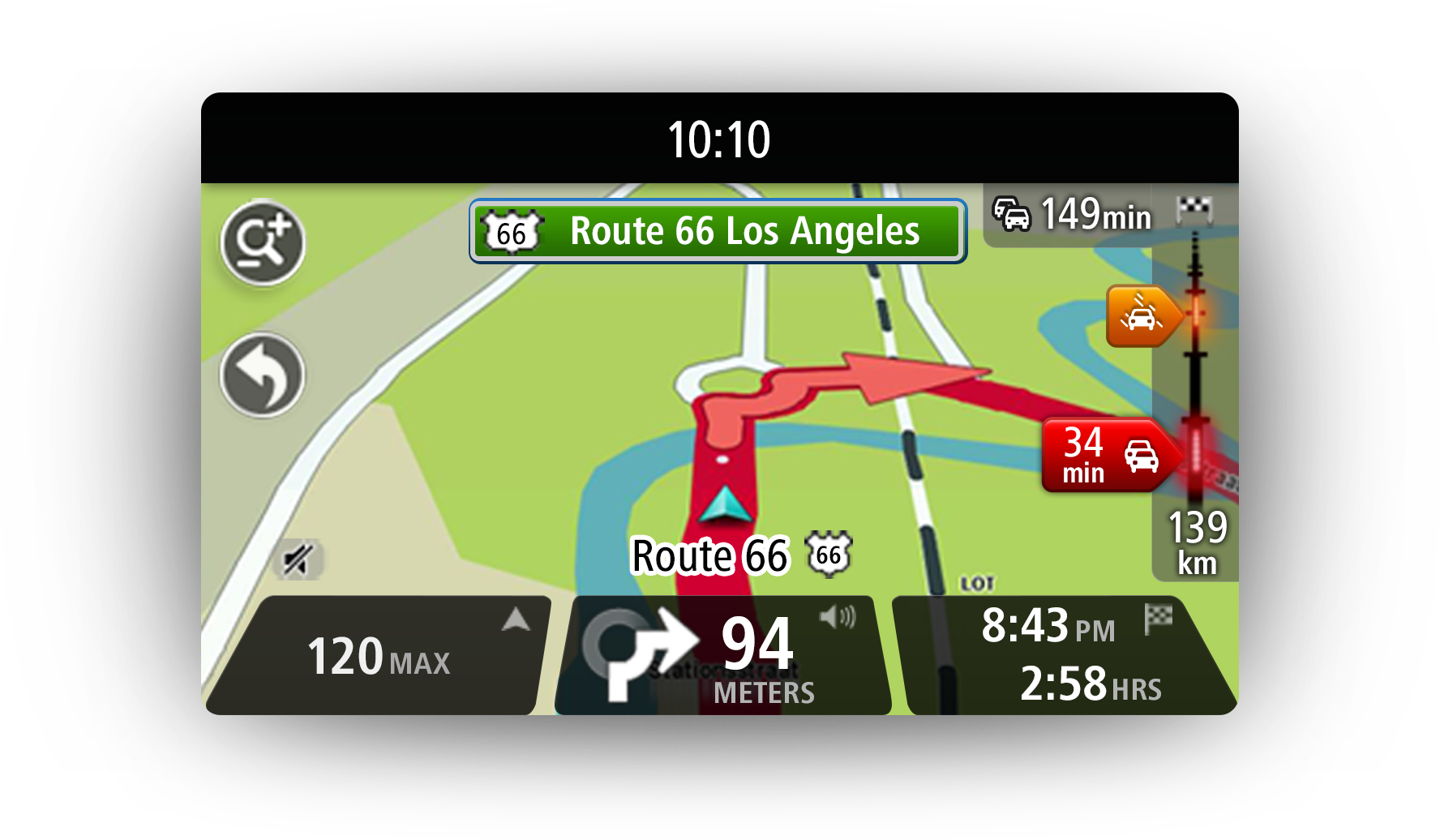
Interface
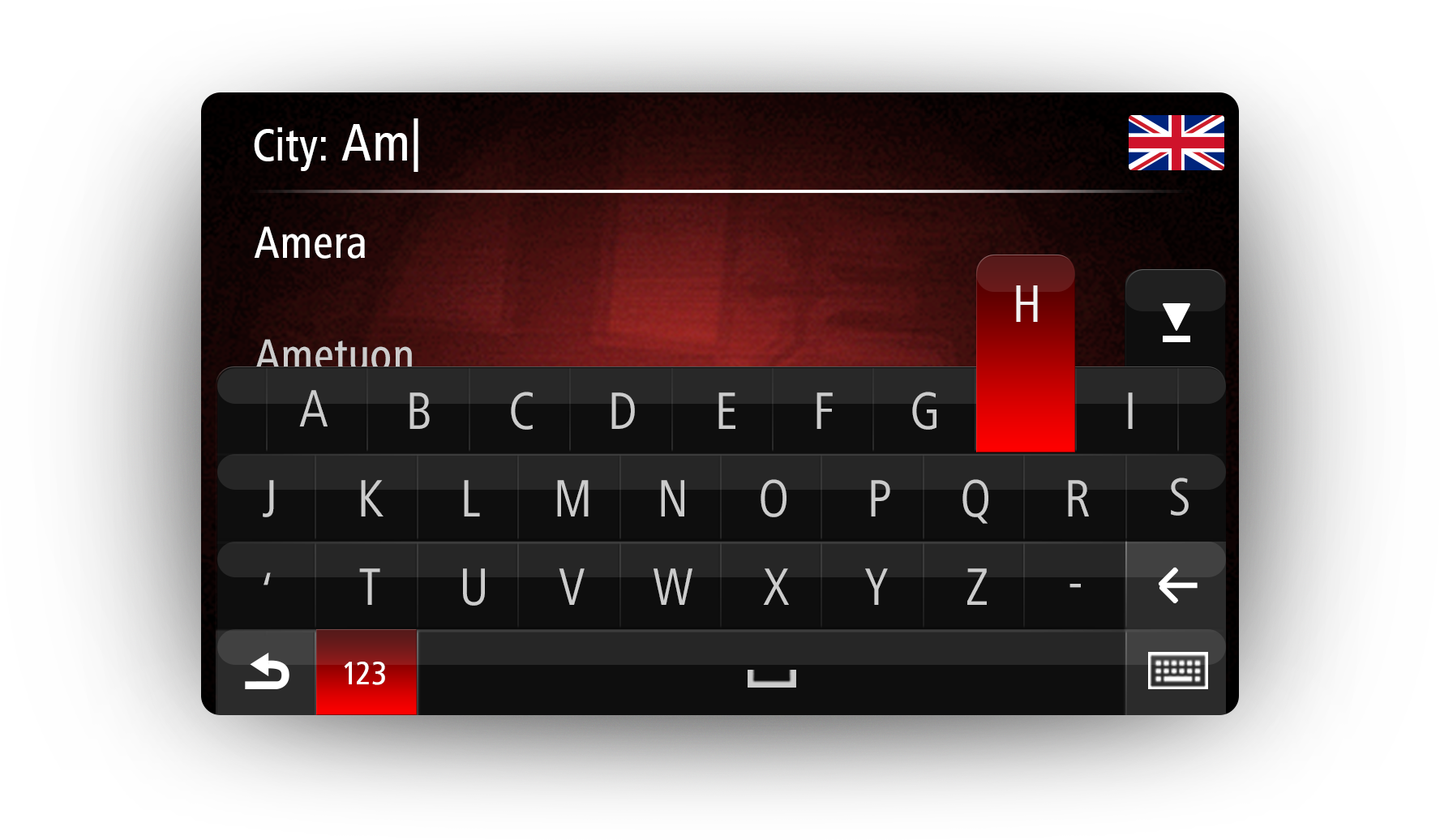
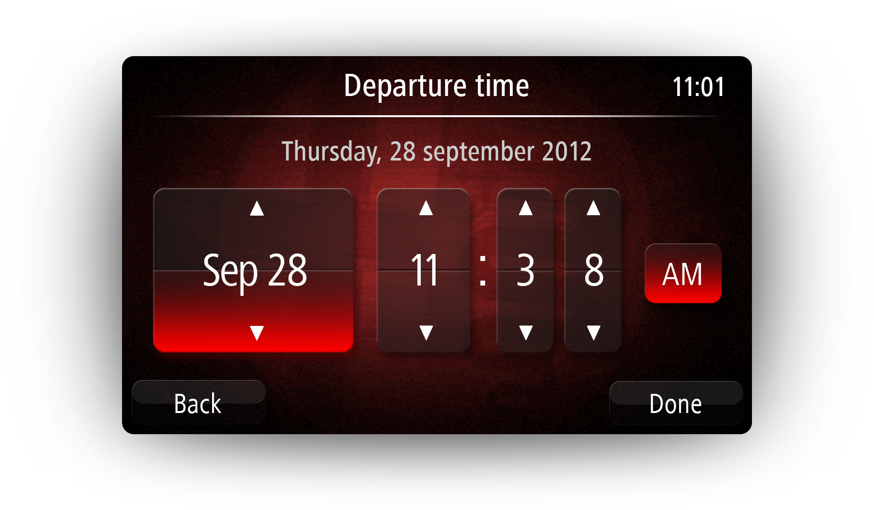
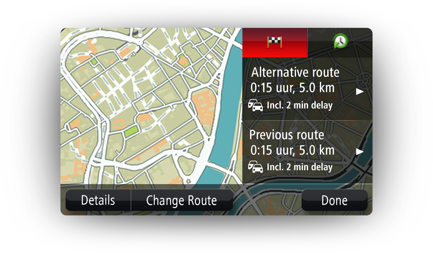
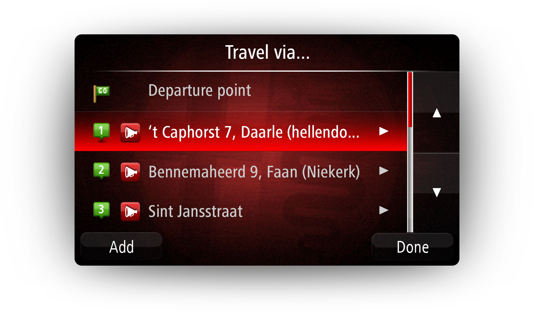
In-dash navigation demands clarity under pressure. Every UI element must be readable at a glance and from a distance, meeting strict safety requirements. To ensure this, I crafted a comprehensive style guide covering all controls, then applied those standards screen by screen. I also created all required visual assets and supported the development process to guarantee consistency.
03.
Result
This project was an early but pivotal moment in my career. It exposed me to the complexity of automotive UI: the long development cycles, tight safety standards, and the challenge of adapting one interface to another while maintaining stylistic continuity.
It was also the first time I needed to minimize visible seams between design systems – ensuring that the transition from generic TomTom visuals to Alfa Romeo styling feels seamless and native.