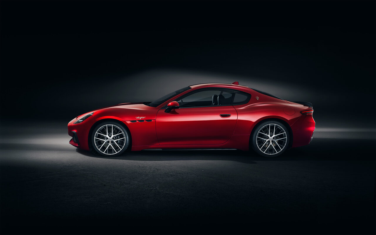
Maserati GranTurismo
Driving experience UI design
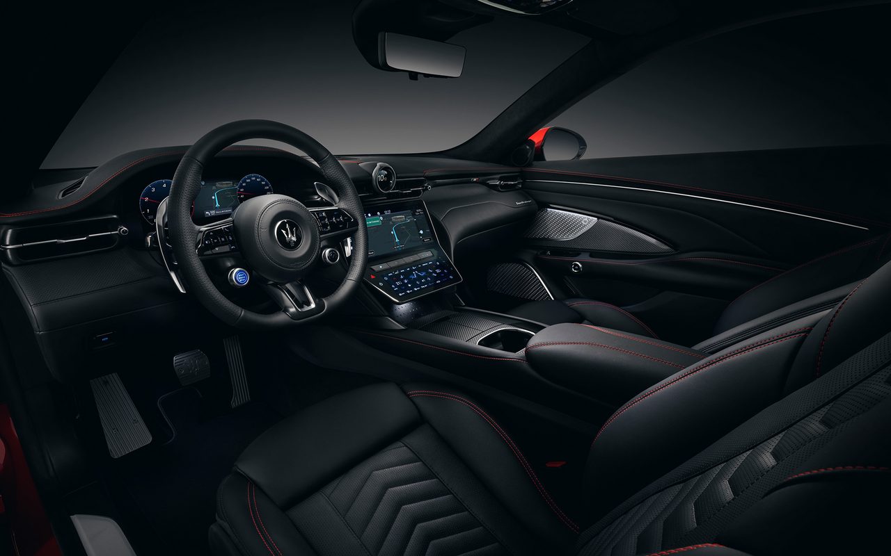
- Client
- Fiat Chrysler Automobiles
- Agency
- TomTom Automotive, Amsterdam
- Role
- Senior UX/UI Designer
- Date
- November 2019
01. Goal
The task was to adapt TomTom’s navigation product for the new FCA platform, used across multiple brands within the Fiat Chrysler group. The interface, originally designed for personal navigation devices, required a full redesign and additional functionality to work seamlessly in embedded systems. Each brand demanded custom adjustments to reflect its identity and fit various screen sizes and positions inside the vehicle.
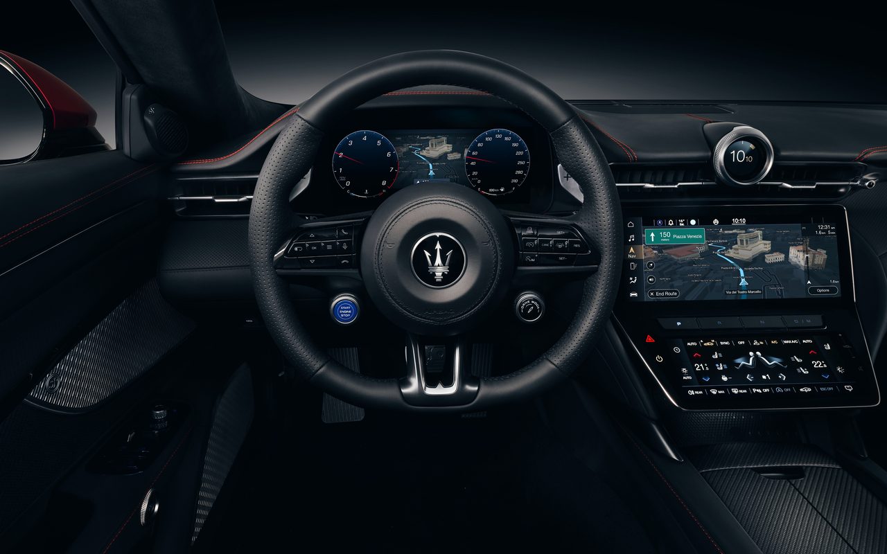
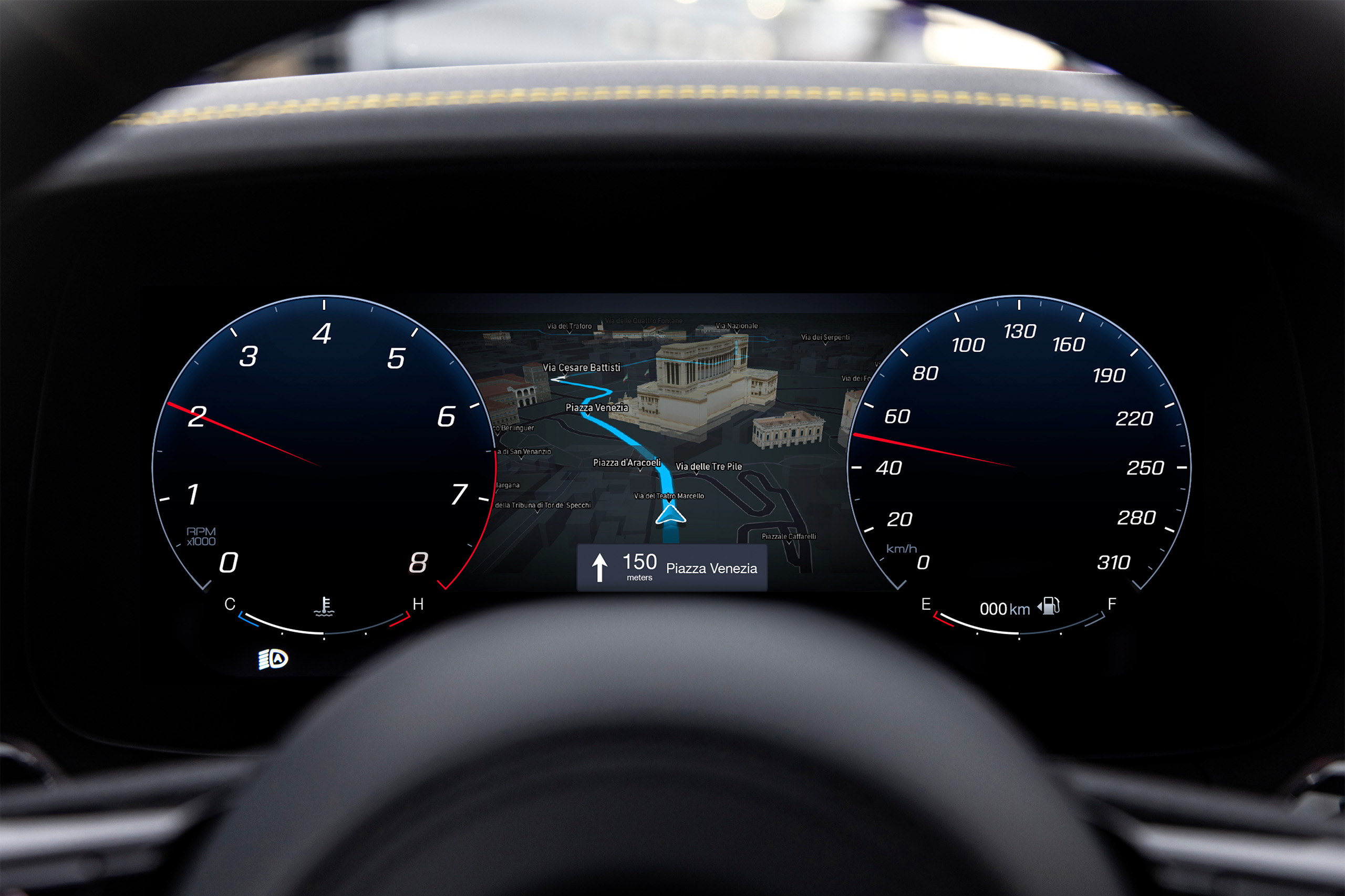
The goal was to make the product scale effortlessly across center-stack, cluster, passenger, and HUD screens, while maintaining a consistent logic and visual flow. A strong focus was placed on localization for different markets, with the final solution successfully integrated into the Maserati GranTurismo for both CSD and cluster use.
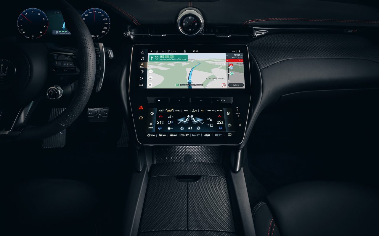
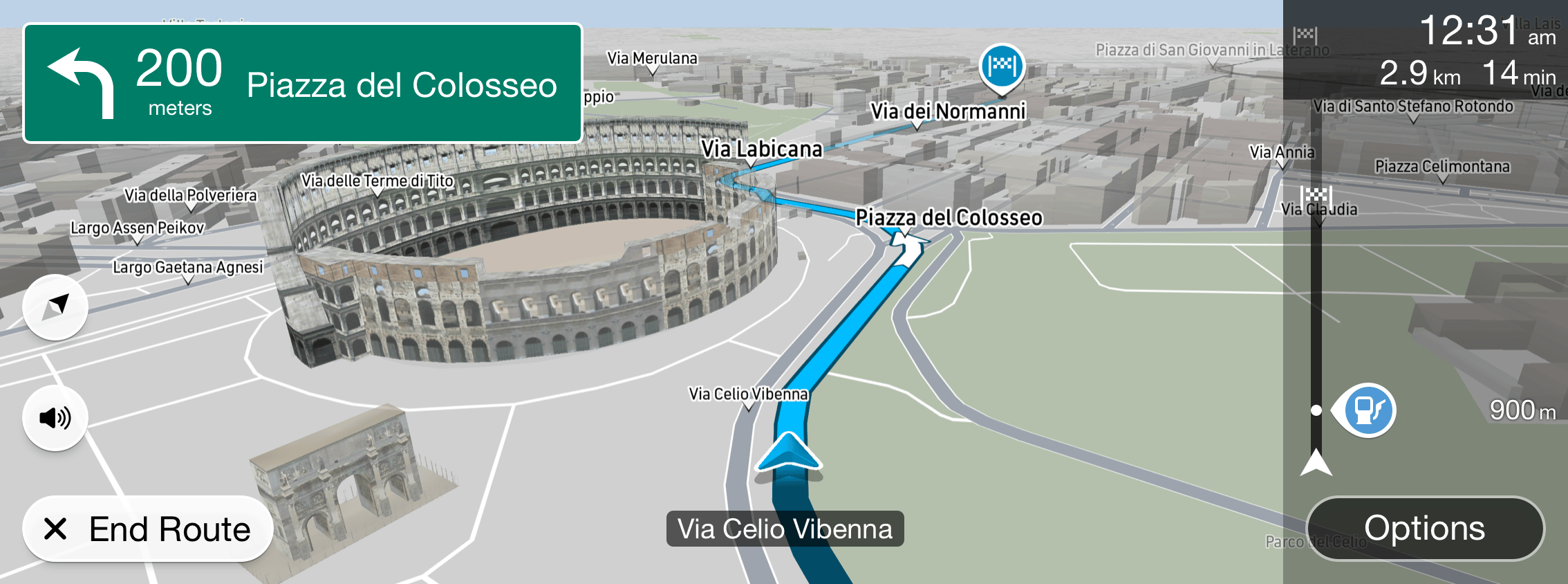
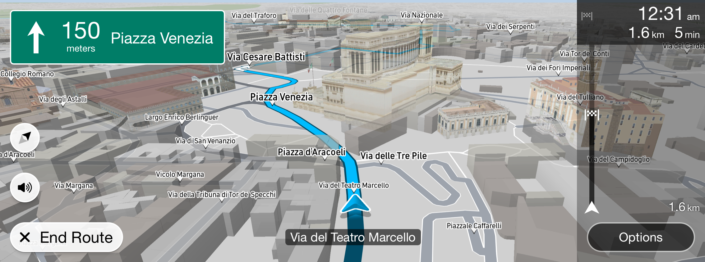
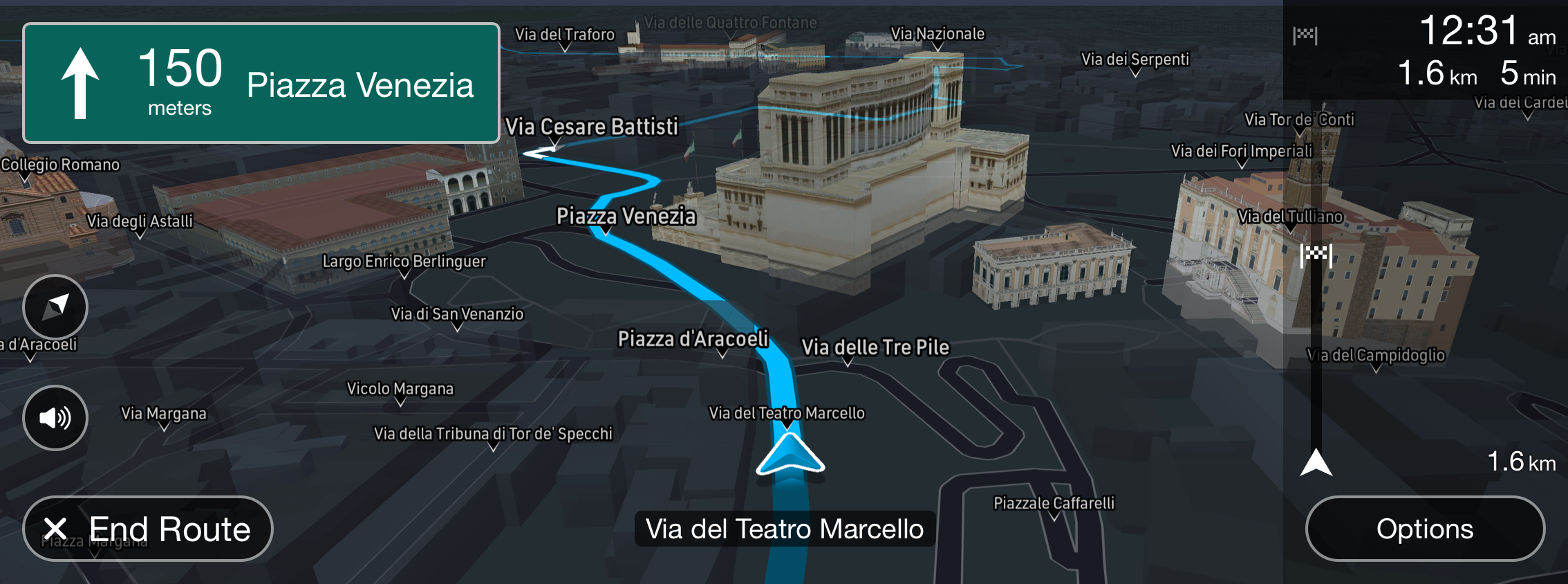
As a UI/Visual designer, I worked on multiple parts of the navigation experience, with a key focus on the driving UI – refining next-instruction and ETA panels for maximum clarity and legibility in motion. Whether driving through city traffic or along a highway, the interface had to stay calm, readable, and precise.
02. Approach
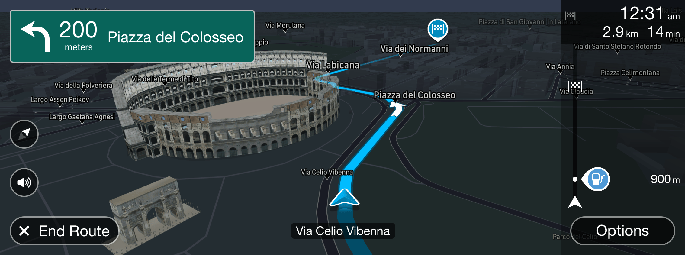
The navigation interface included several functional areas – destination search, adding stops, settings, guidance, and arrival. My main focus was a full redesign of one of its most critical components: the next instruction panel.
This element directly affects how quickly a driver can react and complete a maneuver. We replaced abstract graphics with a clear, road-sign-like design that communicates instructions instantly and feels natural in context.
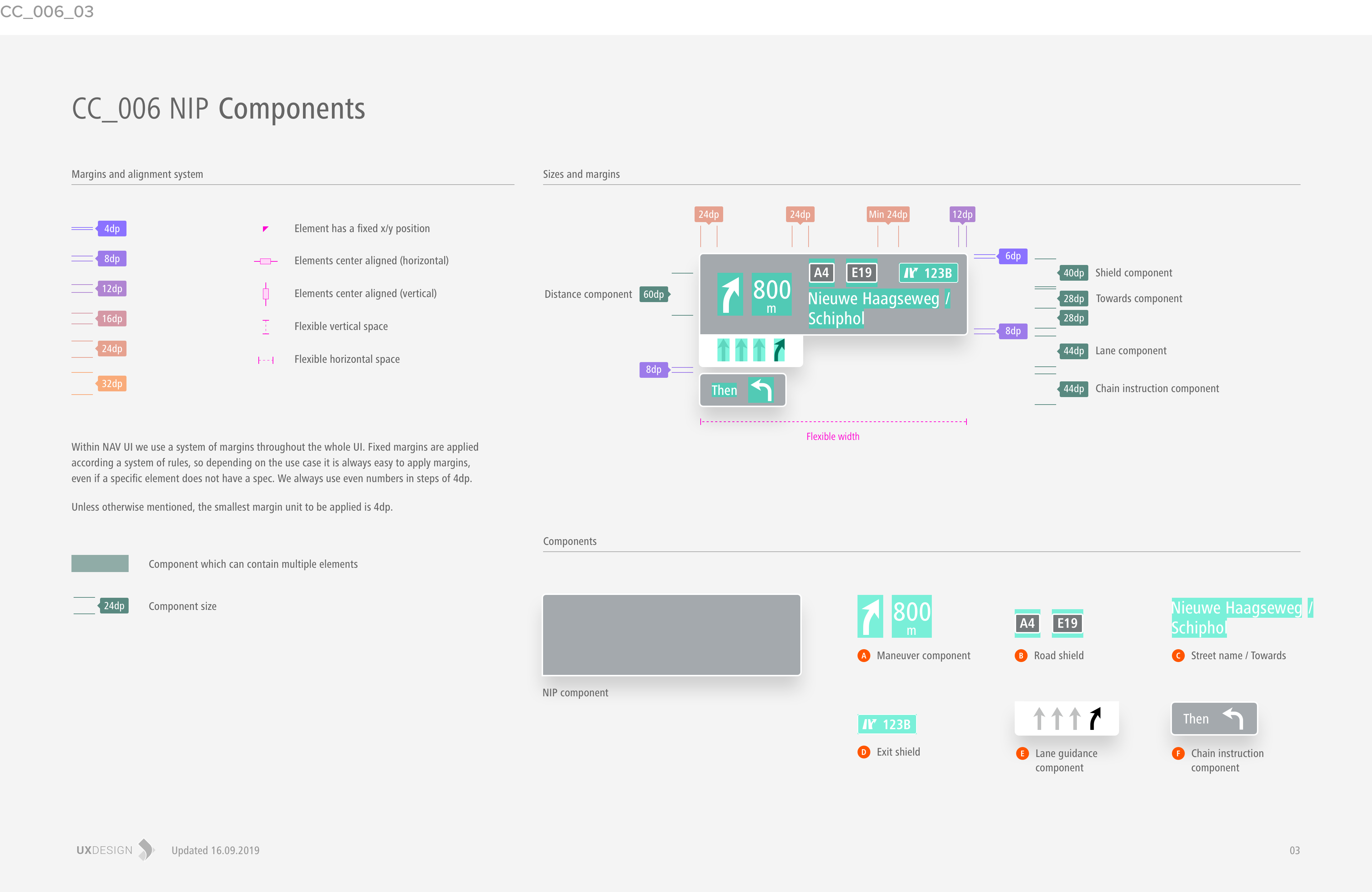
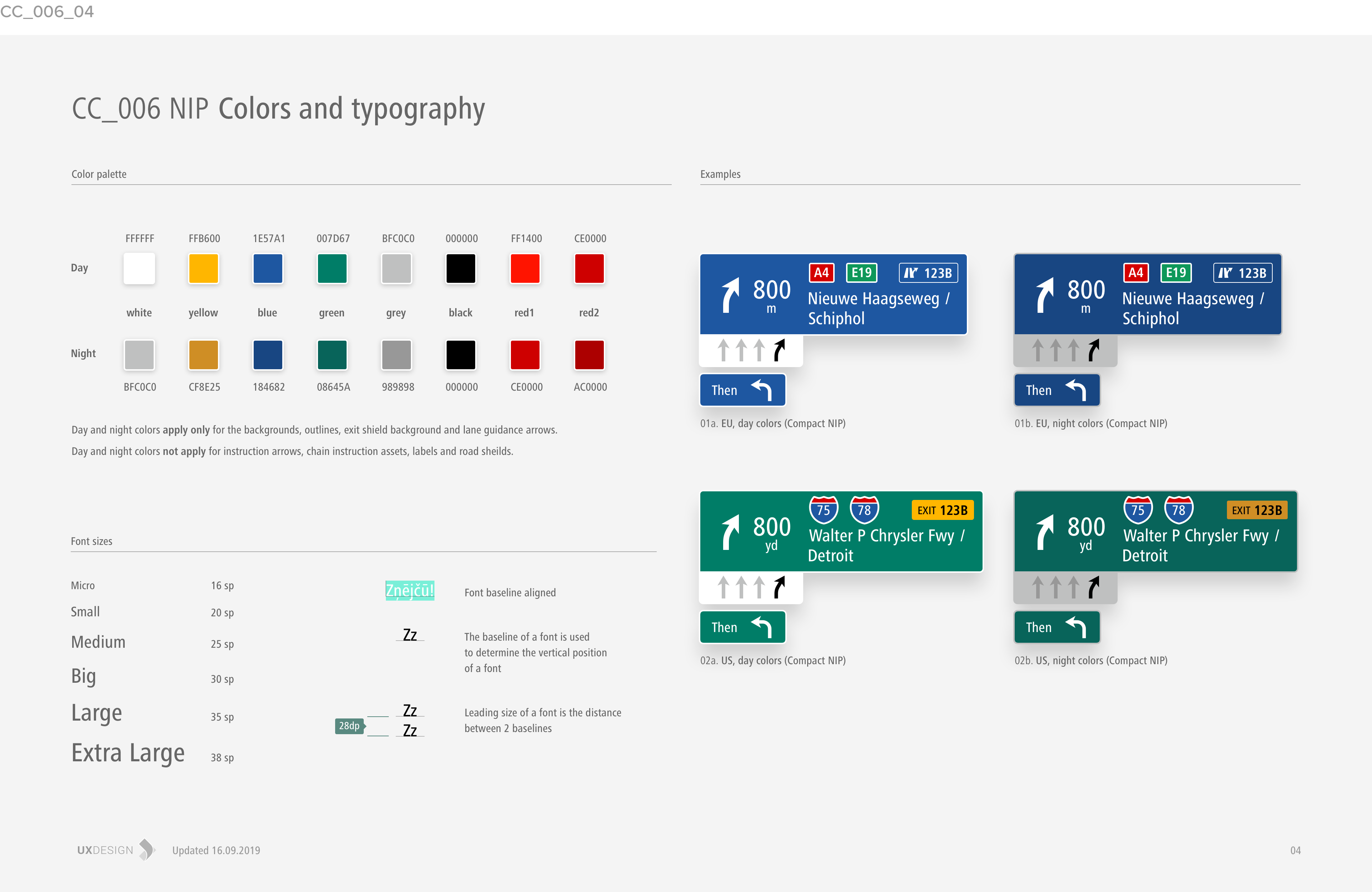
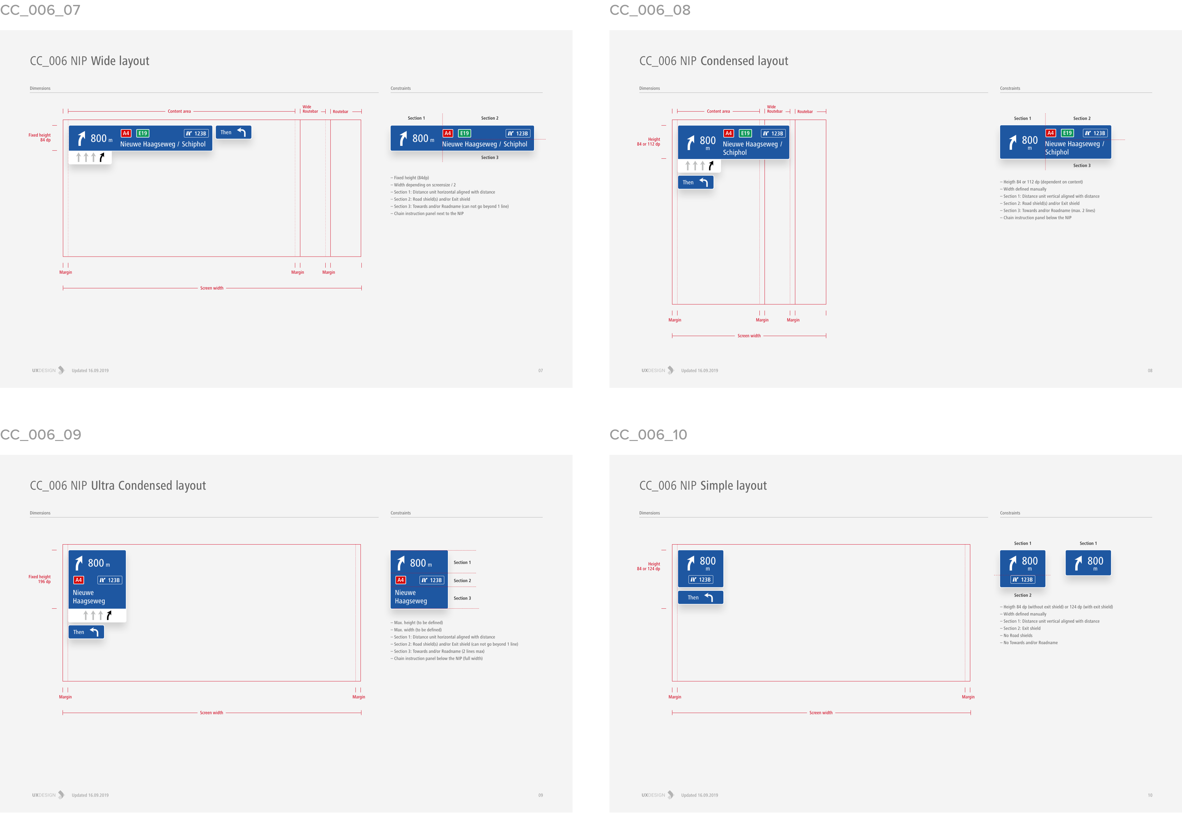
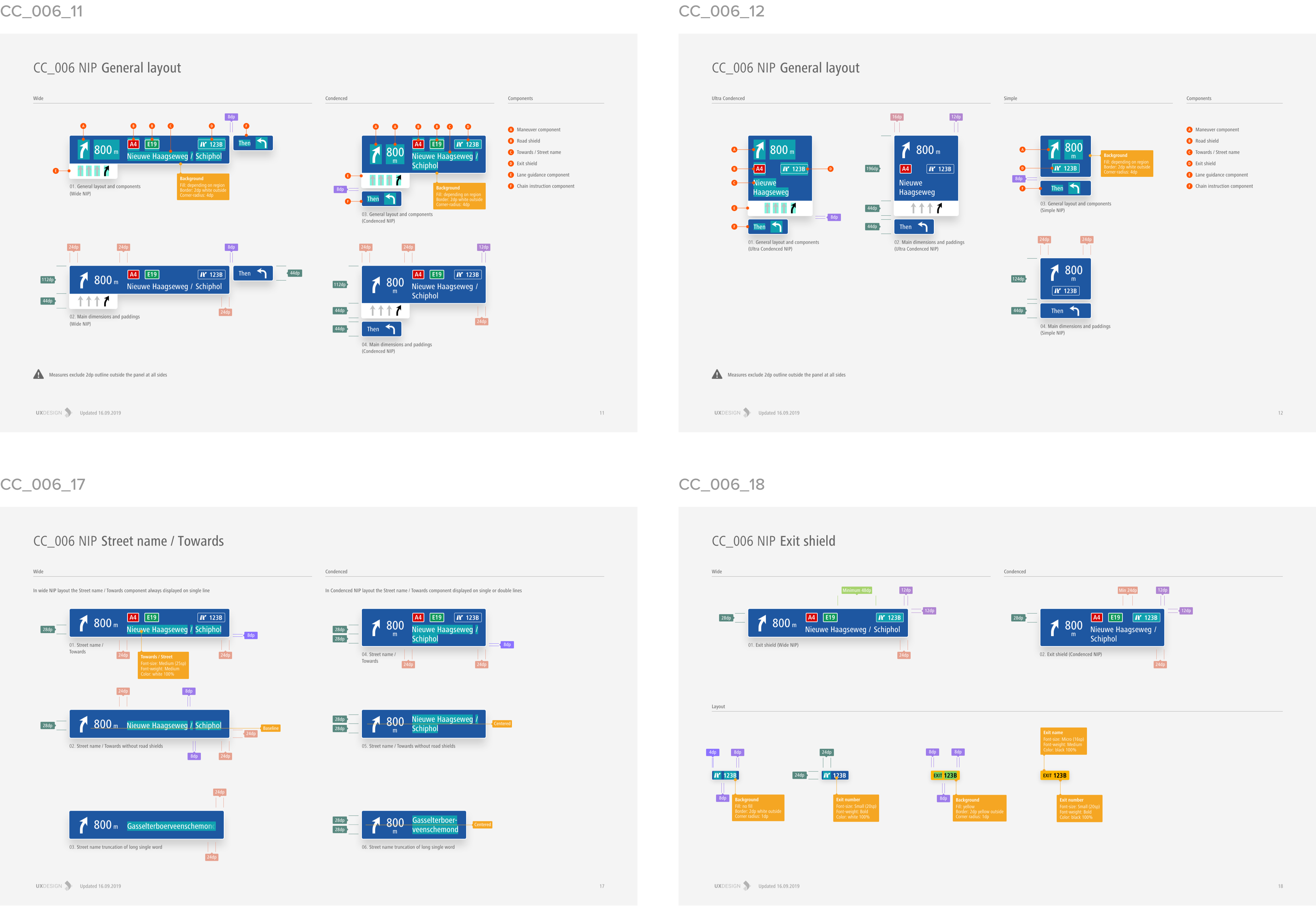
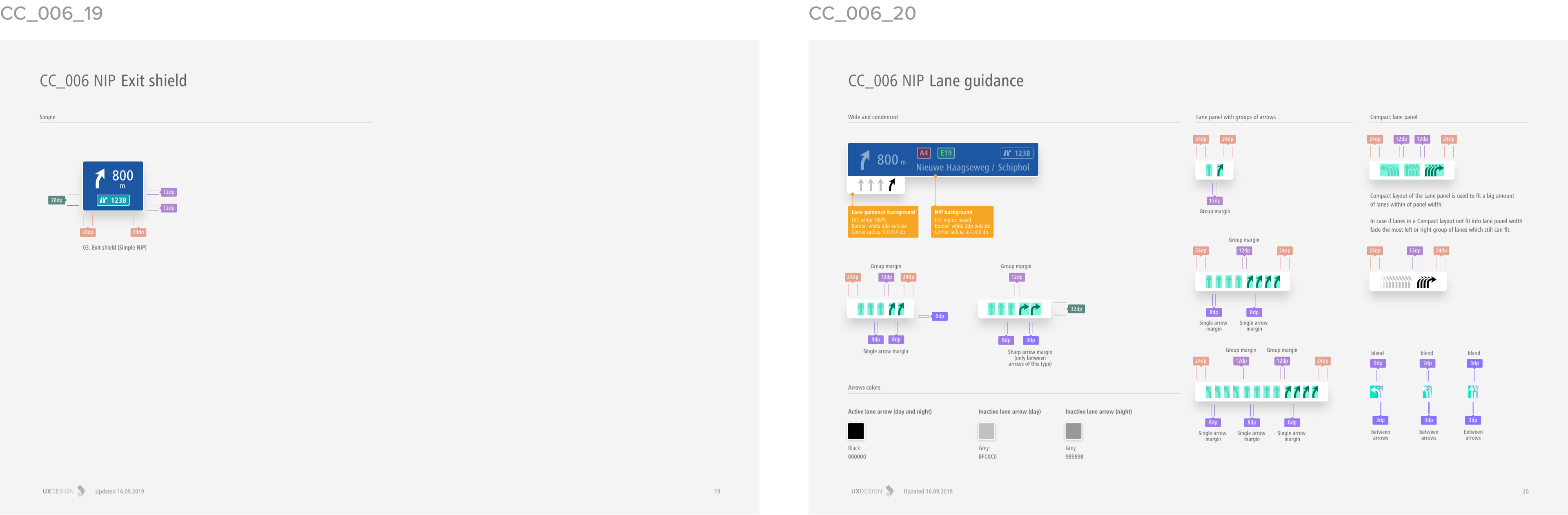
To fit different screens and containers, we created a set of adaptive layouts: a compact version for small or portrait screens, a balanced layout for medium formats, and an extended version with all available information for wide displays.
The panel switched automatically depending on screen type and state – full-screen mode, in-screen widget, or widget size variation.
03. Style
The visual direction focused on clarity, contrast, and rhythm. It had to deliver information instantly without distraction, yet stay elegant and consistent with the vehicle interior.
The design kept a neutral base – clear typography, balanced color, and minimalist iconography – ensuring focus on the road ahead. It also allowed enough flexibility to adapt to each brand’s visual language and seamlessly blend into the overall in-car experience.
04. The outcome
This project was an important milestone for both TomTom and FCA. We collaborated closely with JD Power, whose expert evaluations and feedback helped refine the final product.
The updated system was integrated into several FCA models, including the Maserati GranTurismo, and received positive usability ratings from JD Power.
I’m proud of my contribution – especially the work on the key navigation element that helped make the driving experience more intuitive, focused, and distinctly Maserati.