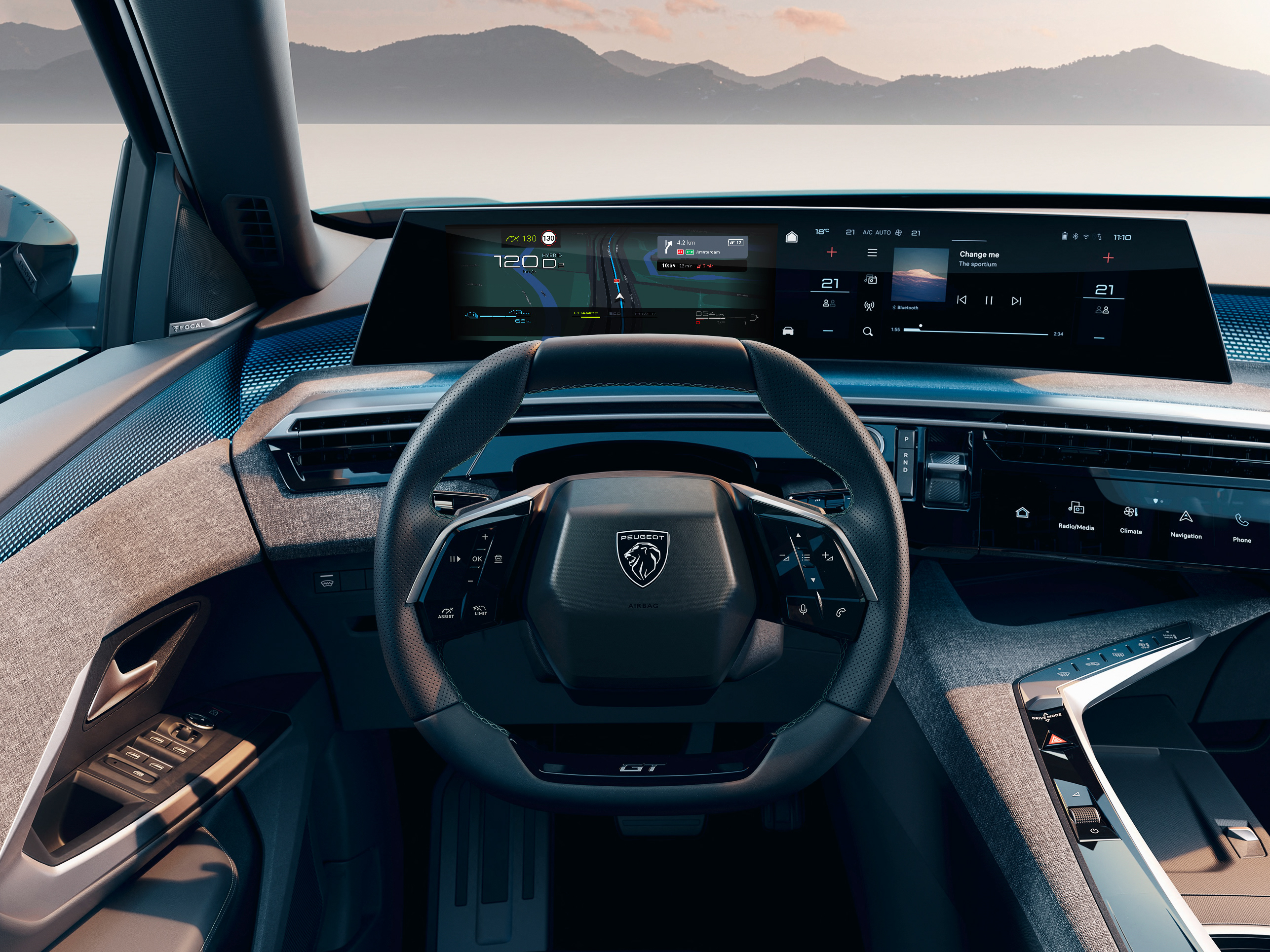
Peugeot 3008
Driving experience UI design
September, 2023
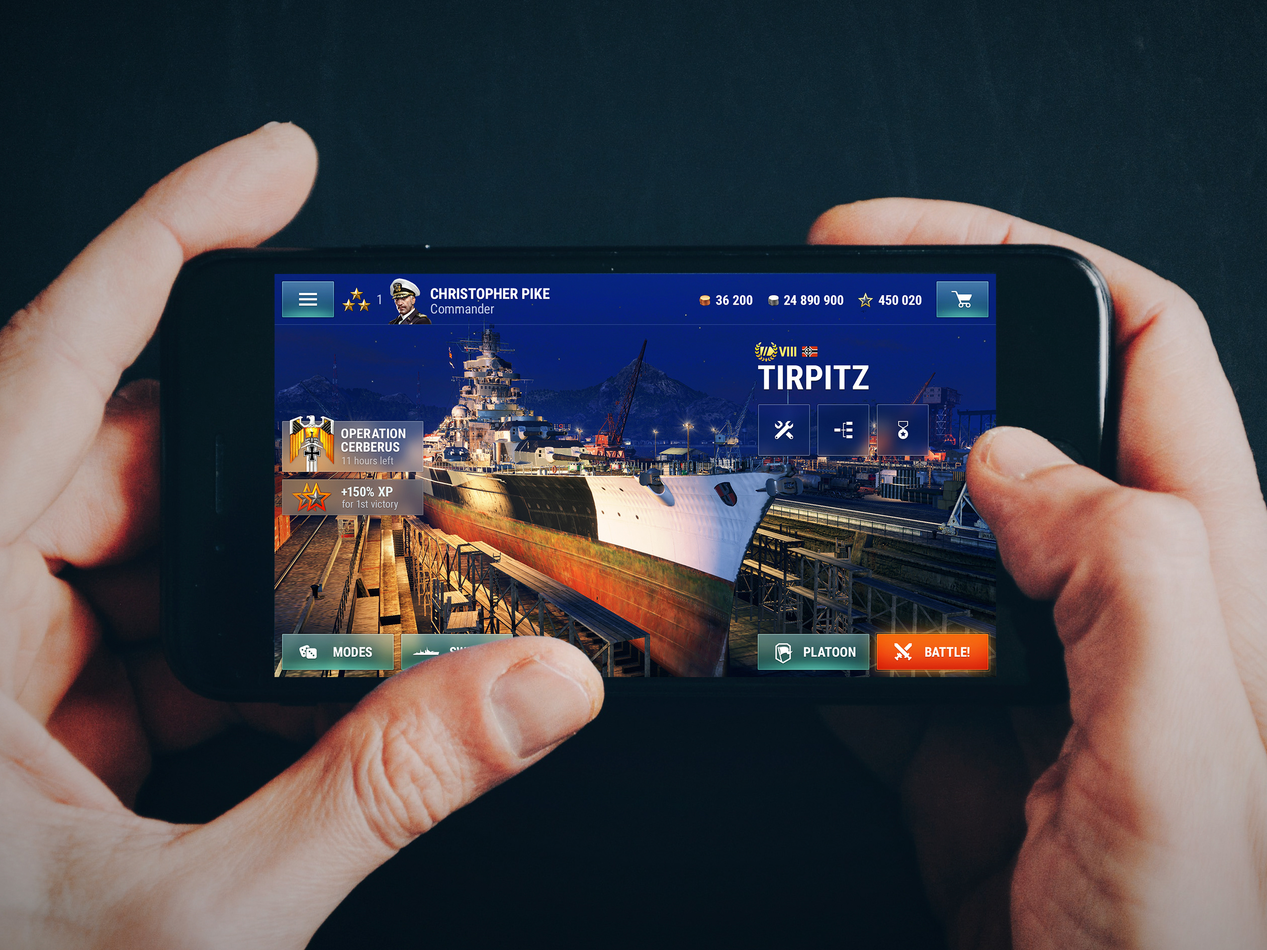
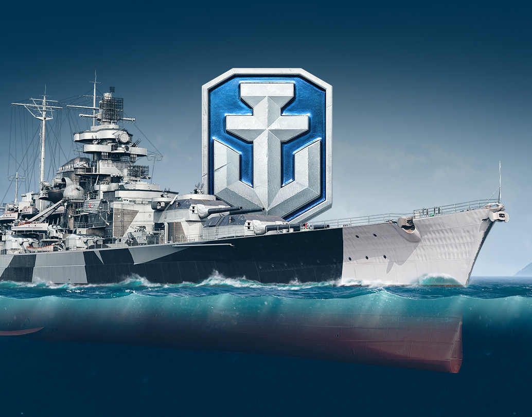
World of Warships Blitz
Game UI rework
September, 2018
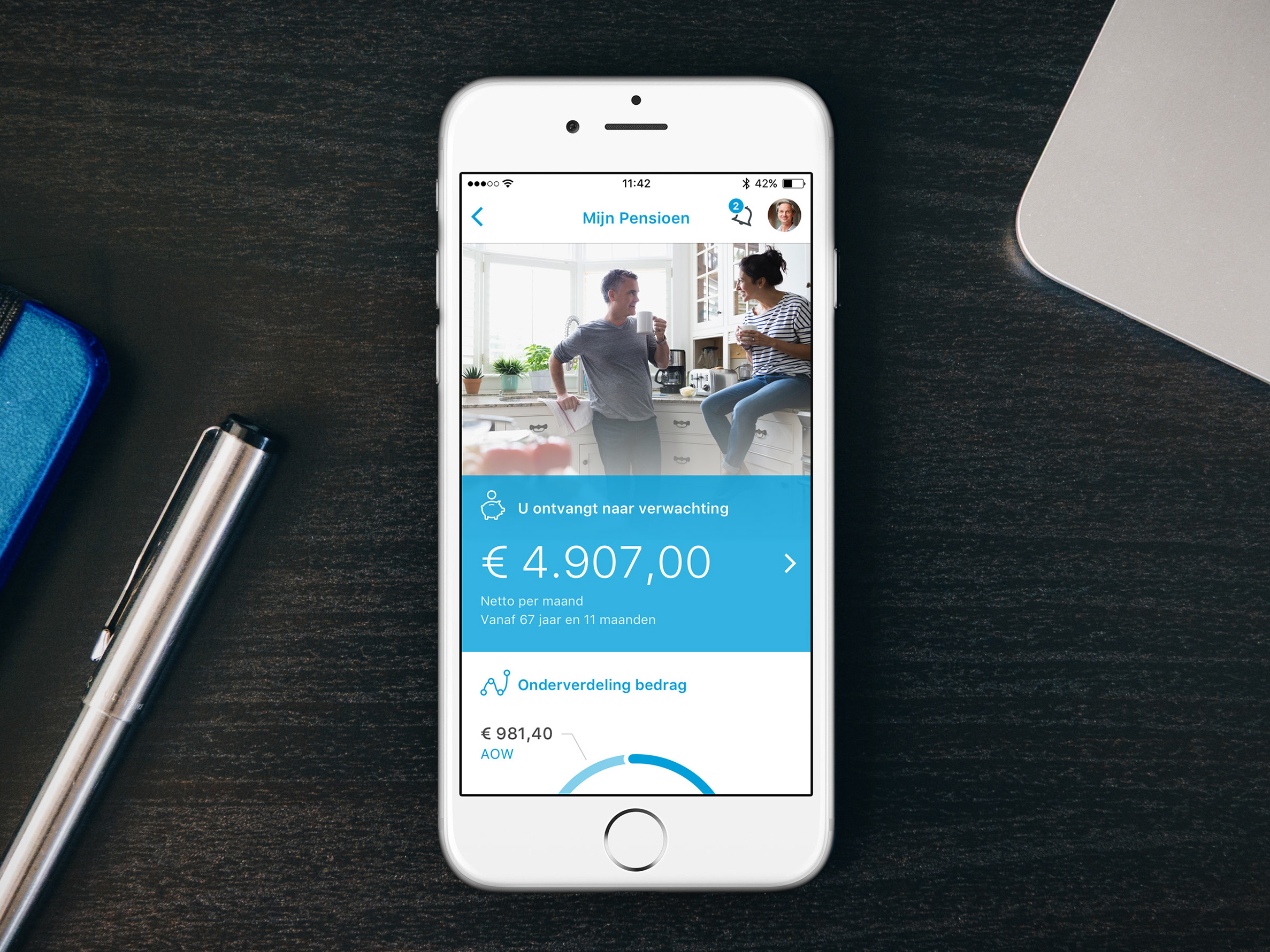
Delta Lloyd
Pension app UI
September, 2016
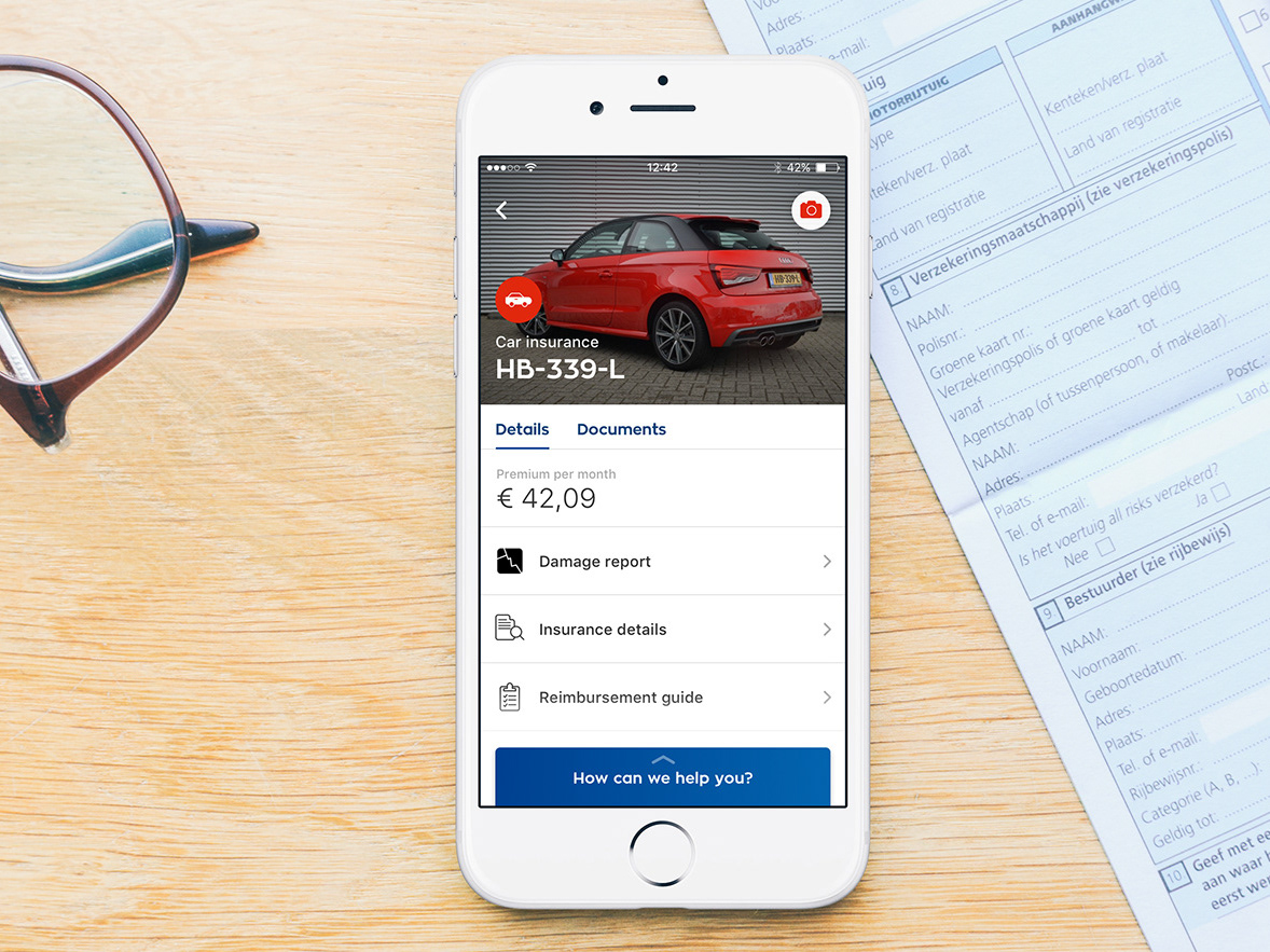
Ohra app 3.0
UI design
March, 2017
Manual Exposure
App for serious landscape photographers
September, 2013
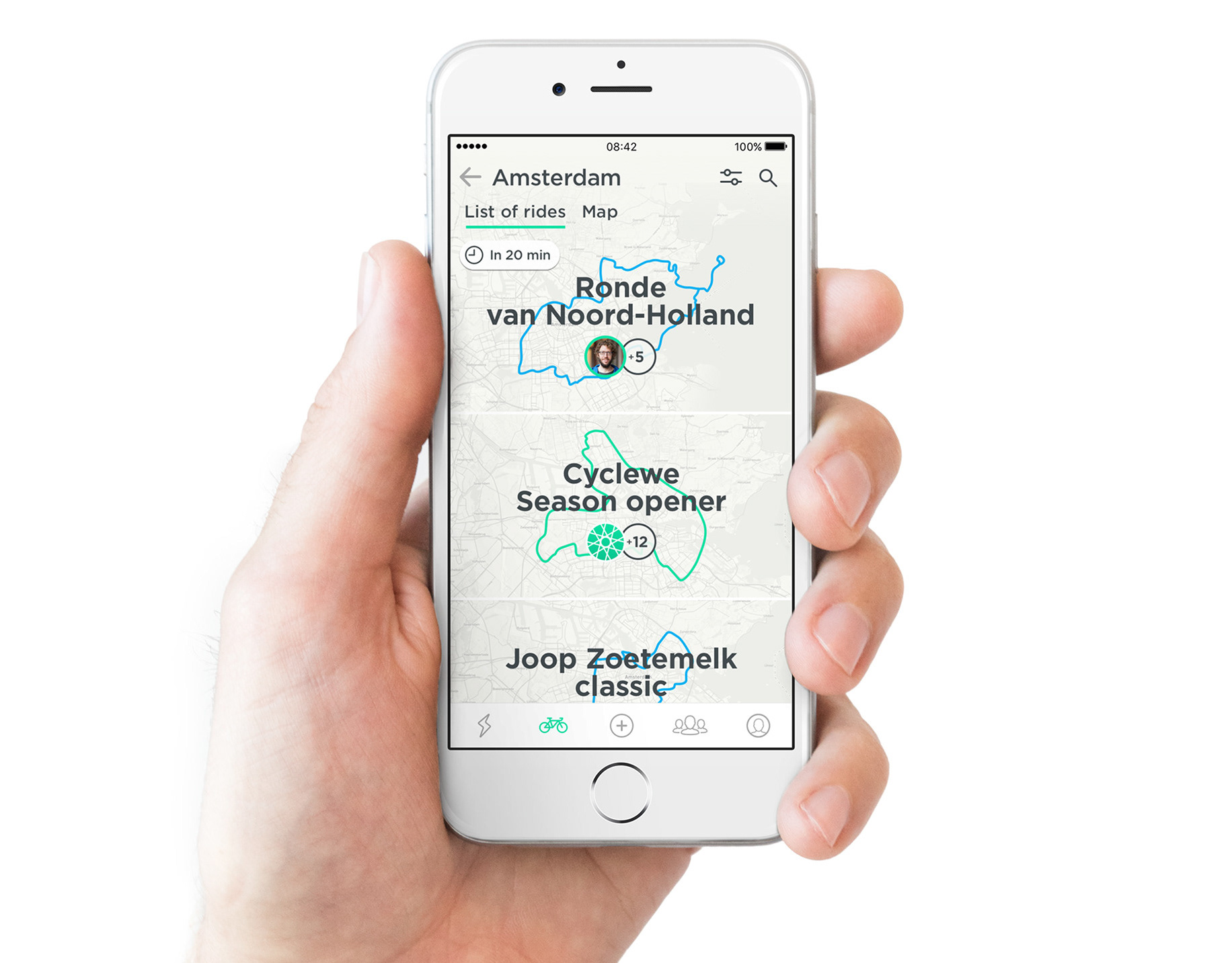
Join app
Cycling made social
August, 2016
WoWS Blitz website
Warships arrived on mobile
June, 2018
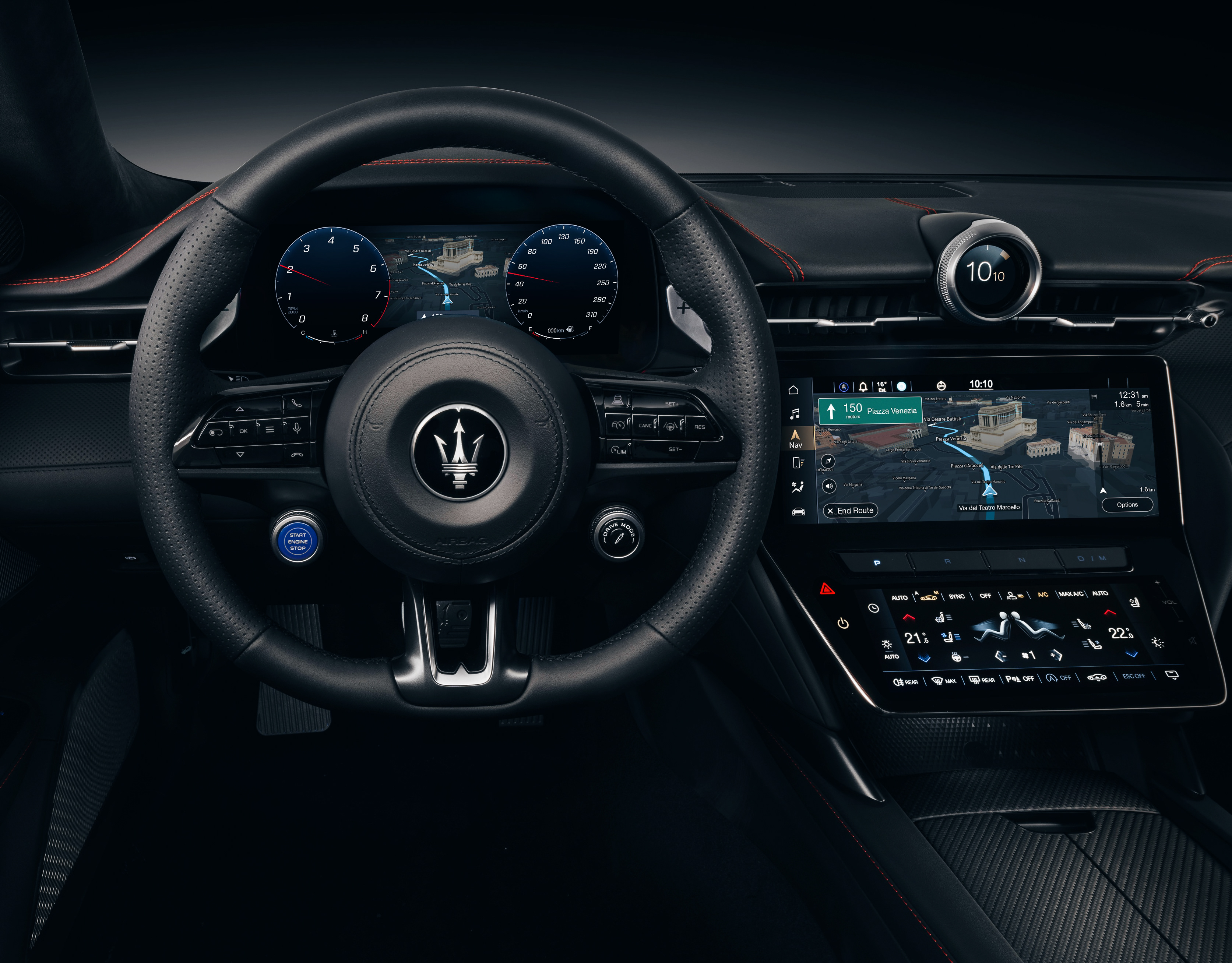
Maserati GranTurismo
Driving experience UI design
November, 2019
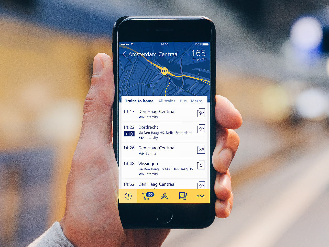
NS Stations
App concept
December, 2015
Connexxion
Apple Watch app concept
December, 2015
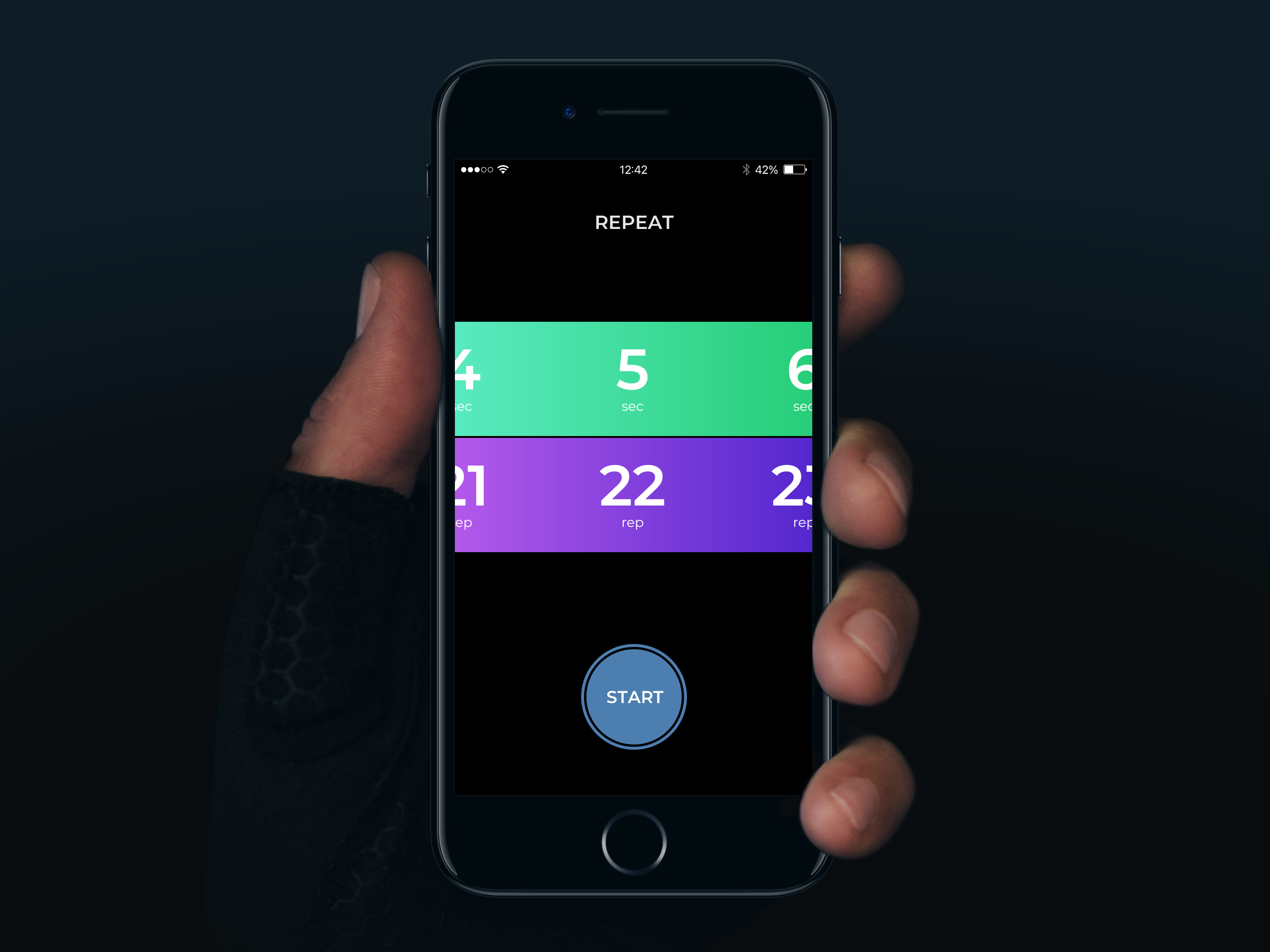
Repeat app
Simple workout timer
October, 2019
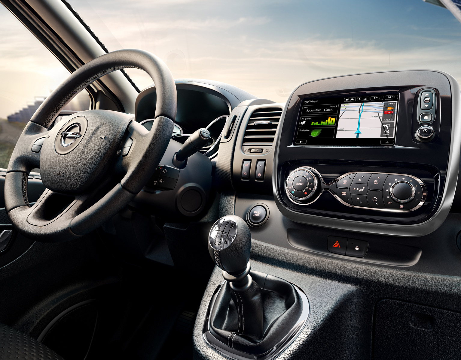
Opel Vivaro
In-dash system UI
June, 2014
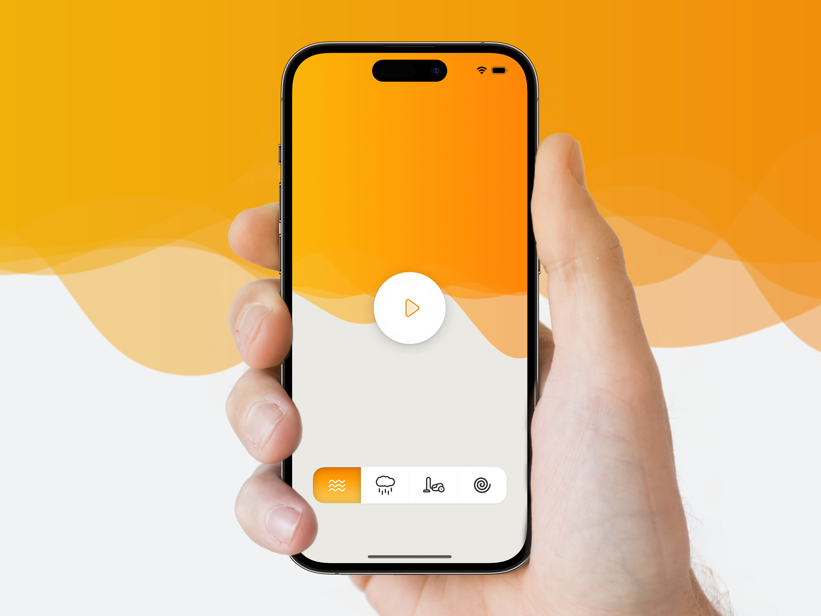
White noise
App to make noise
April, 2023
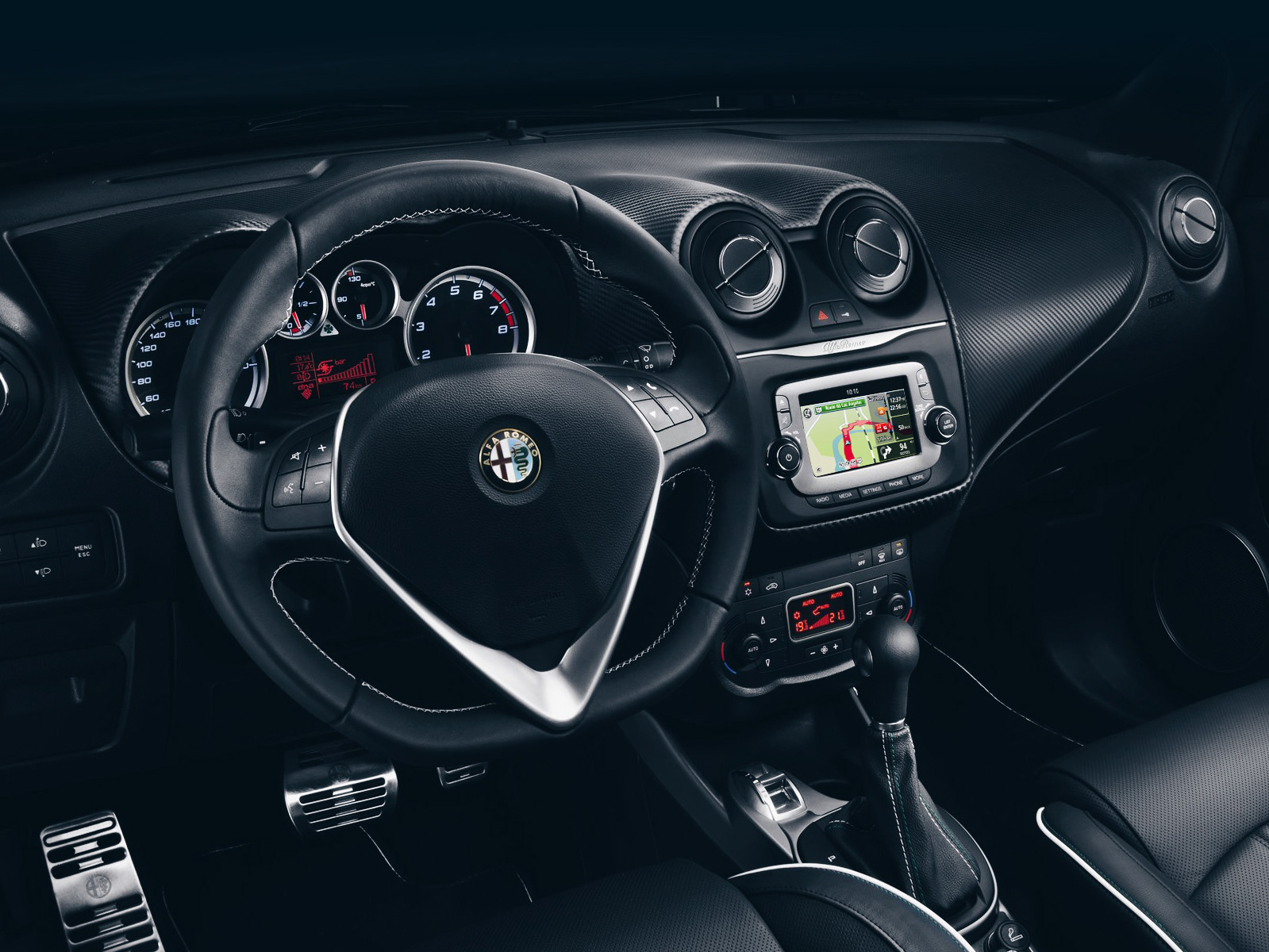
Alfa Romeo Mi.To
In-dash navigation
April, 2013
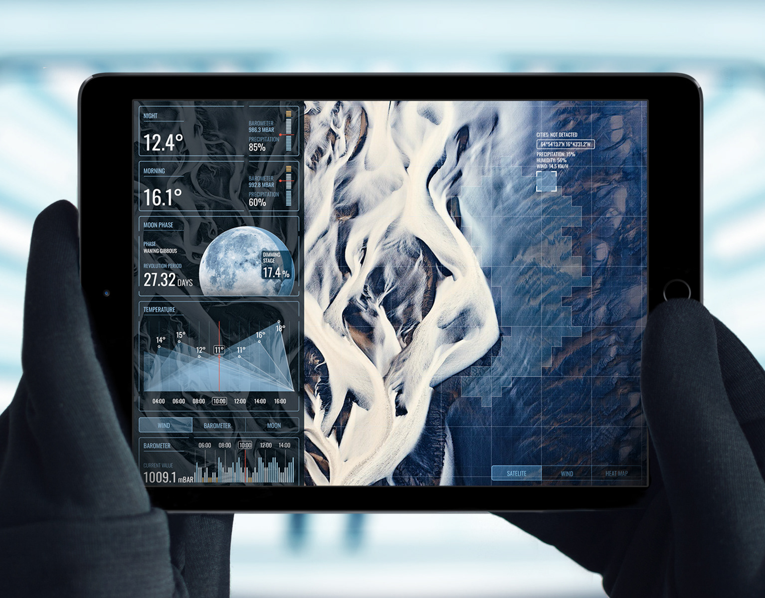
Weather
Overcomplicated app concept
November, 2014
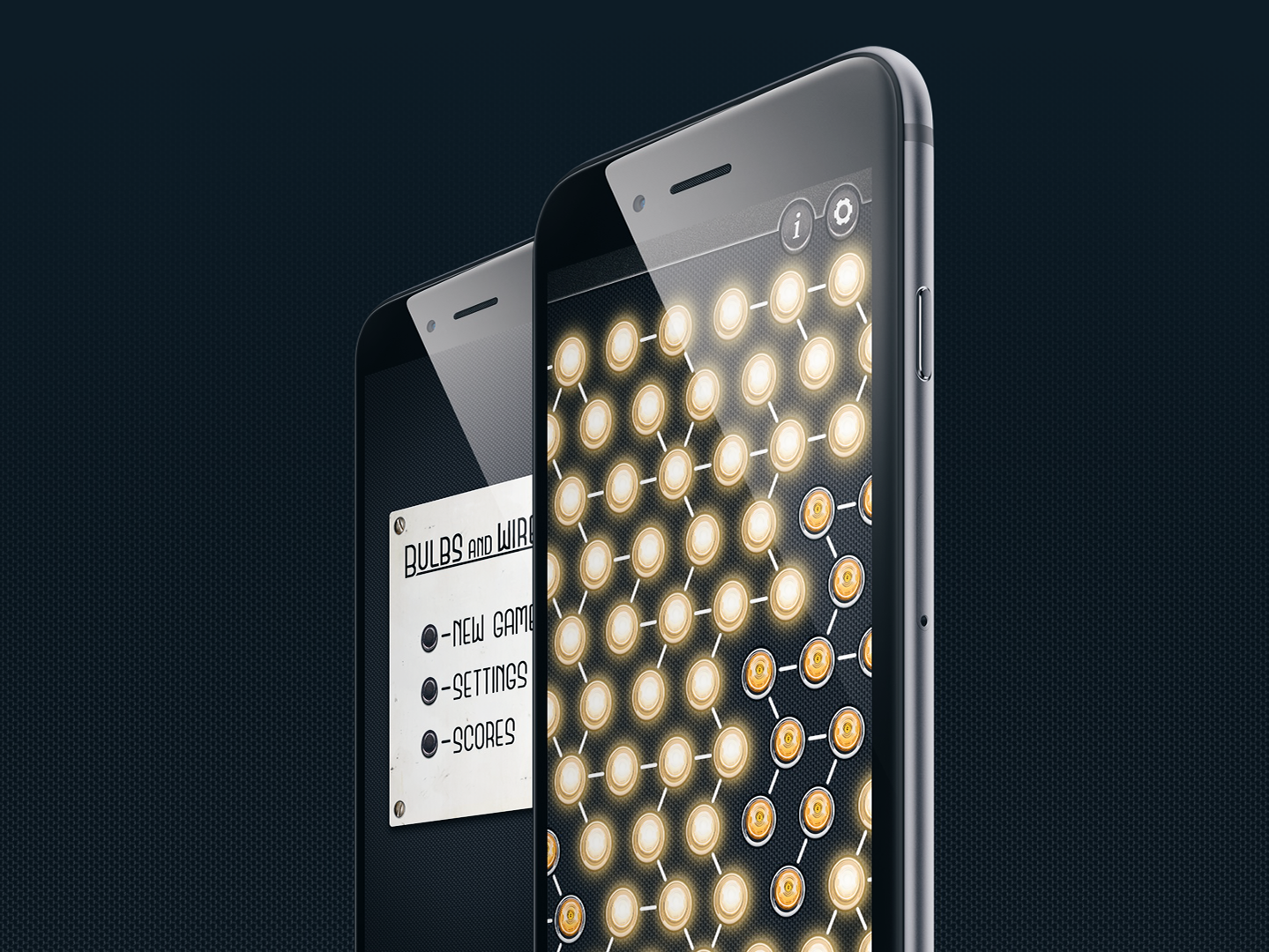
Bulbs and Wires
Puzzle game for true erudits
October, 2012
About
George Koultouridis
July, 1985